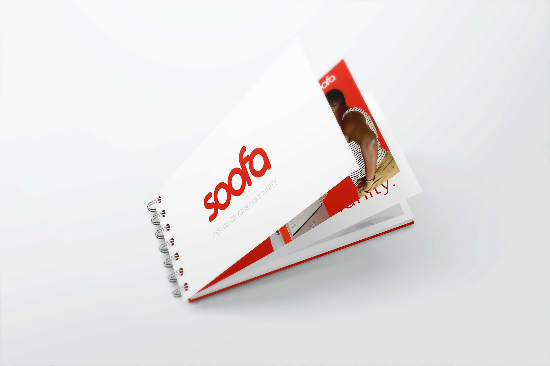

Case Study — Soofa Brand Guidelines & Sign Design Standards
Role: Visual Brand Designer and UXUI Designer
Project: Soofa Brand Guidelines — Design for Soofa Sign displays & communication assets
Published: 2018 (Behance)
Client/Product: Soofa — innovative outdoor signage and advertising system for smart cities, community messaging, and hyperlocal communication.
Project: Soofa Brand Guidelines — Design for Soofa Sign displays & communication assets
Published: 2018 (Behance)
Client/Product: Soofa — innovative outdoor signage and advertising system for smart cities, community messaging, and hyperlocal communication.
📍 Project Overview
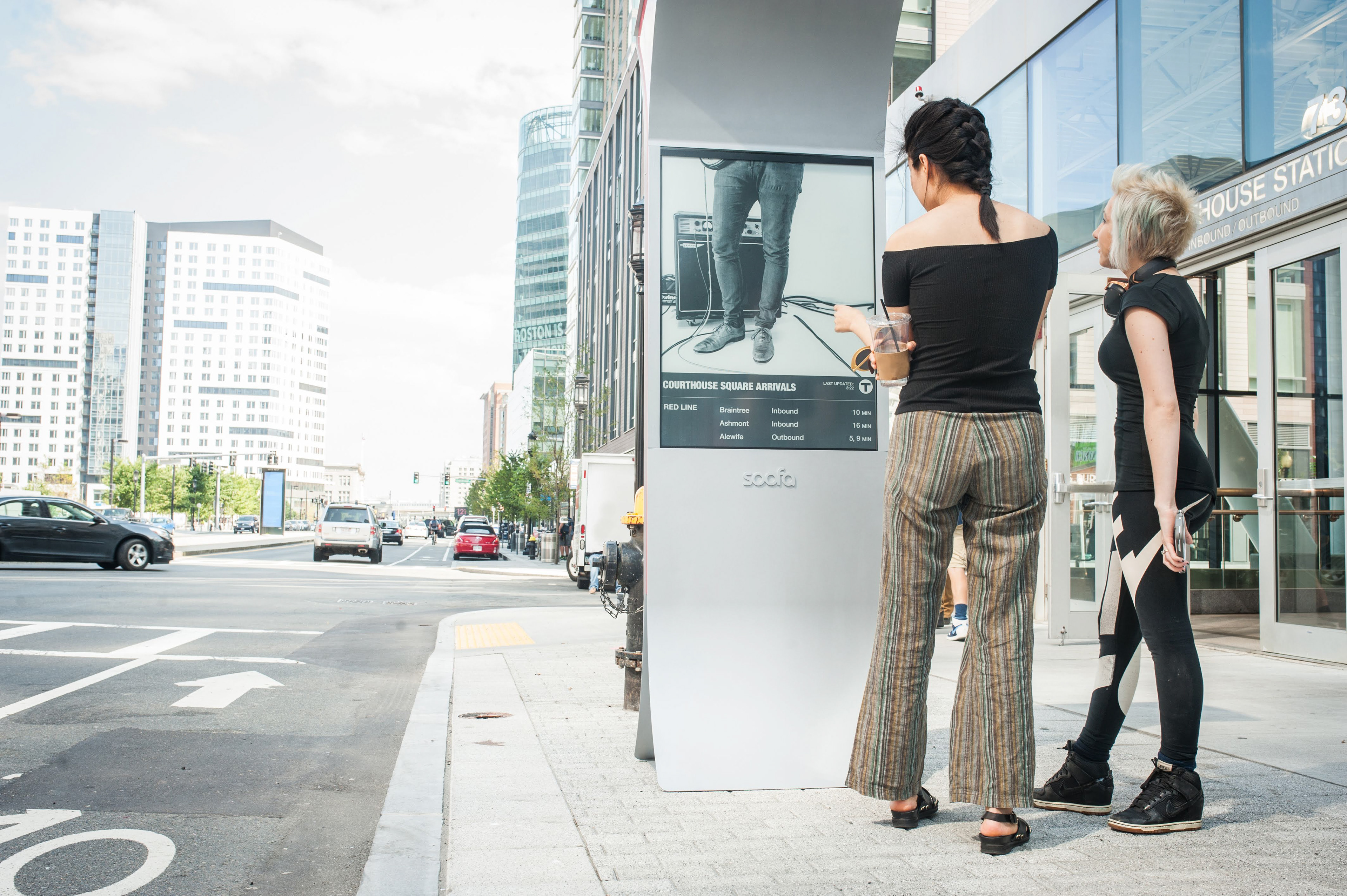
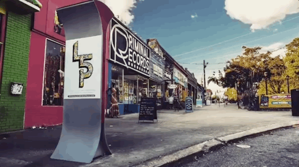
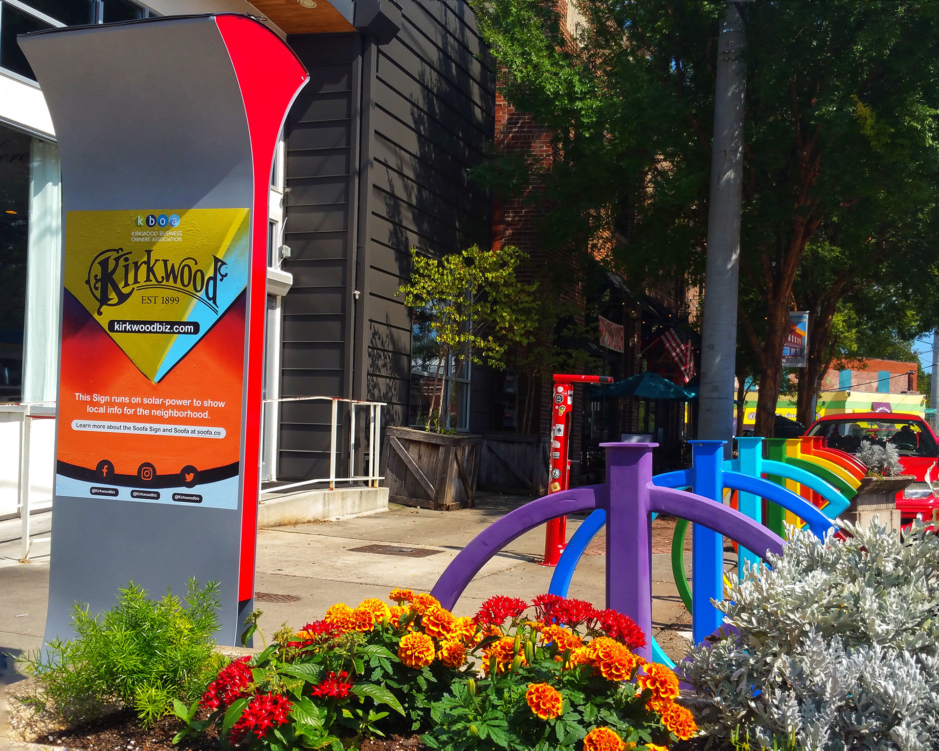
Soofa is a smart city communication and outdoor signage technology built on solar-powered digital displays designed for neighborhoods, campuses, parks, and sidewalks. The mission of this brand design initiative was to develop a comprehensive brand guideline that could be used both internally (design team, developers) and externally (cities, advertisers, creative partners) to maintain consistency in visual identity and ensure legible, effective messaging on Soofa Sign displays.
🎯 Project Goals
Establish a clear visual system for all brand applications both online and in physical signage.
Define a flexible design language that could scale across digital platforms and large-format, outdoor Soofa Sign screens.
Provide practical design specs and rules for content creators and advertisers to design for the e-Ink/electronic paper signage environment.
Ensure the brand communicates community, sustainability, and smart city values.
🔄 Design Challenges
1. Dual-Use Brand System
The guidelines had to serve both:
Internal stakeholders — product teams and UX/UI designers using the brand in apps, web interfaces, and city resources.
External partners — advertisers and local organizations creating content for Soofa Signs and other physical assets.
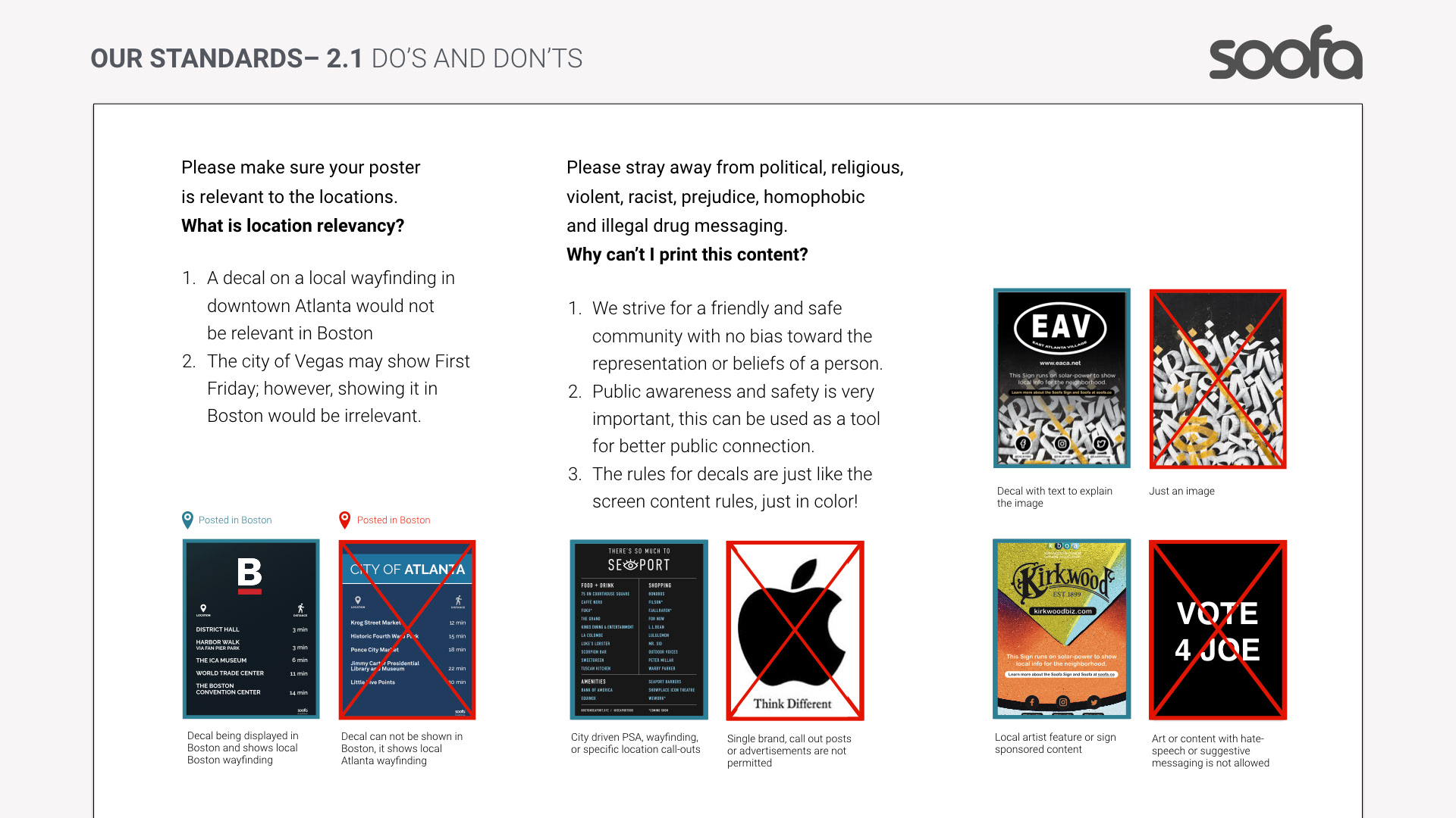
Ensuring consistency without overly restricting creative expression was a key balance.
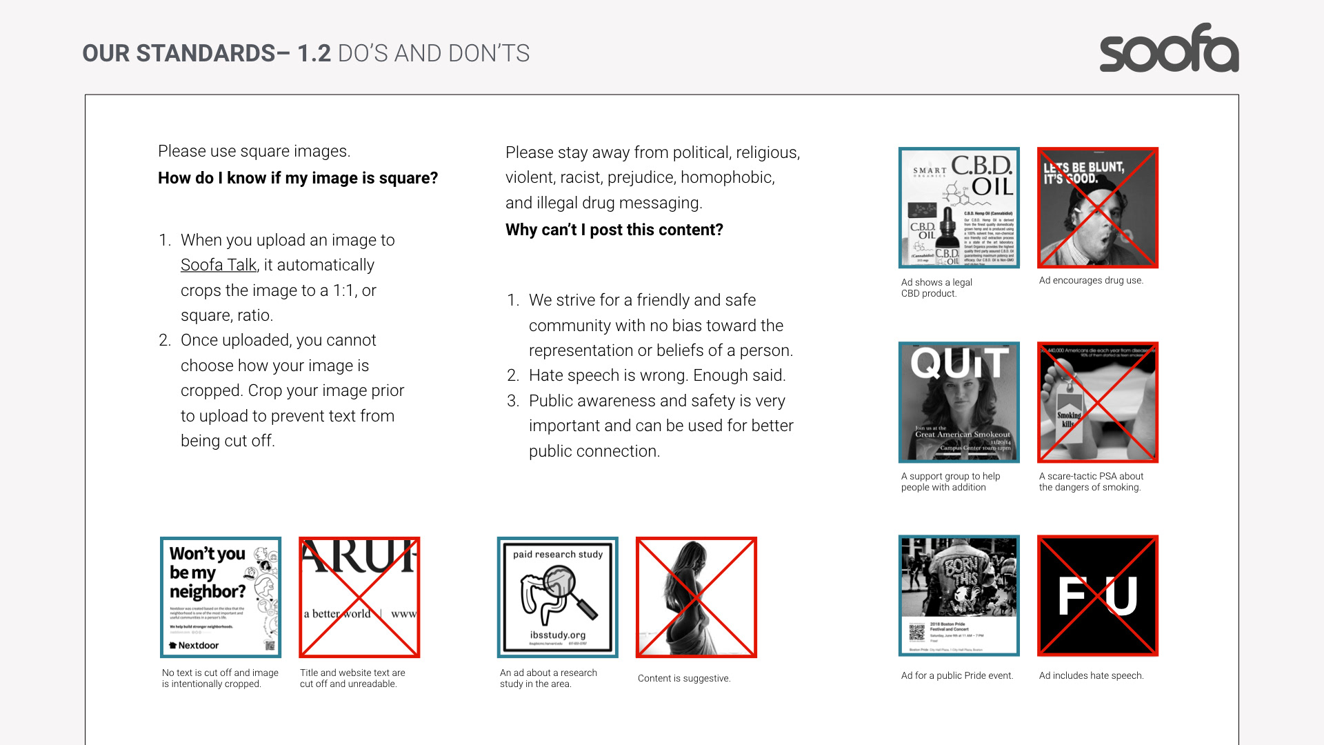
2. Outdoor Signage Constraints
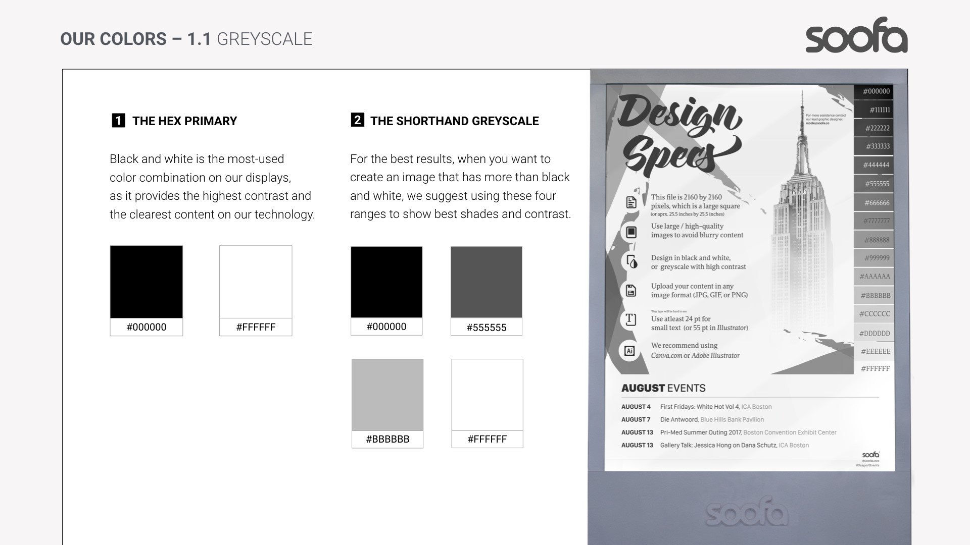
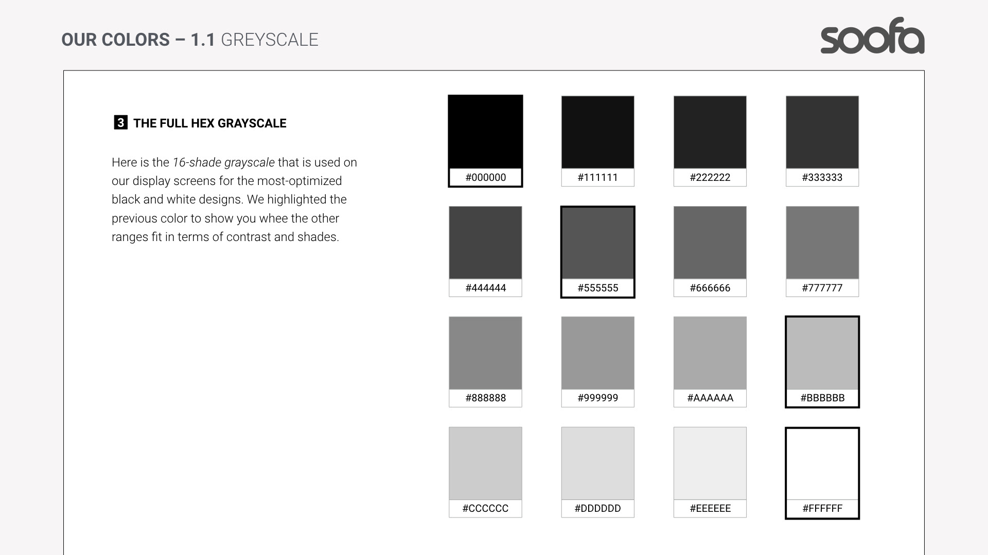
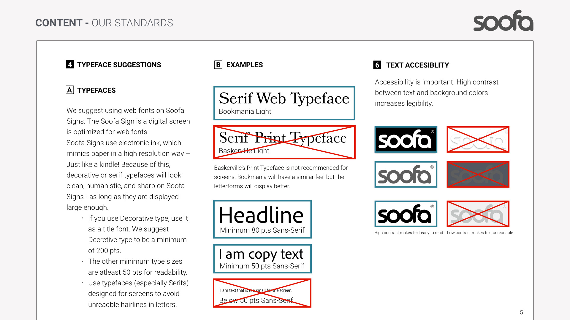
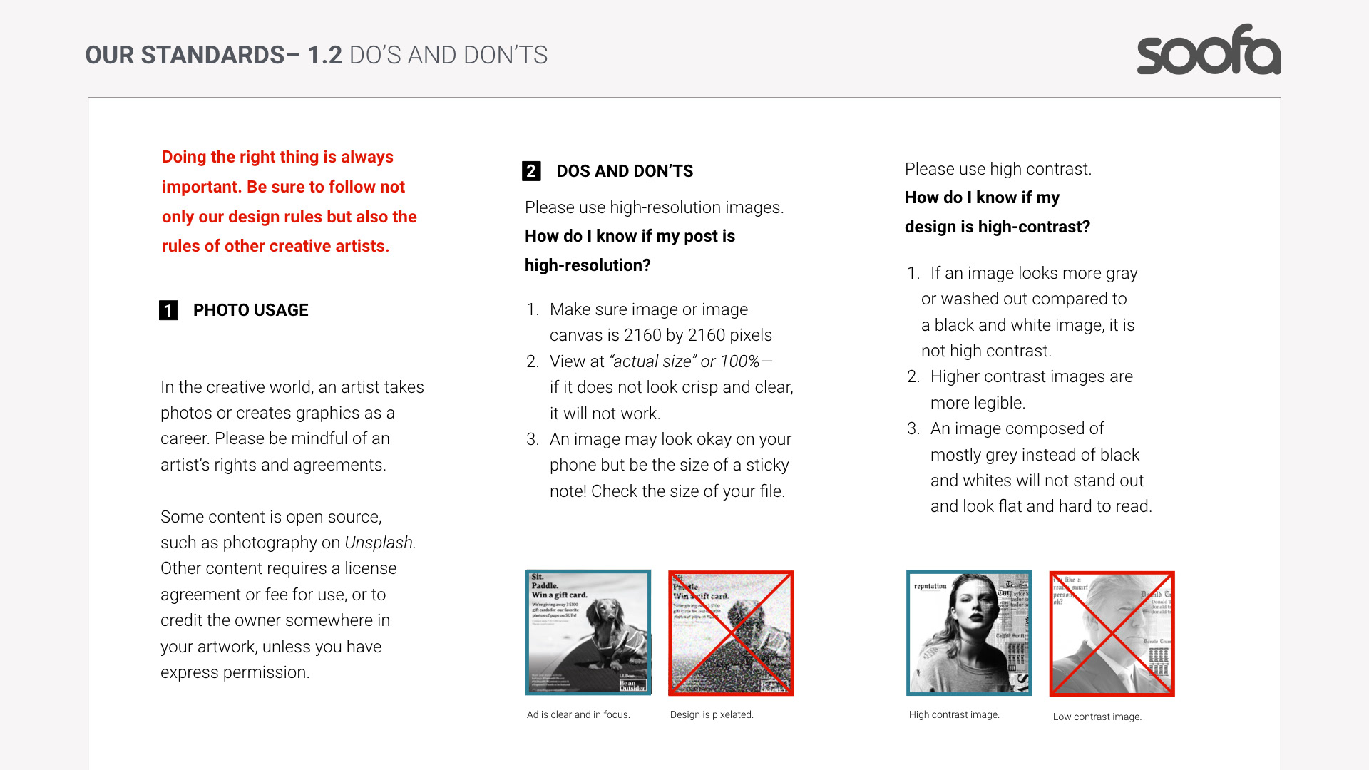
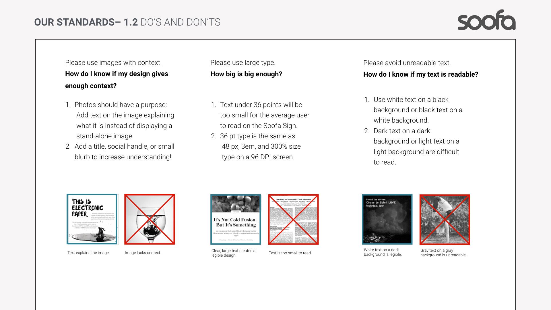
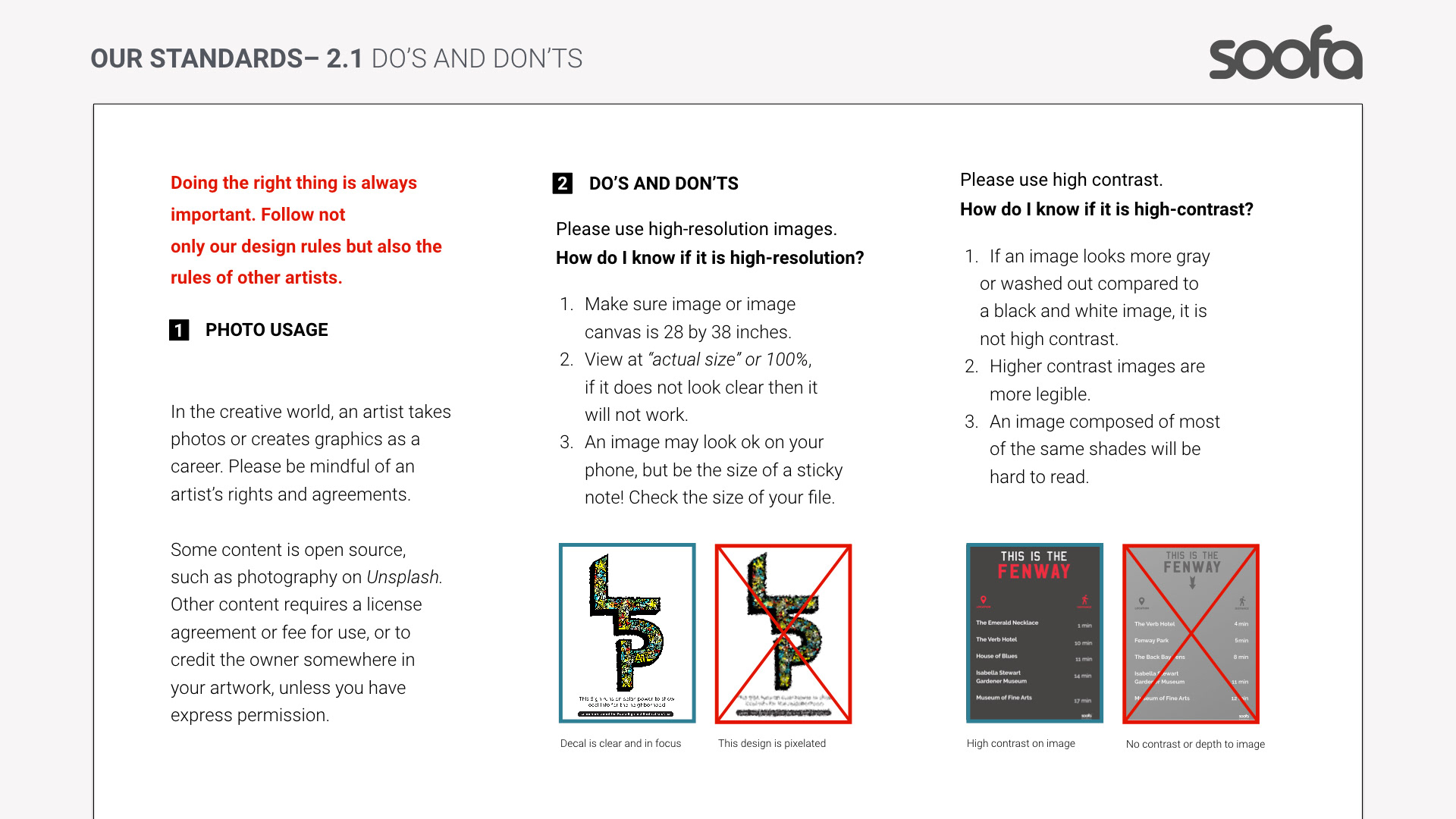
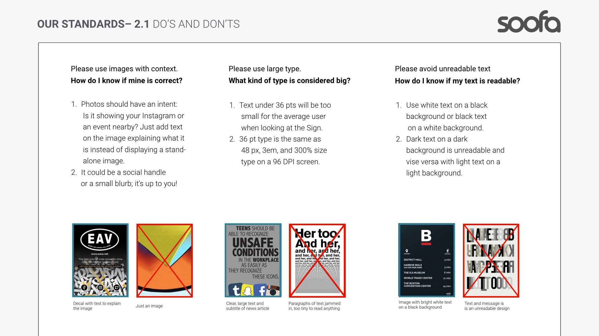
Soofa Signs are solar-powered electronic paper displays with grayscale content optimized for pedestrian viewing. This posed unique design considerations:
Typeface and layout legibility at a distance
High-contrast visuals for electronic ink displays
Simplified messaging due to limited word count and rotation intervals
Layouts that adapt across vinyl branding and digital screens.
Because of these constraints, the guidelines needed practical specs that content creators could use directly for campaigns and signage graphics.
🧠 Brand Identity & Guidelines Strategy
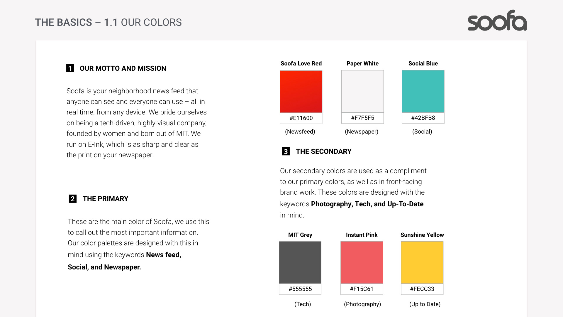
1. Brand Core & Values
The foundational narrative for Soofa’s brand centered on community, sustainability, and connection — positioning Soofa as a smart city tool for authentic local communication. The visual identity needed to support that: friendly, dependable, modern, and flexible.
2. Visual Identity System
The brand guidelines established rules and elements including:
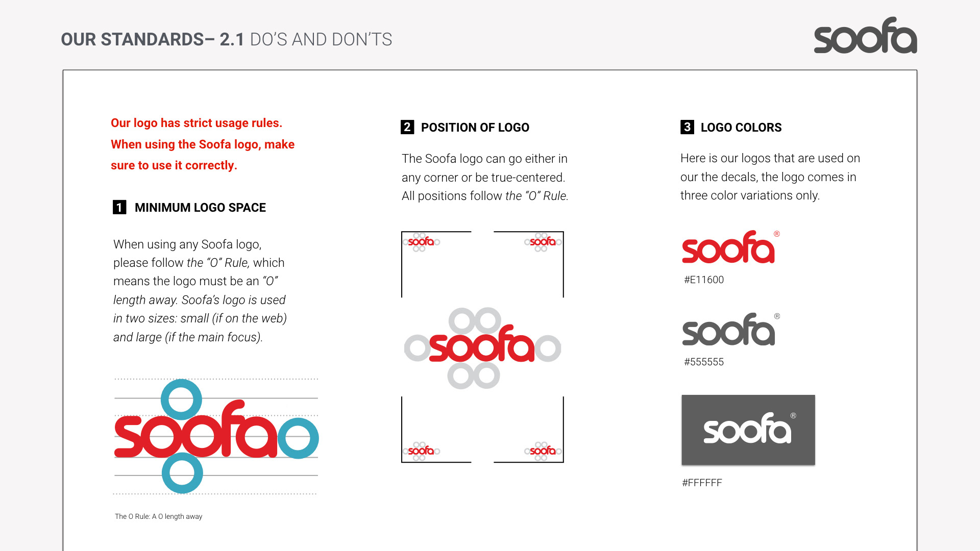
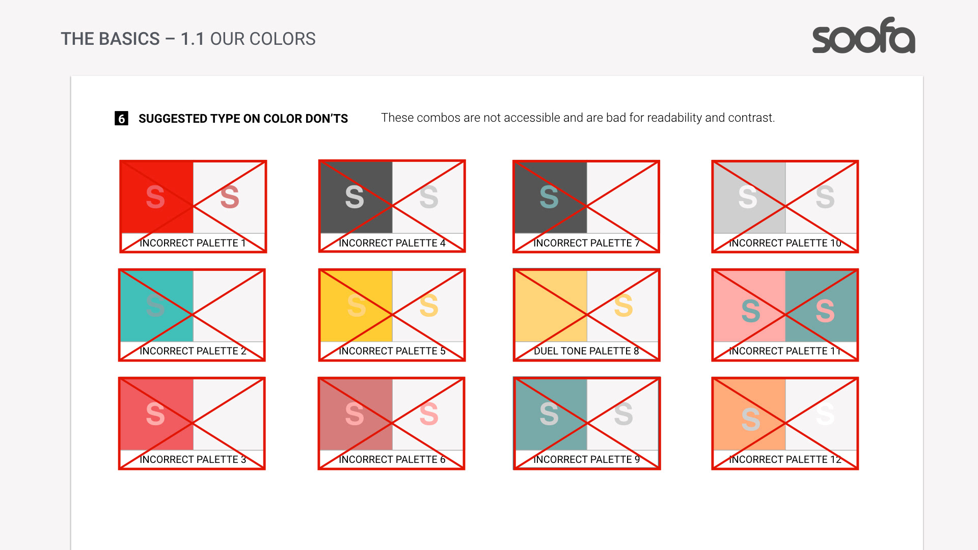
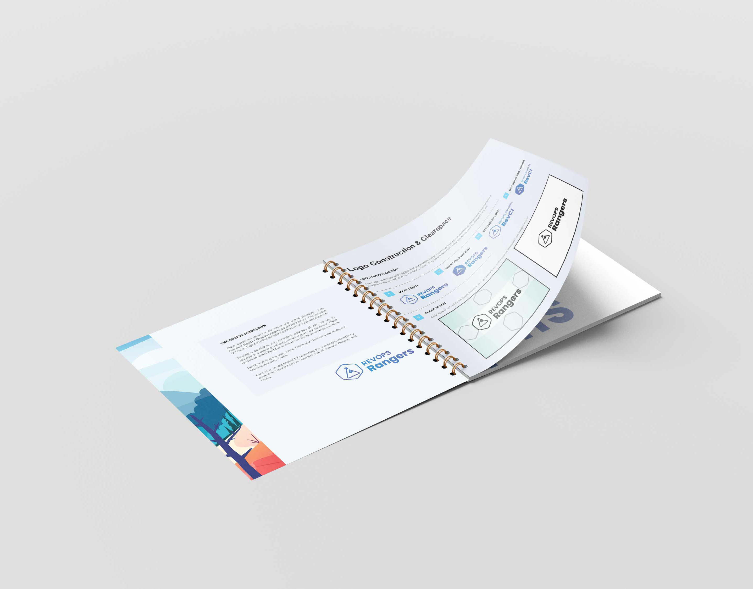
Logo usage: Clear spacing, scale rules, and incorrect usage examples.
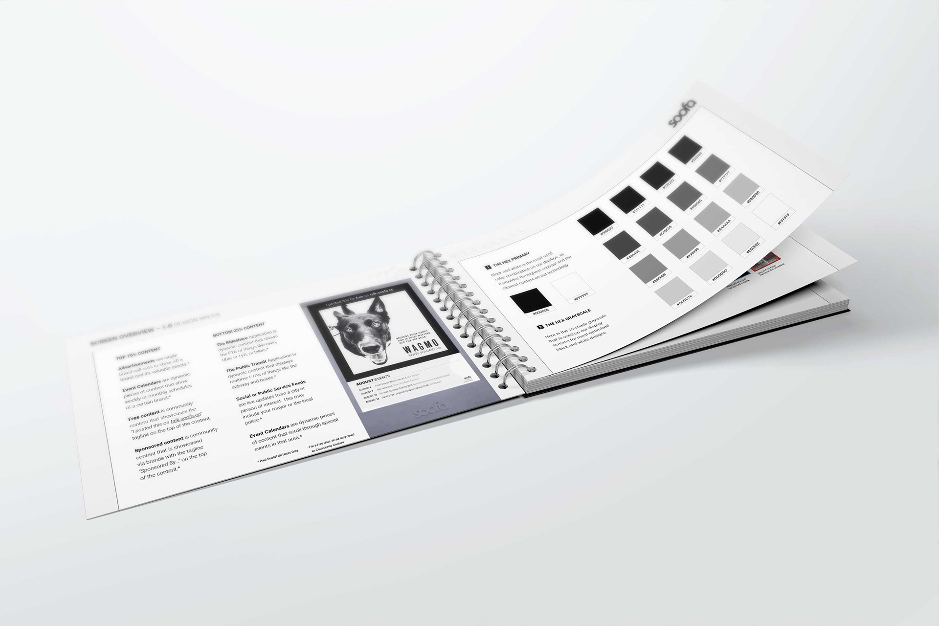
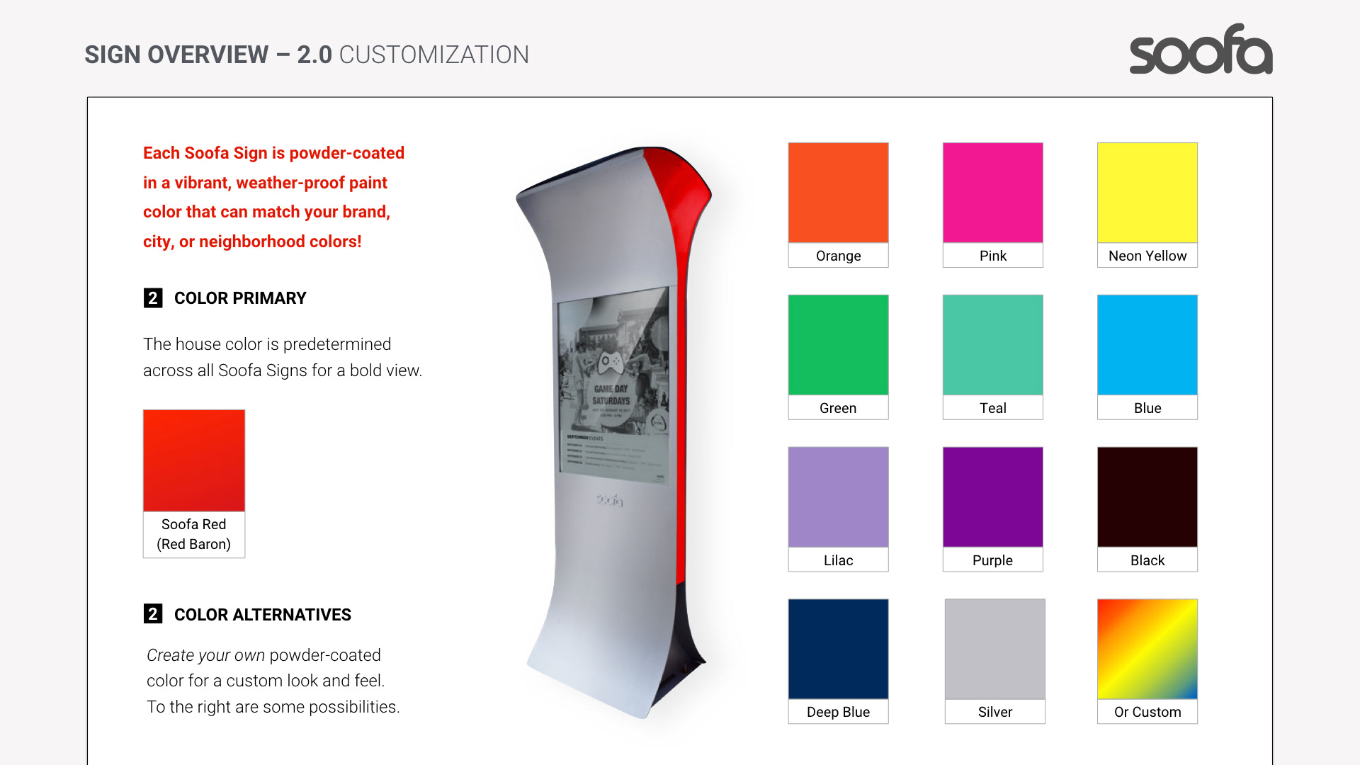
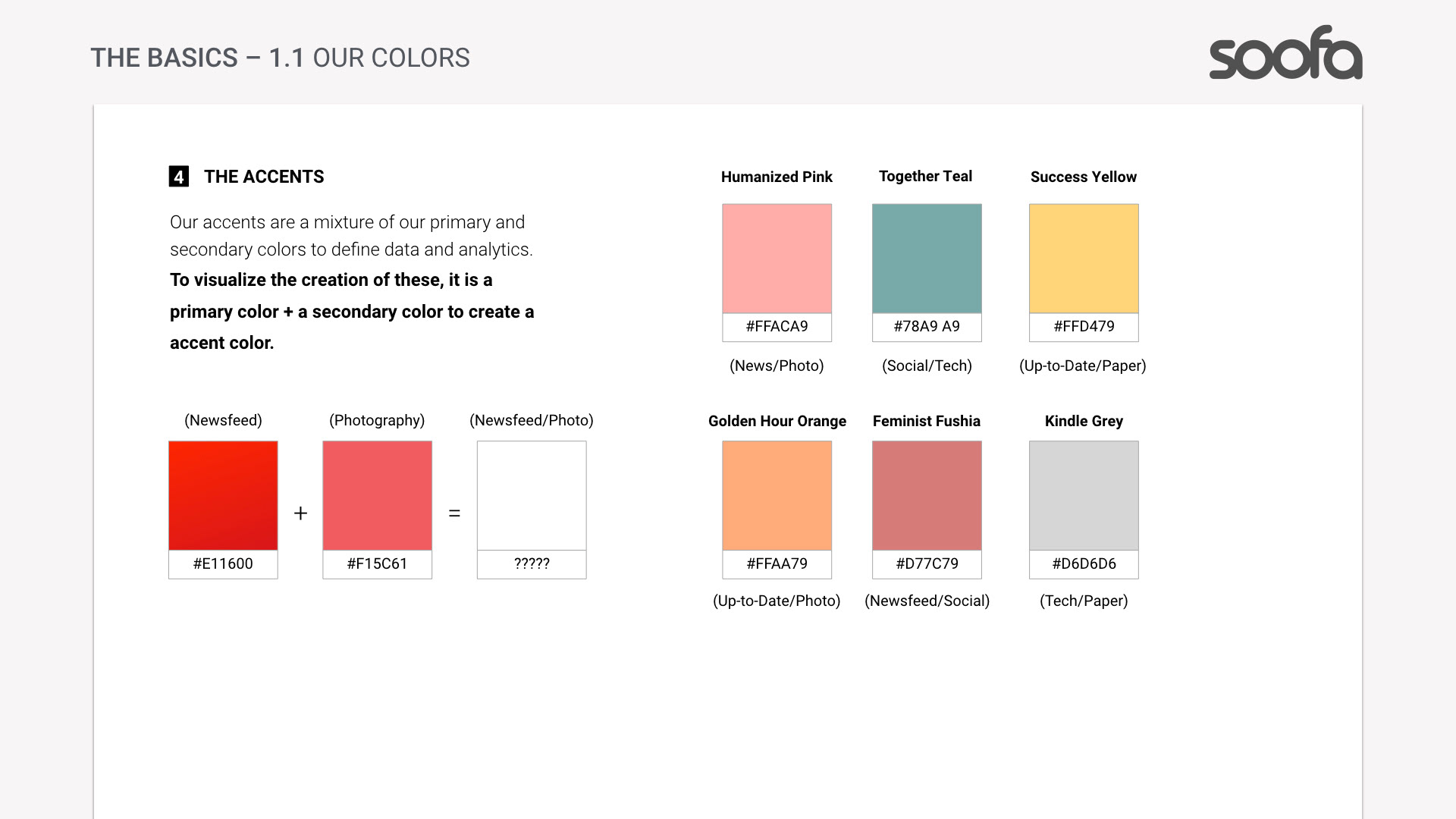
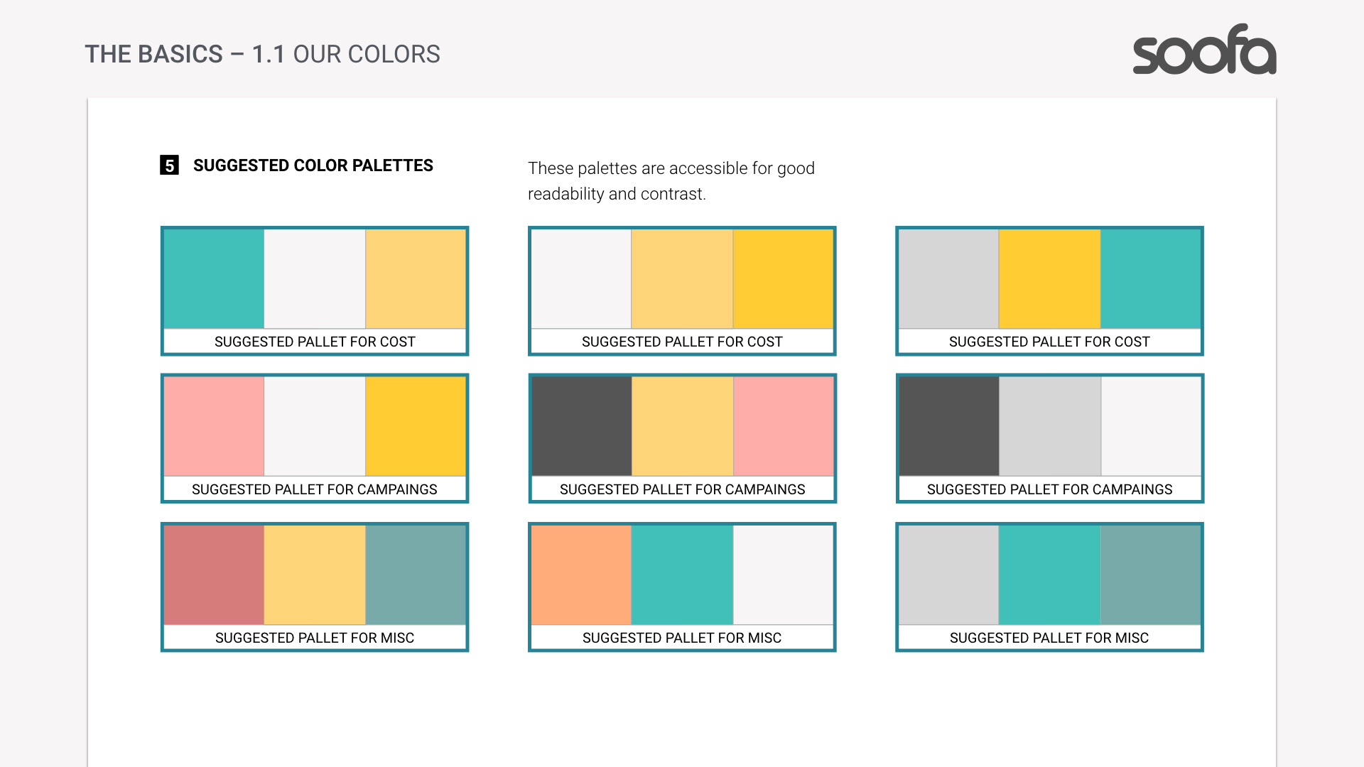
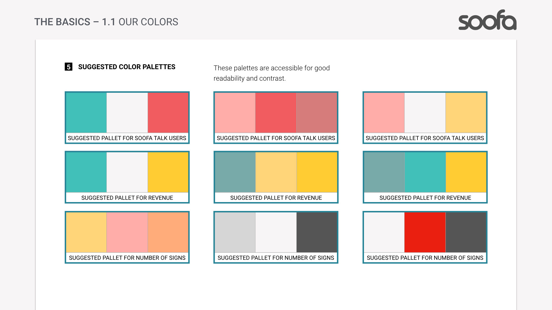
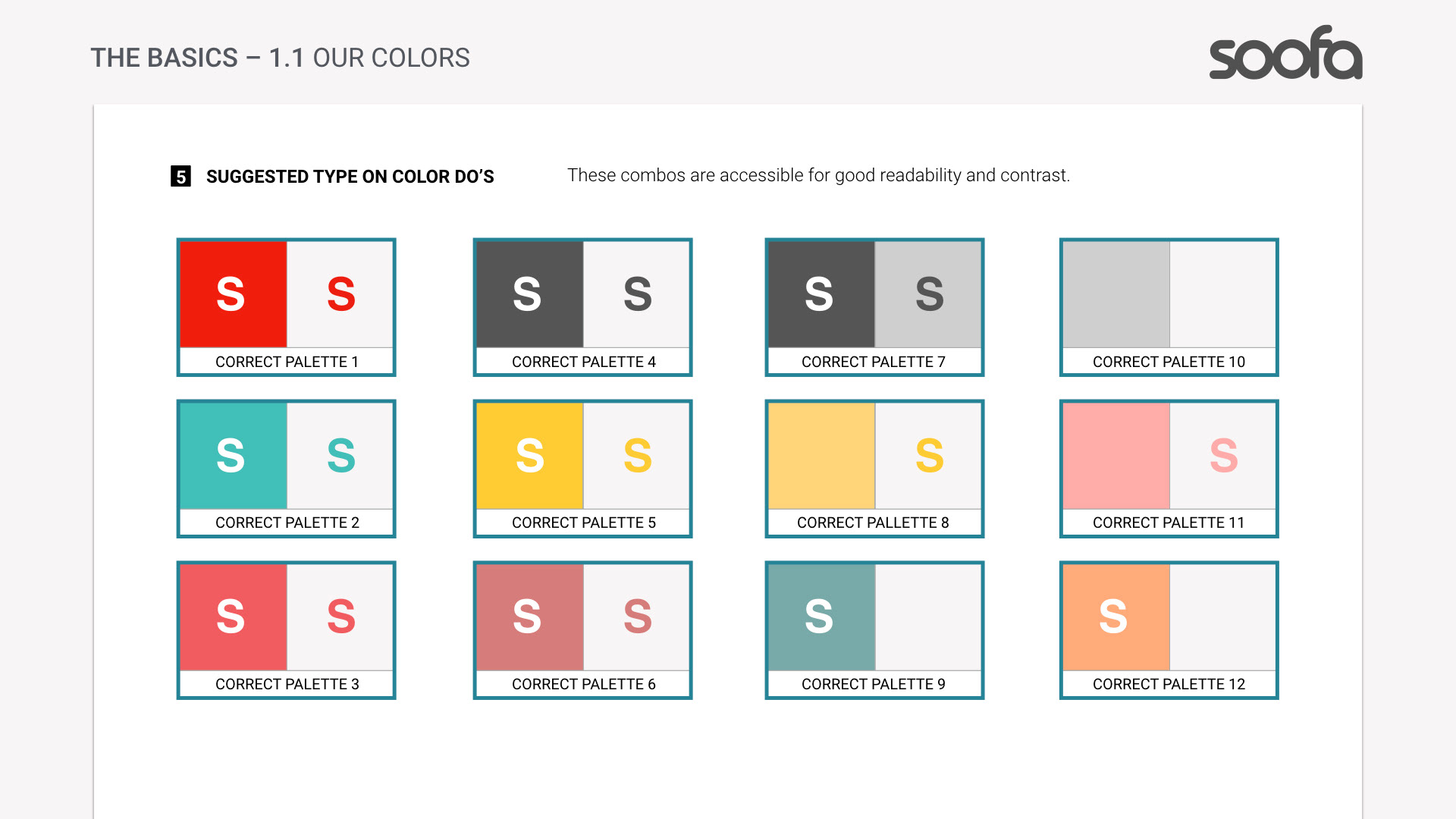
Color palette: Primary neutrals with accent colors that evoke urban energy and approachability.
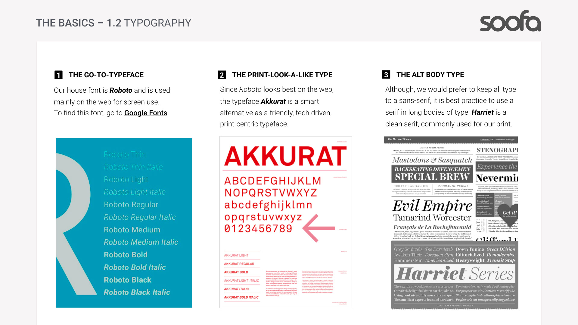
Typography: Scales and hierarchies optimized for both digital and physical signage.
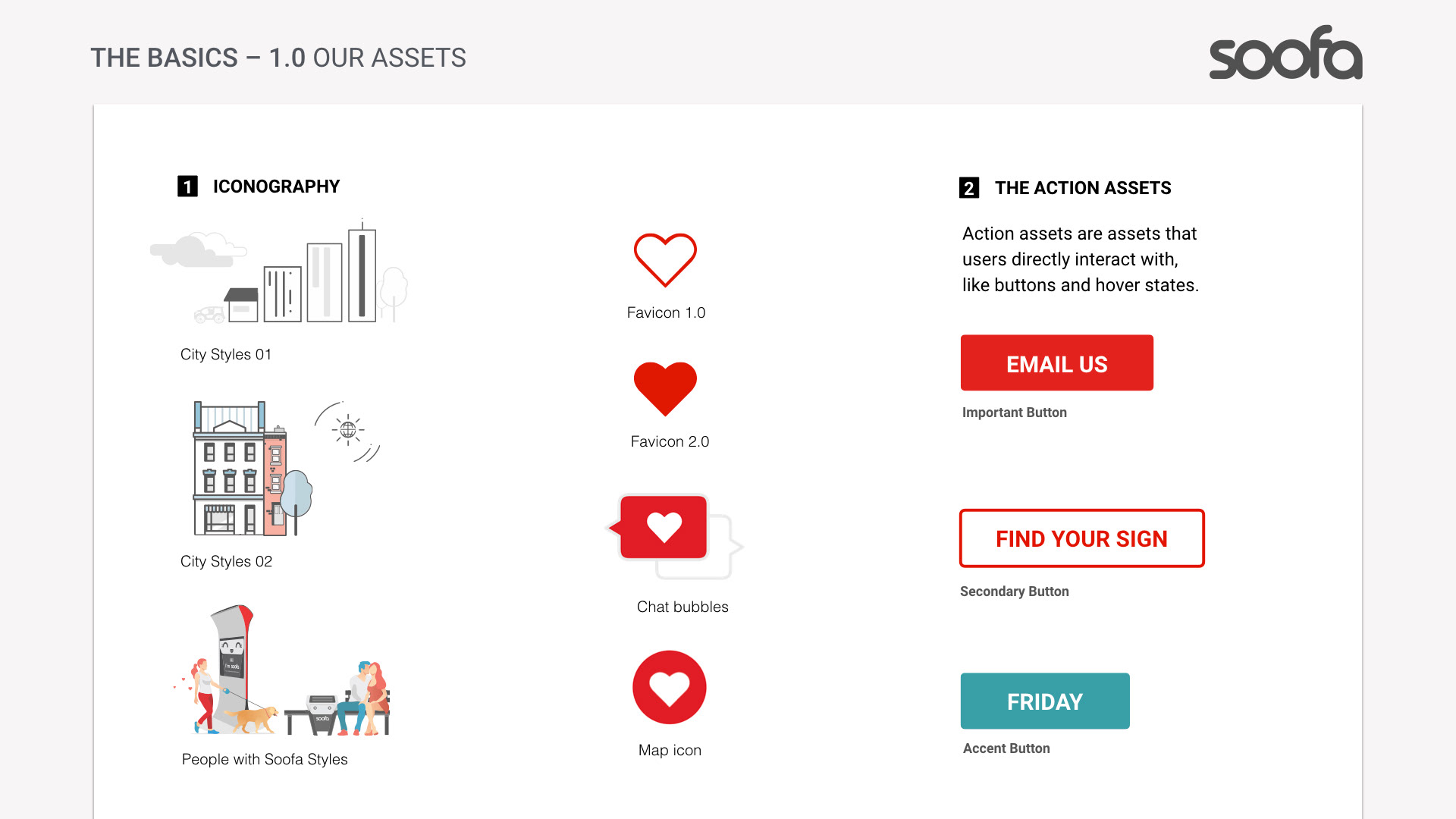
Iconography: Simple, geometric icons that translated well into grayscale Soofa Sign displays.
Visual hierarchy rules: Prioritizing information based on audience need and viewing context.
These elements ensured clarity and brand consistency across all touchpoints.
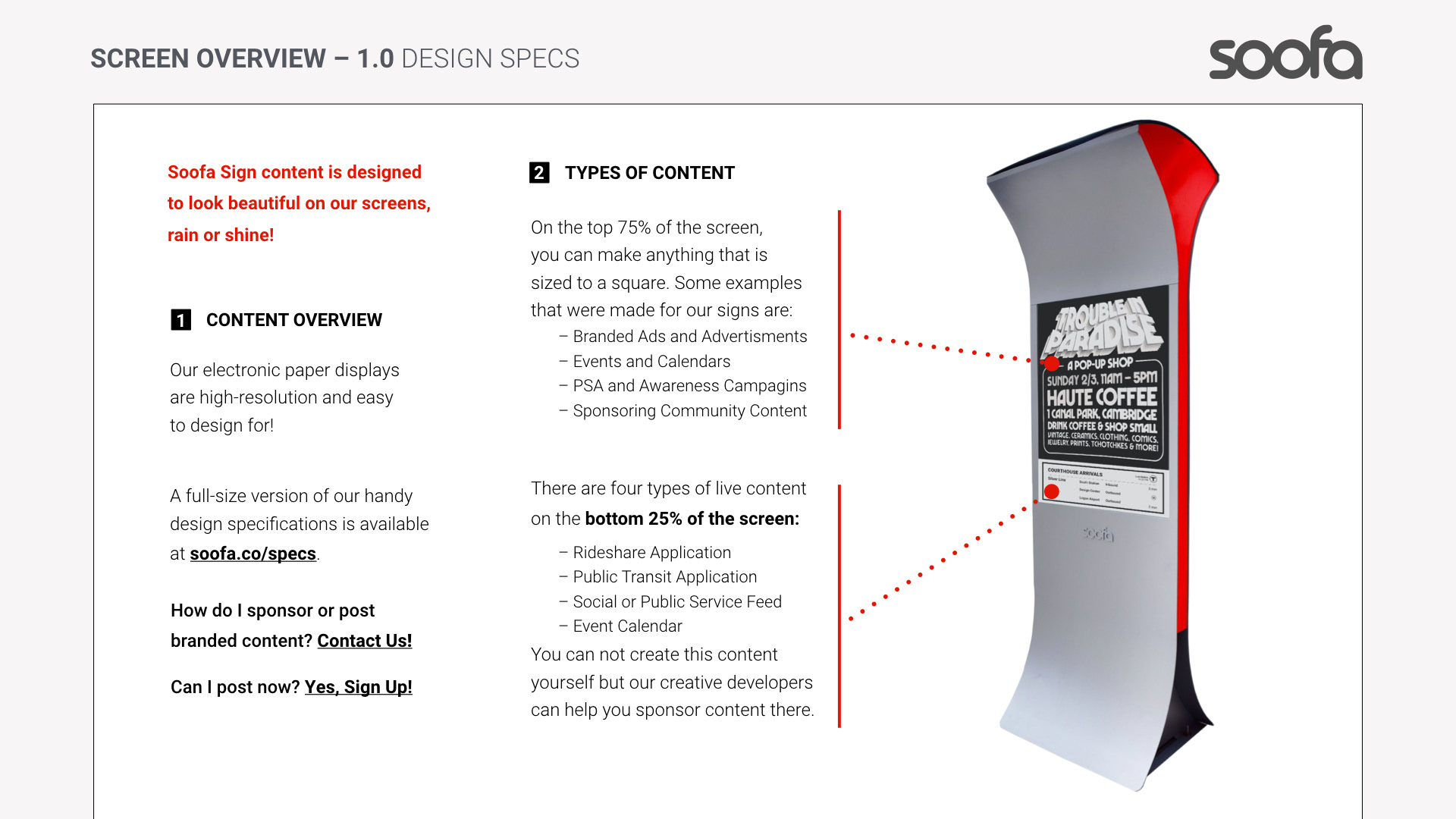
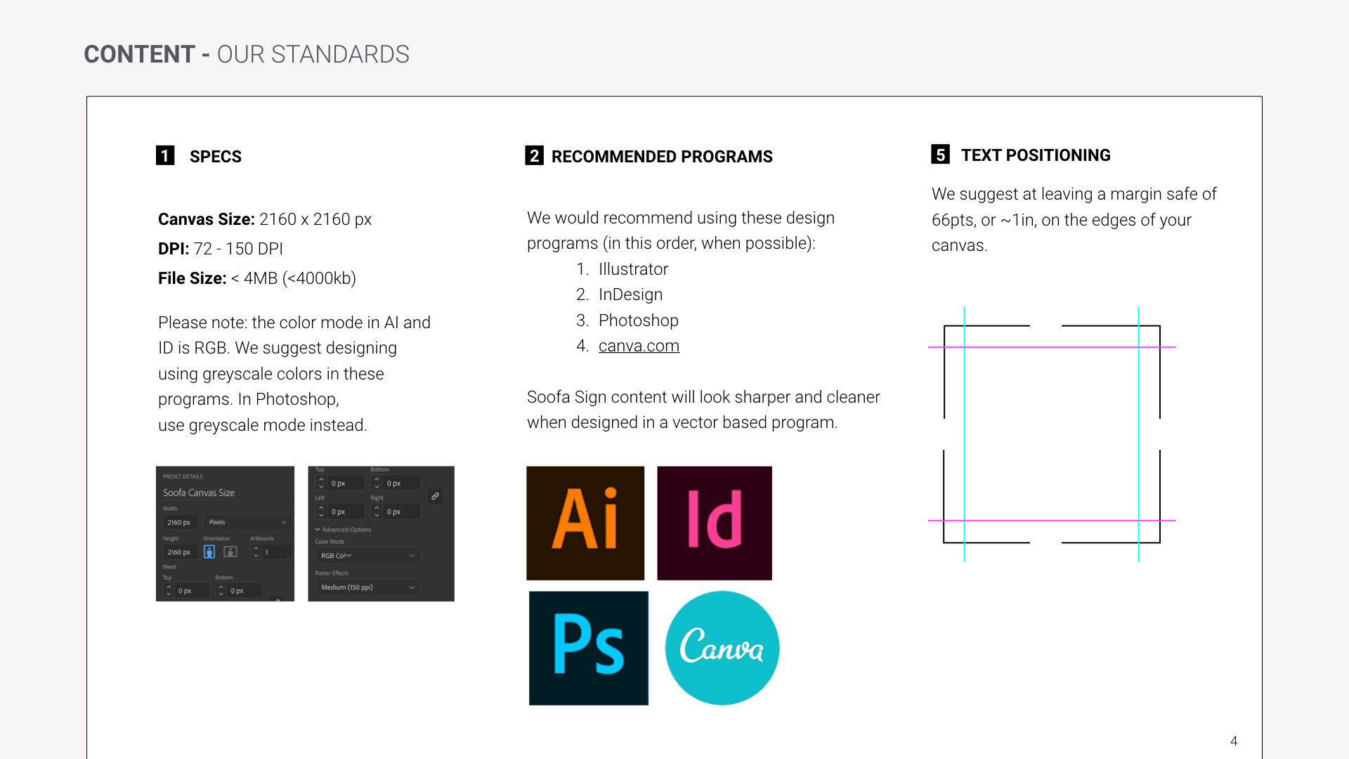
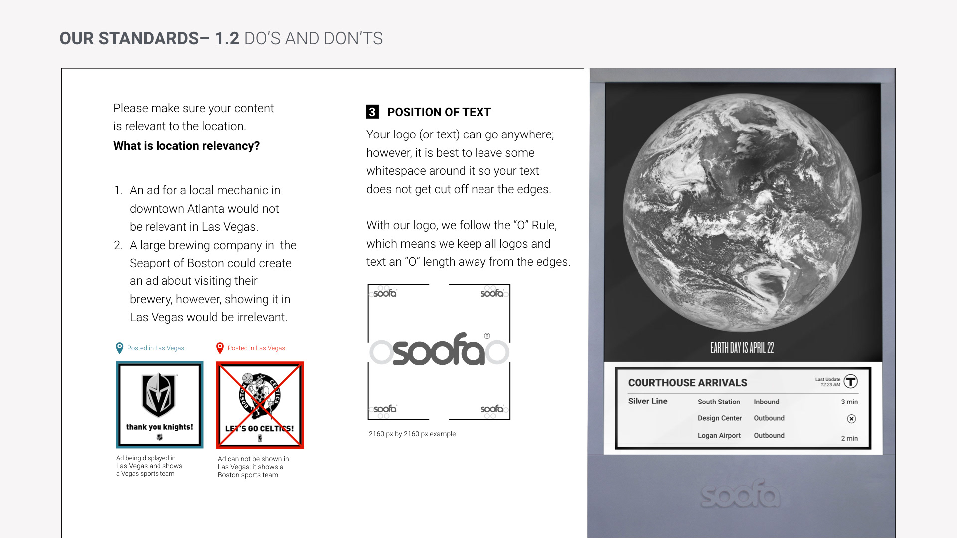
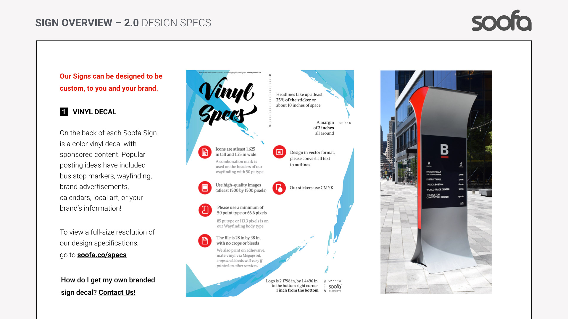
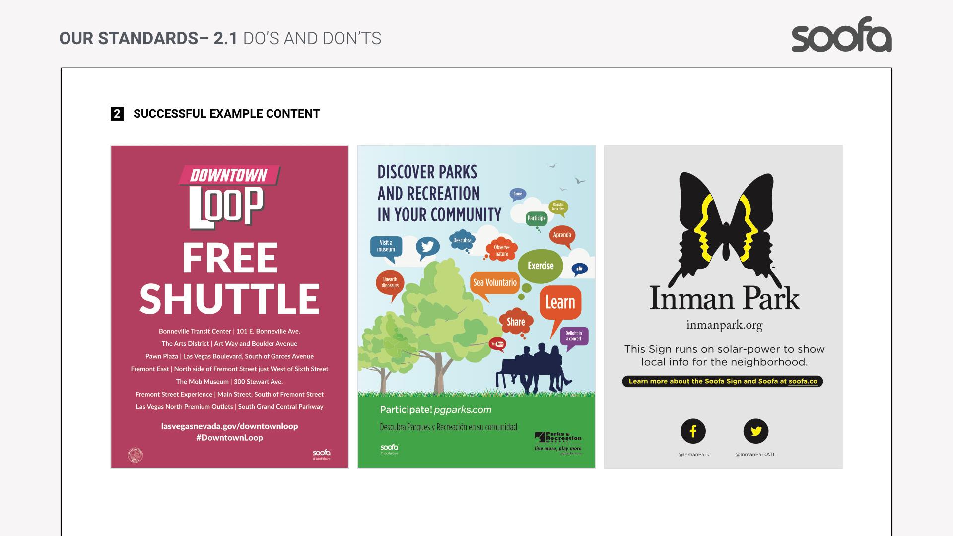
3. Soofa Sign Design Specs
Because the guidelines also supported Soofa Sign content design, specific technical rules were incorporated for signage creatives:
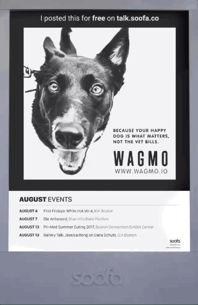
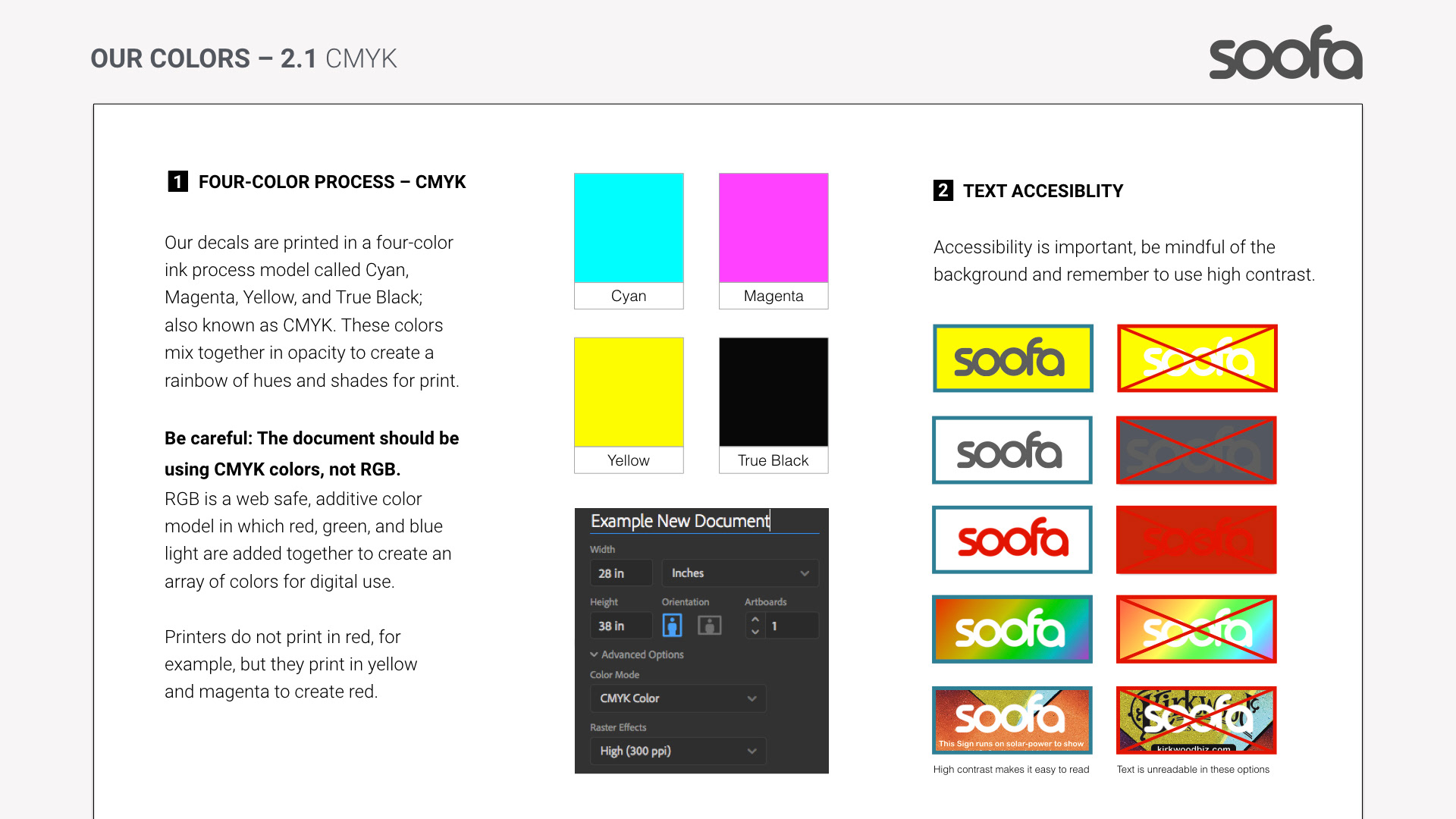
Display mode: Grayscale (electronic paper) with strong contrast for pedestrian visibility.
Hierarchy rules: Bold headlines and limited supporting text to ensure readability from distance.
Contrast and negative space: Avoid heavy mid-tone backgrounds that reduce readability.
Word count limits: Keep messages concise to fit the screen and maximize viewer comprehension.
Artwork orientation and specs: High resolution files, clear artwork margins, and layout suggestions tailored to the 42″ digital display format used by Soofa.
These specs helped international brands and local organizations design content that met Soofa Sign’s unique hardware constraints.
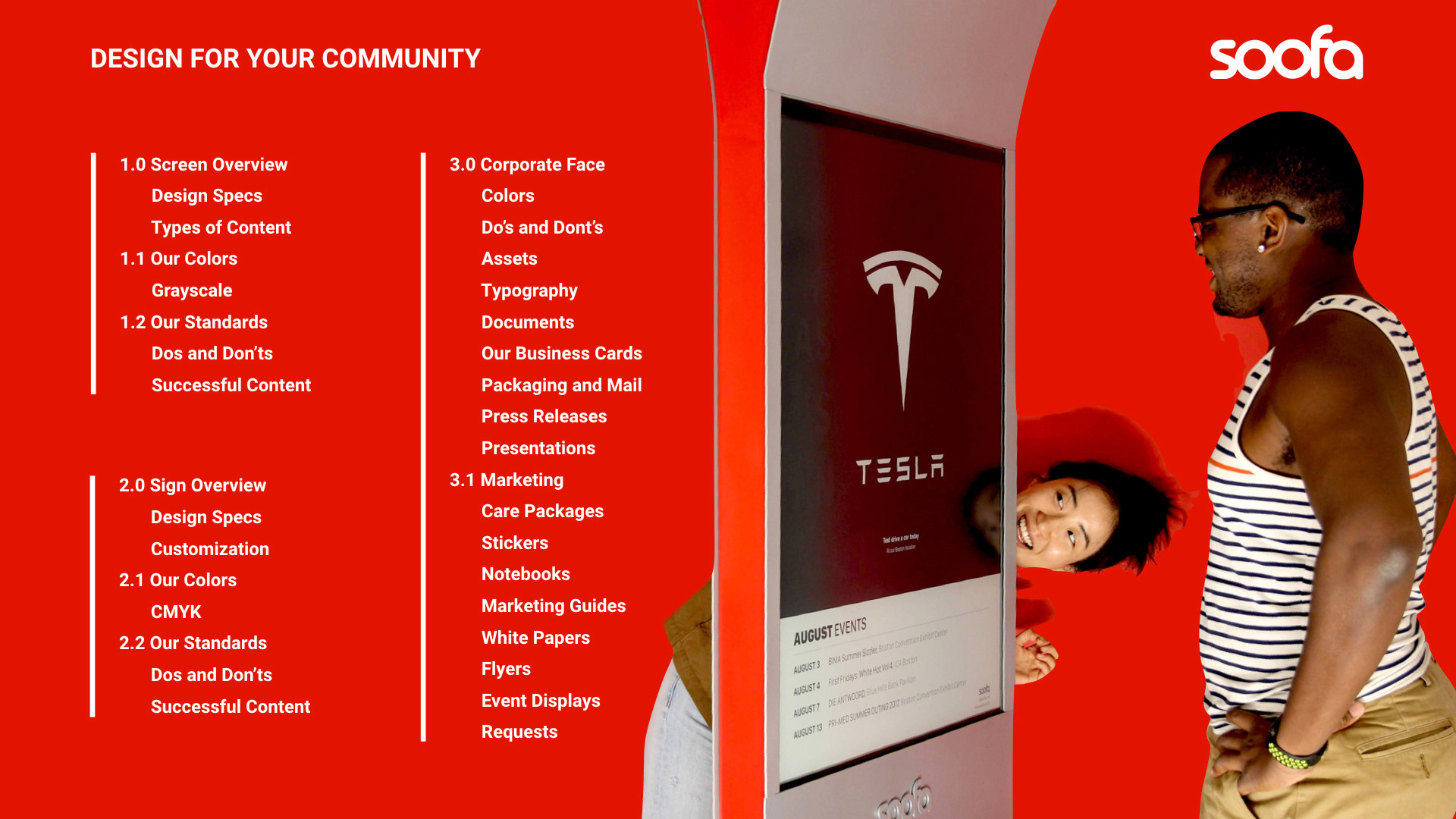
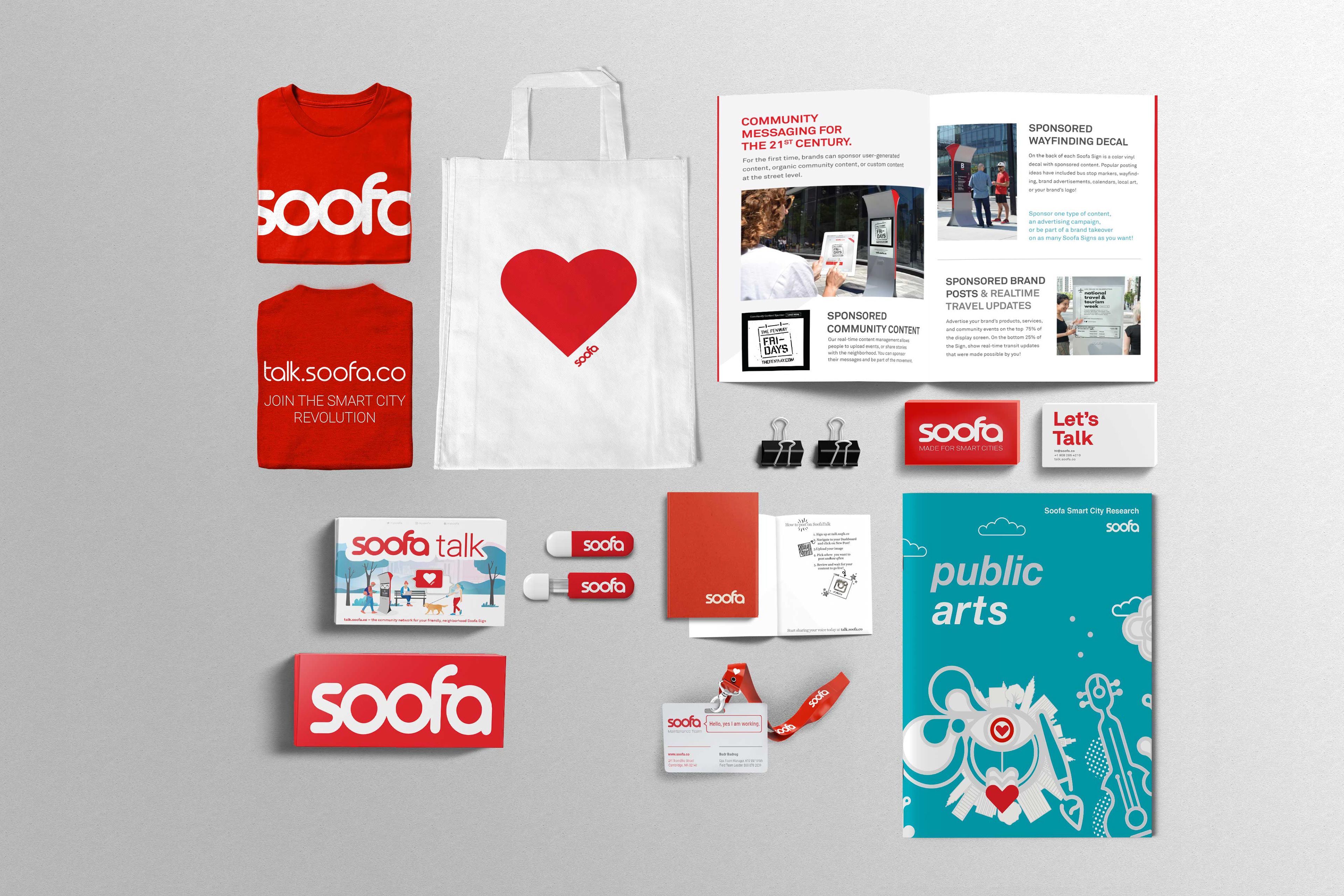
🧾 Brand Deliverables
The comprehensive guideline deliverables included:
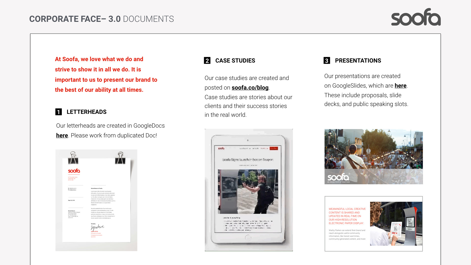
Brand standards document — with logo rules, color system, typography, and usage examples.
Sign design specs sheets — technical templates and layout grids tailored for Soofa Sign displays.
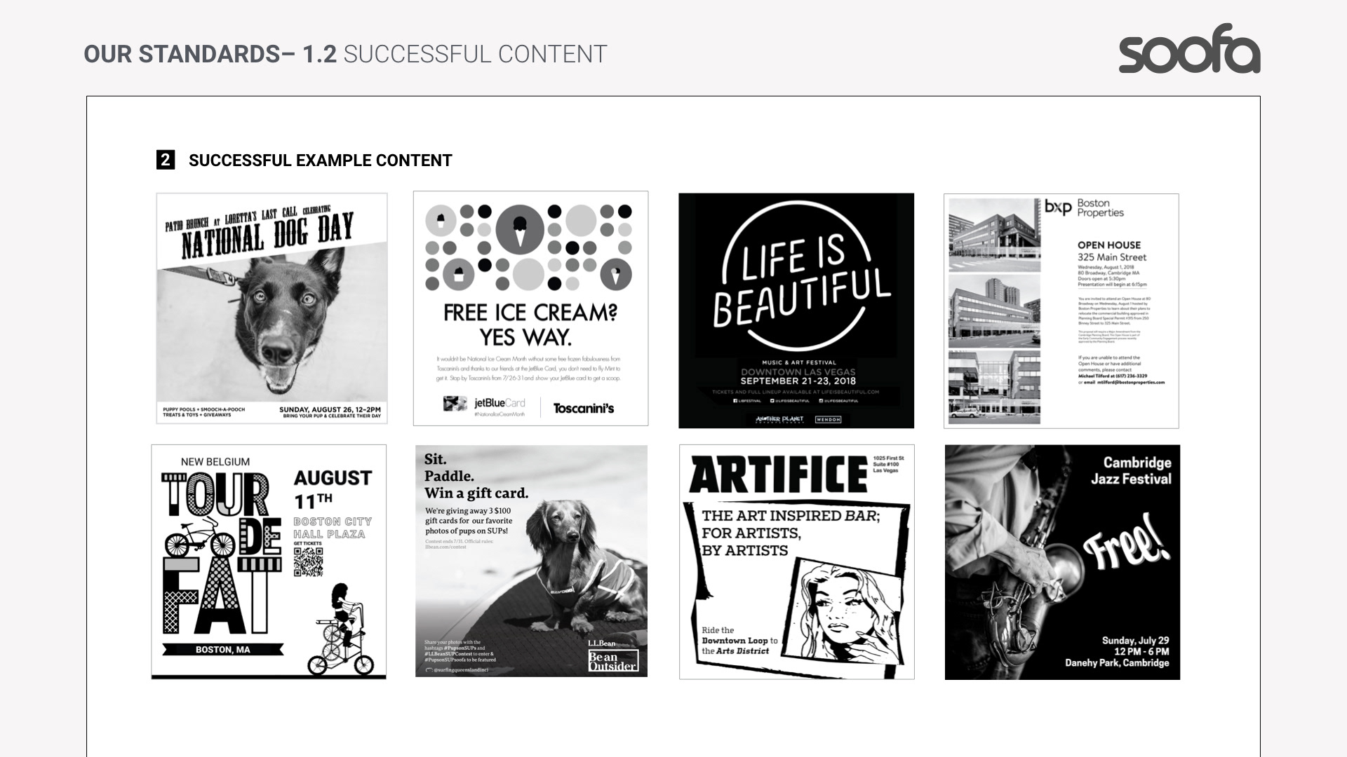
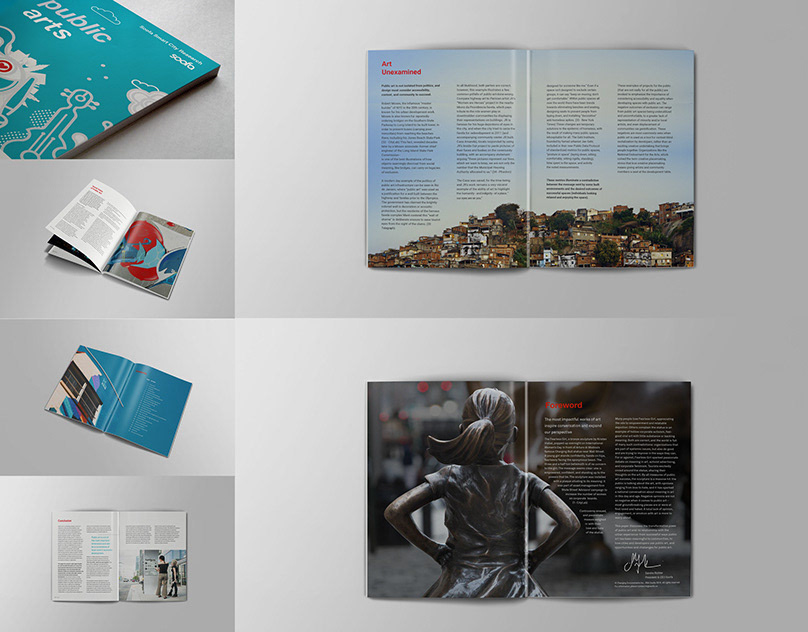
Examples of approved layouts — demonstrating advertising layouts, community messaging layouts, and informational signage templates.
Internal usage doc — supporting Soofa product teams with UI/UX alignment across digital interfaces.
📊 Impact & Results
This brand guideline project delivered measurable benefits:
Consistency Across Mediums
Soofa’s visual identity remained cohesive across digital platforms, printed marketing materials, and large outdoor signage. Aligning all touchpoints strengthened brand recall and trust.
Empowered Content Creators
Advertisers and partners could produce Soofa Sign-ready designs that met technical and audience needs without repeated design iterations.
Smart City Messaging Optimization
Design specs ensured core messages were easily read in pedestrian contexts, increasing the odds of engagement with community information and advertising content.
💡 Design Insights & Lessons Learned
Function drives form: Outdoor signage with electronic paper demands a different design mindset than typical screens — simplicity and high contrast are not just aesthetic choices but functional necessities.
Brand utility matters: Guidelines are most useful when they integrate practical, real-world rules (e.g., text size minimums, pixel specs) in addition to visual standards.
Audience context defines choice: A brand used by cities and advertisers across the U.S. must work both for quick reads in public spaces and longer engagement in digital formats.
🔮 Opportunities for Future Development
Interactive Brand Kits: Expand guidelines to include interactive templates and downloadable assets for users.
Dynamic Sign Content Standards: Emerging widgets (weather, transit, polls) could have dedicated design specs.
Localized Branding Extensions: Support cities with custom identity extensions that preserve the Soofa brand while integrating local identity cues.