
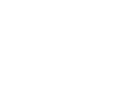

Salesforce Experience Cloud Custom AMS LWC System
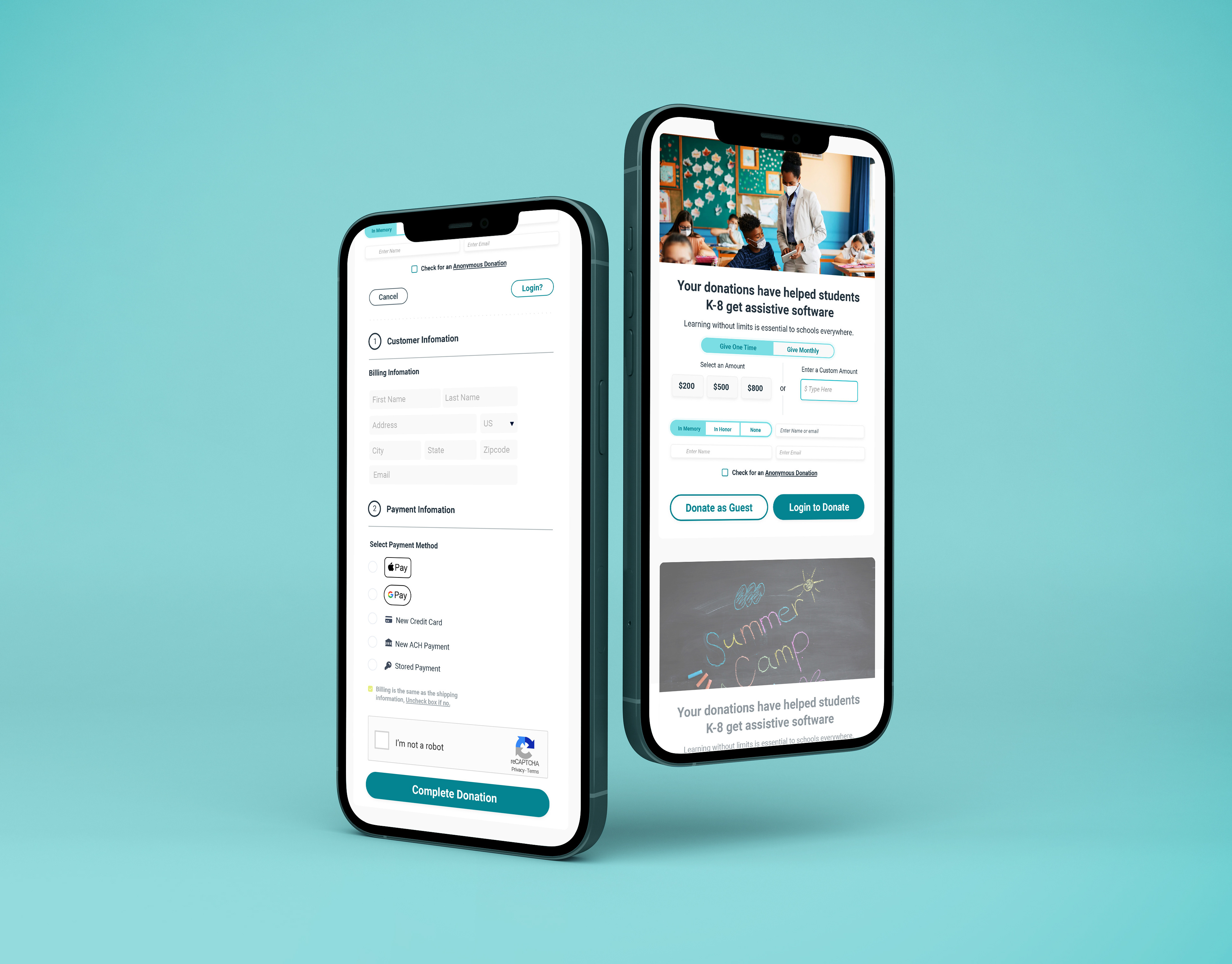
Soofa Design In Review 2017–2020
A collection of projects created while being part of Soofa. This ranges from UX/UI, Human-Centered Industrial Design, and Content / Advertisements made for E-Ink.
© Changing Environments, Inc. Soofa
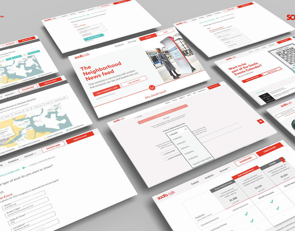
Monklife Responsive Redesign
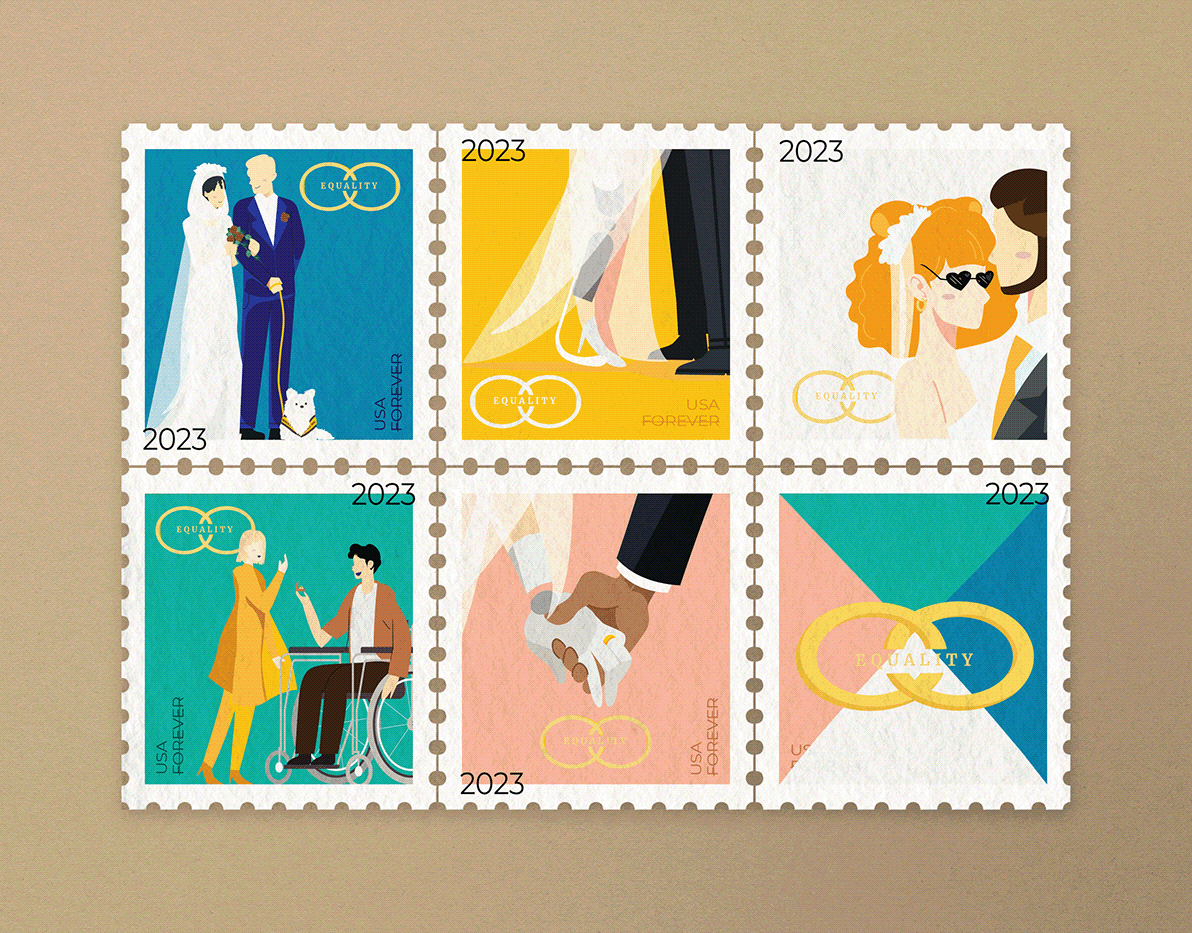
Equality Forever Stamp & Poster Designs 2023
Something very near and dear to my heart, I have personalized this experience by showcasing the people whom I loved as small motifs in the design (a white service dog and a man in the wheelchair next to a blonde girl).
When a person with a disability gets married, they lose benefits.
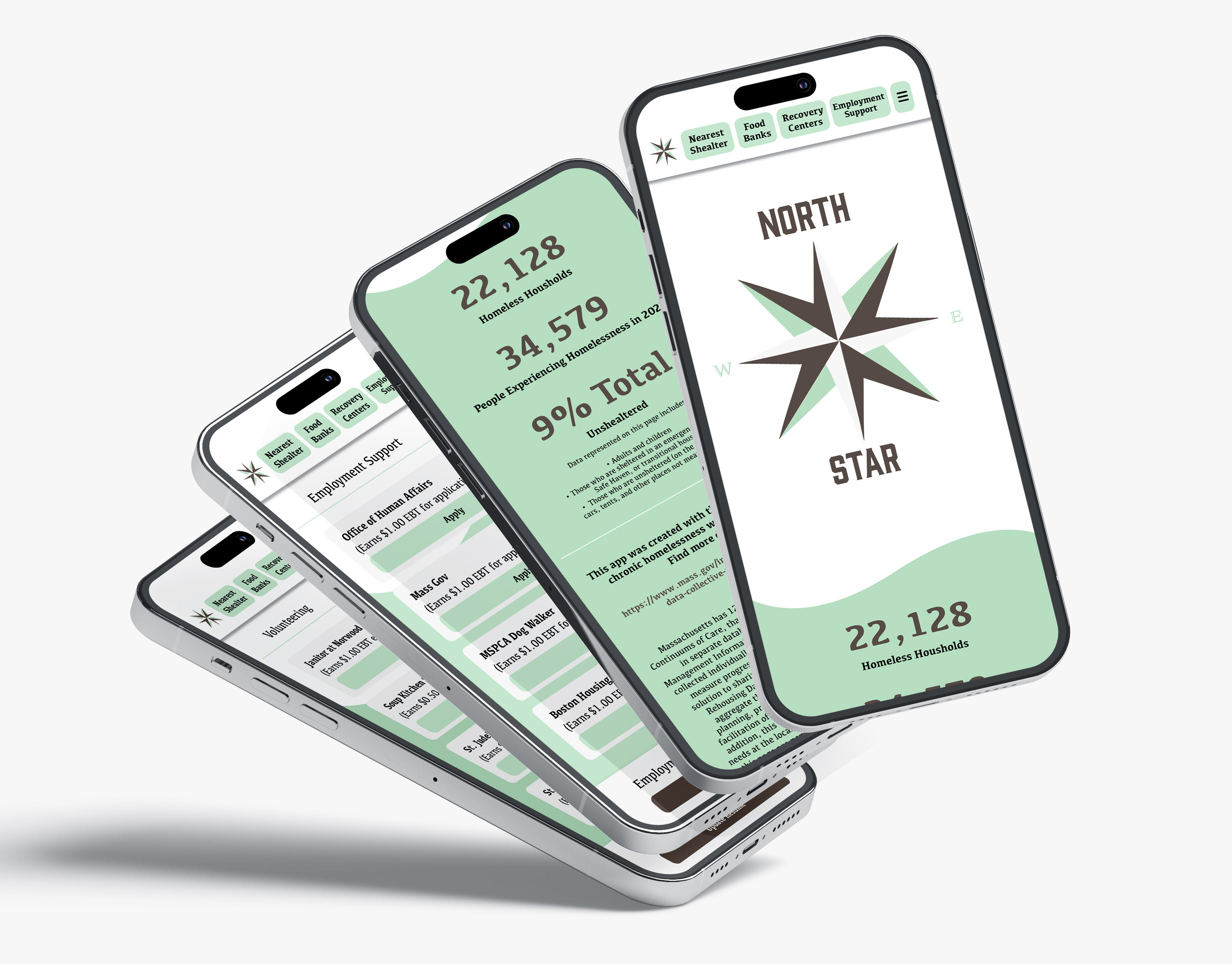
North Star App: Solving the Homelessness Epidemic
More data on homelessness at: https://www.mass.gov/info-details/the-rehousing-data-collective-public-dashboard
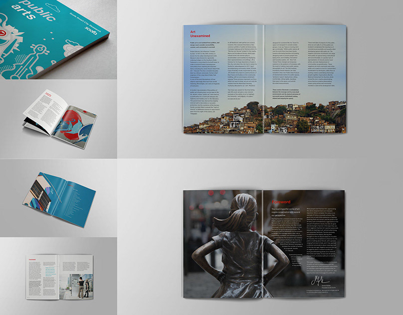
Public Arts White Paper – Soofa
ublic art is one of the most effective mediums for addressing the challenges of changing cities, breaking down barriers, and bringing people together.
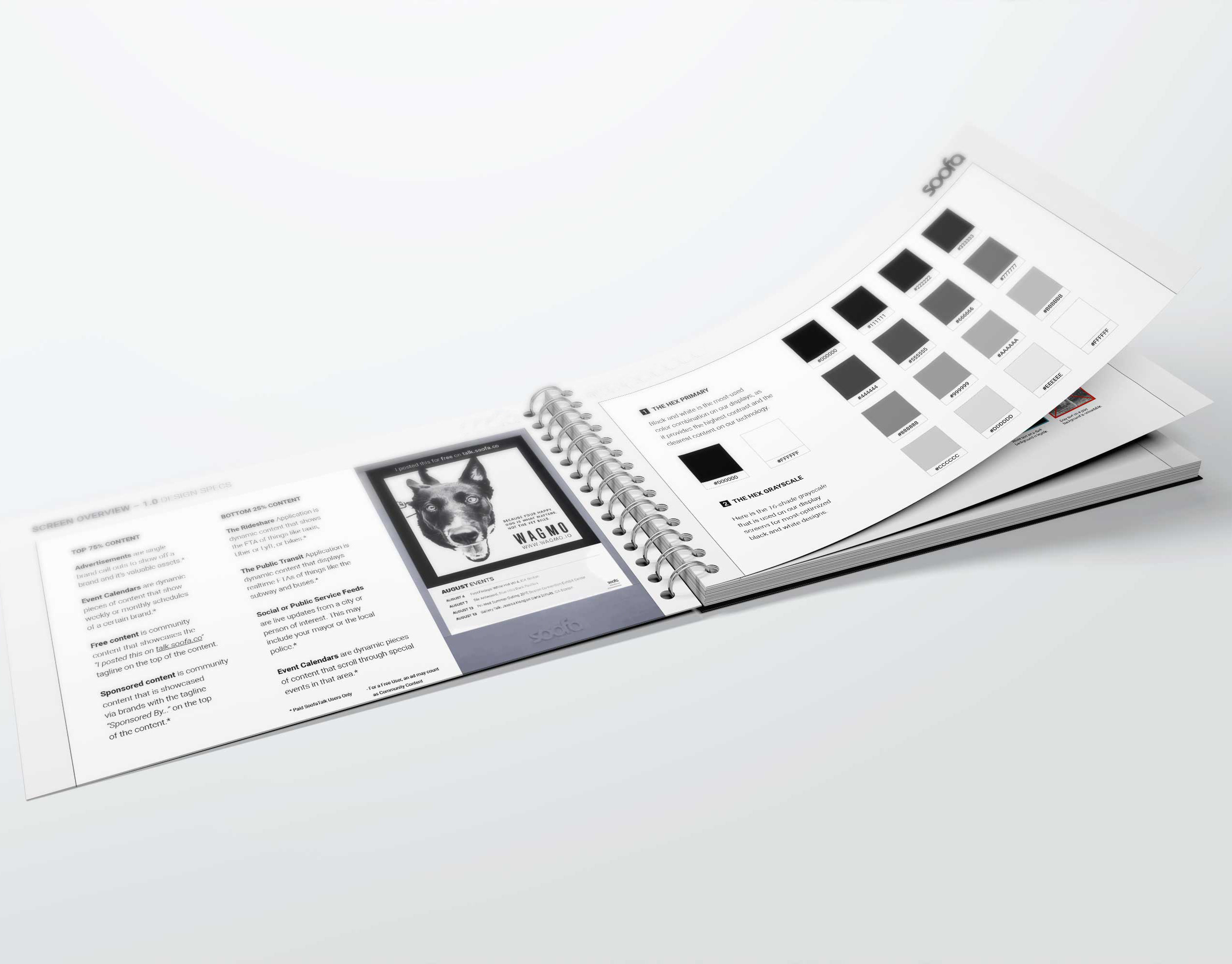
Soofa Brand Guidelines
Soofa is a brand centered around the community and its neighborhood. To us, it is important that users both internally and externally understand the basics of Soofa.
MassIT Year In Review 2016-2017
Content / Advertisement Design
EyeWire Grid System
Our team created a grid system created for EyeWire's game badge icons and design content log (link)
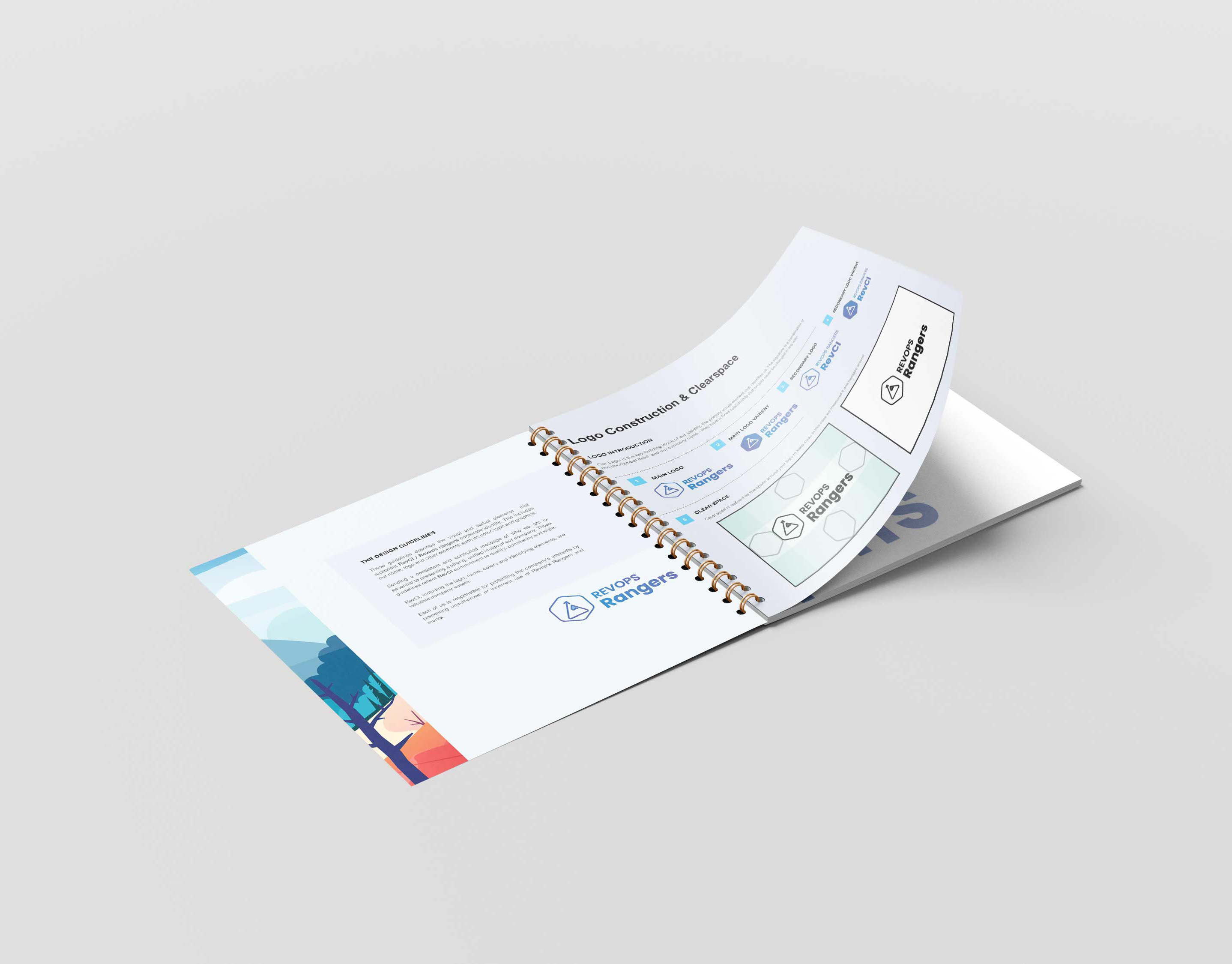
Revops Brand Guide
Booklet layout by: https://mockups-design.com/free-square-binded-brochure-mockup/#
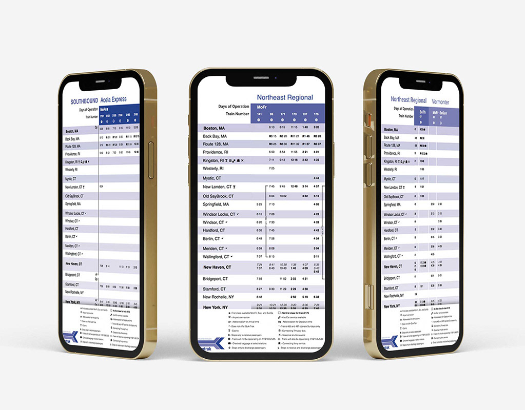
Amtrak Train Map
I was given the Amtrak train map for Southbound and redesigned as well as reorganized it in a more efficient and clear way. The end result was the blue and white map.
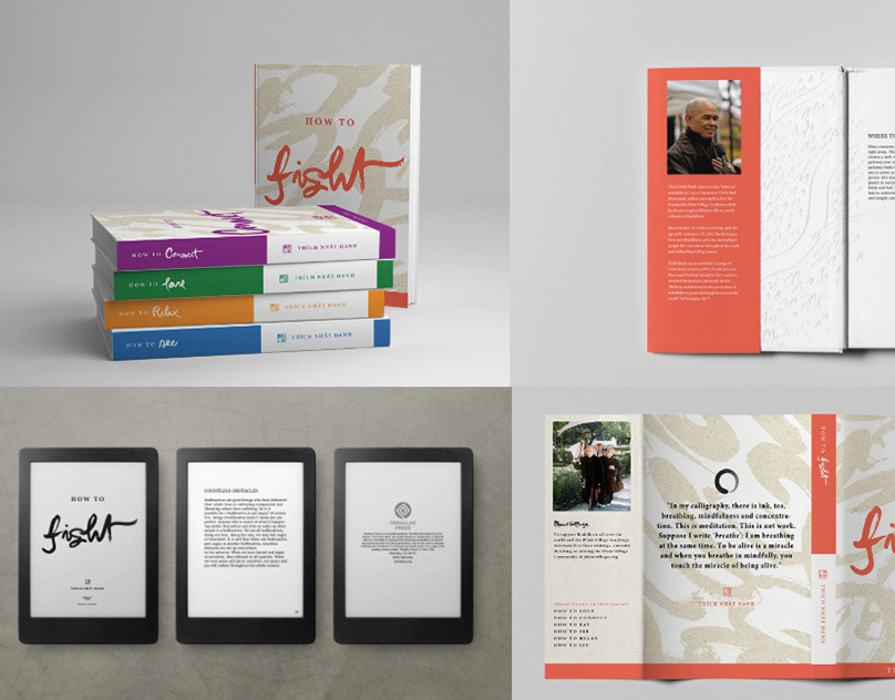
How To Series by Thich Nhat Han – Book Redesign
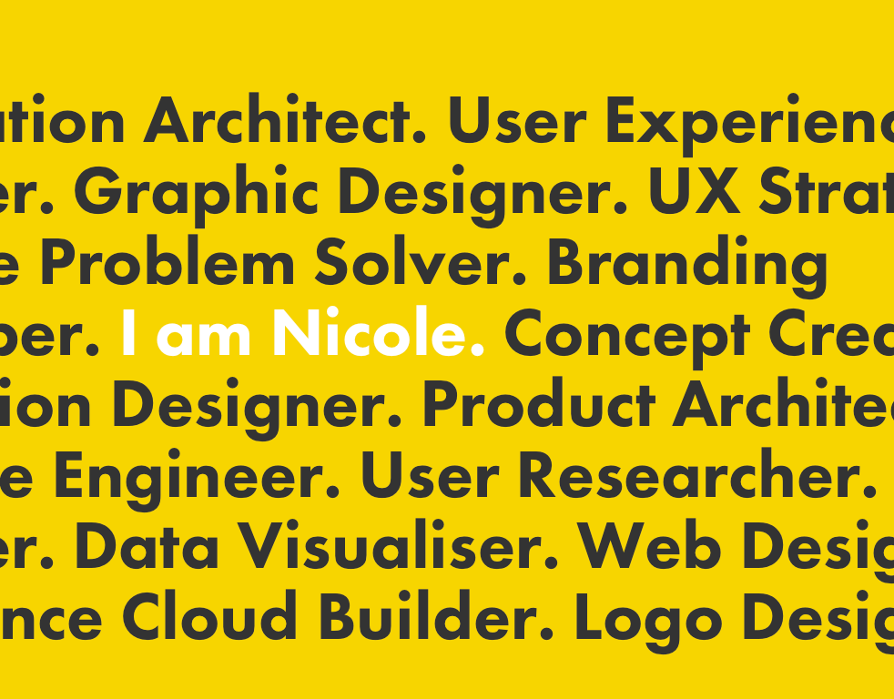
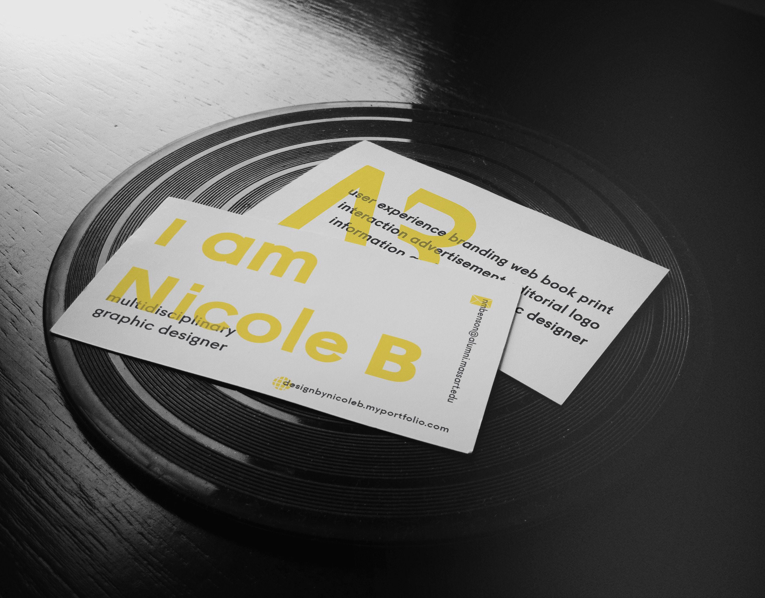
Nicole Design Personal Branding
https://www.fiverr.com/designbynicolee
https://designbynicoleb.myportfolio.com/
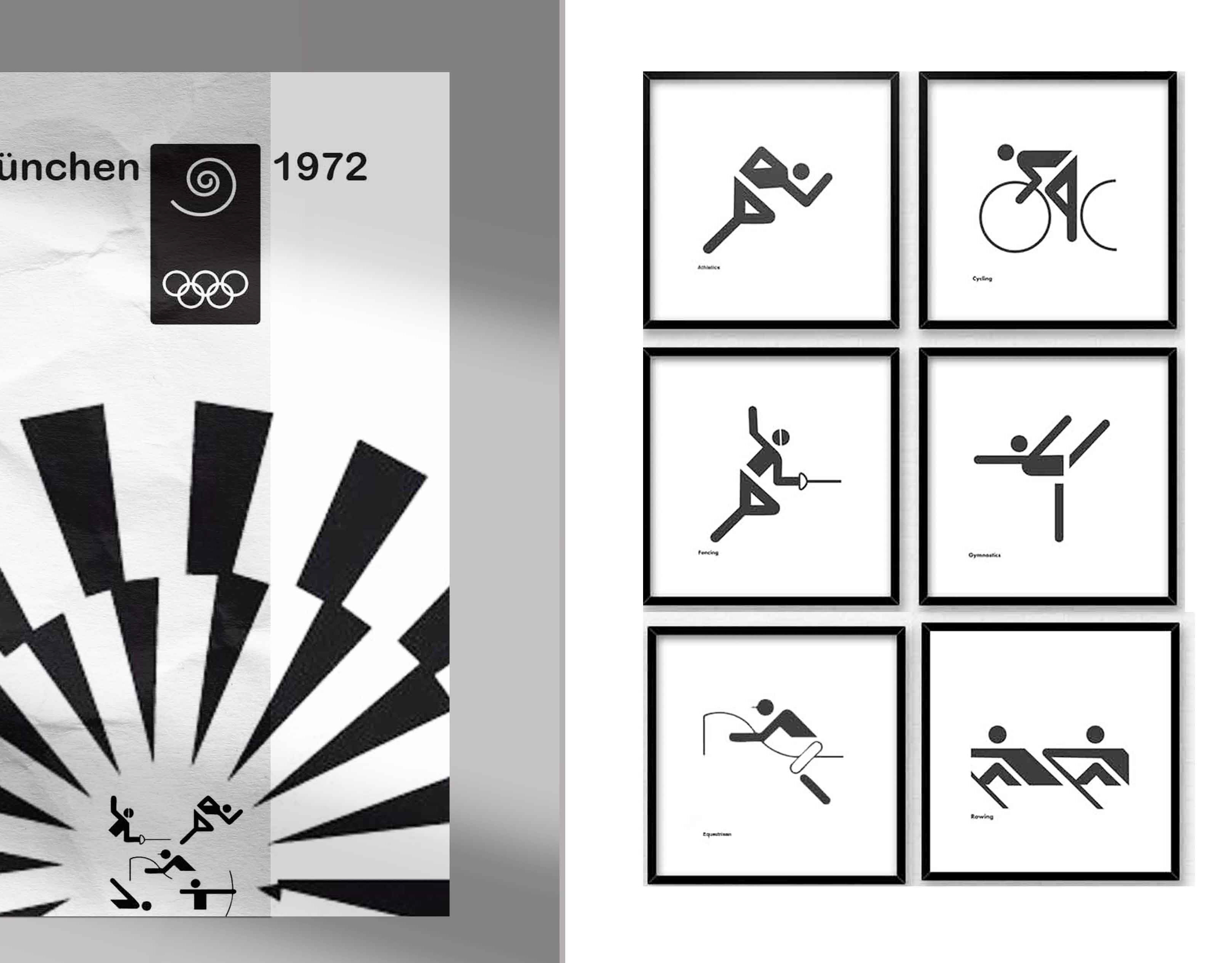
1972 Olympic Pictograms Recreation
During my first semester studio class, we were assigned to recreate and also make new Olympic icons. The icon set I focused on was the 1972 Munich Olympic Pictograms. In order to create these icons I had to first find out and make the grid system. The logo is from the 1972 Munich Games and I chose to make icons in badminton, jumping, freestyle, waterpolo, water skiing, and modern pentathlon
Eyewire Design Log (External Link)
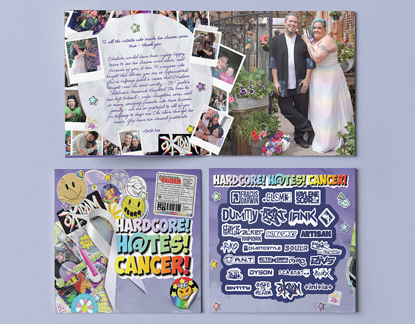
Hardcore! H@tes! Cancer! (Okidam)
IN MEMORIAM of Brandon (Okidam) whom passed away from cancer on October 31, 2023. As part of his legacy, he has given me great detail the images used in this album to represent his life and his work as a DJ. Pictured are his many drawings as well as sentimental and timeless photos of him, his friends, and family. This record is benefitting St. Jude's Children's Cancer Research in Brandon's honor and my services were donated with loving support for his memory.
-
Limited Asset Credits: Yogurt86, Pixelsquid360, CCPreset, Codestonez, QRdesignstd, Icons8, Peterdraw, Sagesmask, Celciusdesigns, UICreativenet, Brandpacks
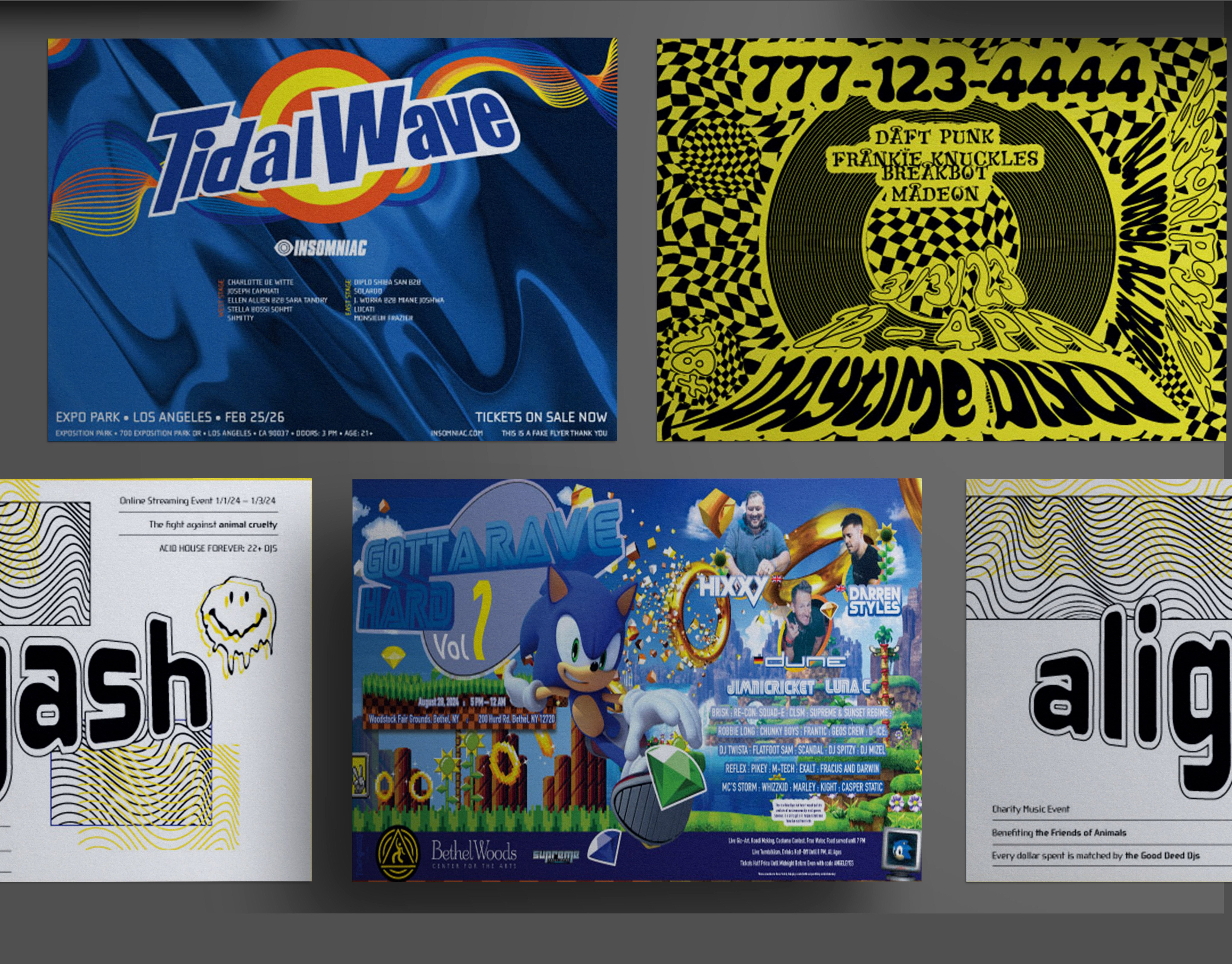
Music Flyer Designs
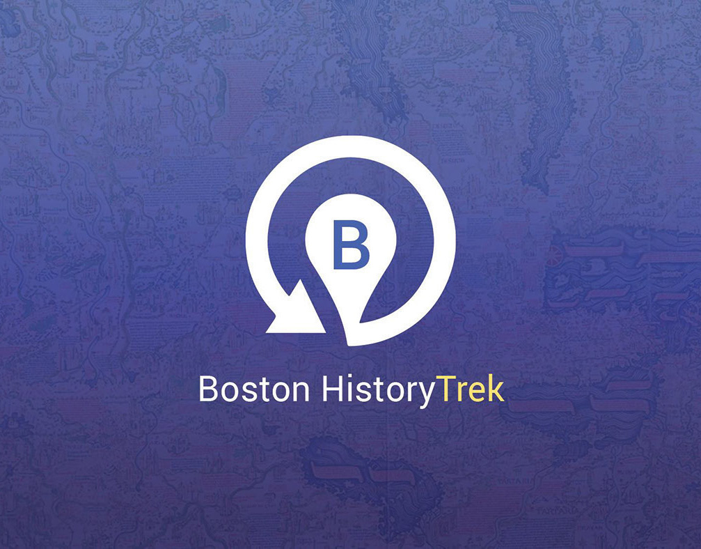
Boston HistoryTrek (Available on IOS)
HistoryTrek is an Apple App that connects you to historic locations in your city. You can plan a trip around set destinations or walk around freely and see what locations are around you at any time!
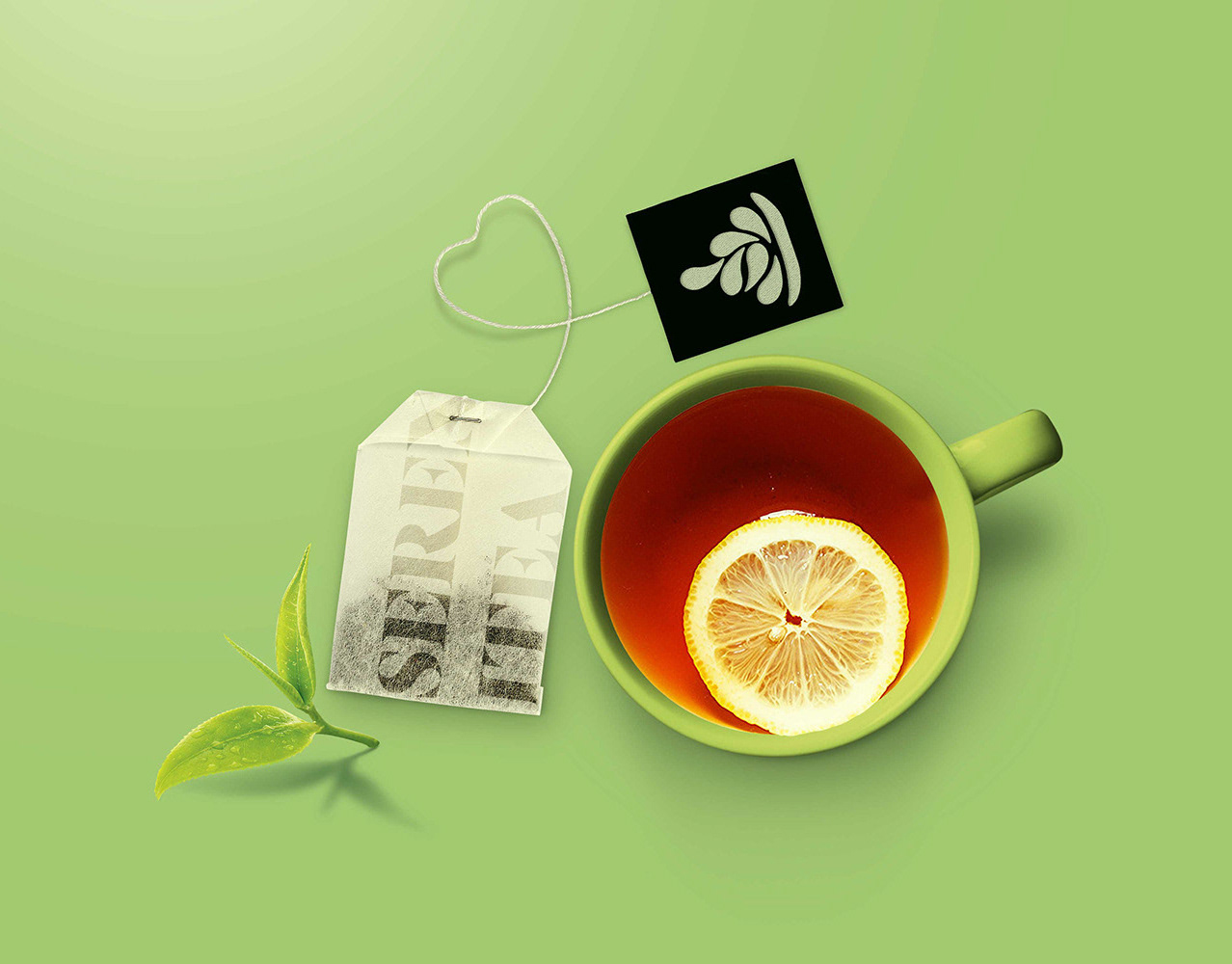
Serenitea
Branding for local tea company
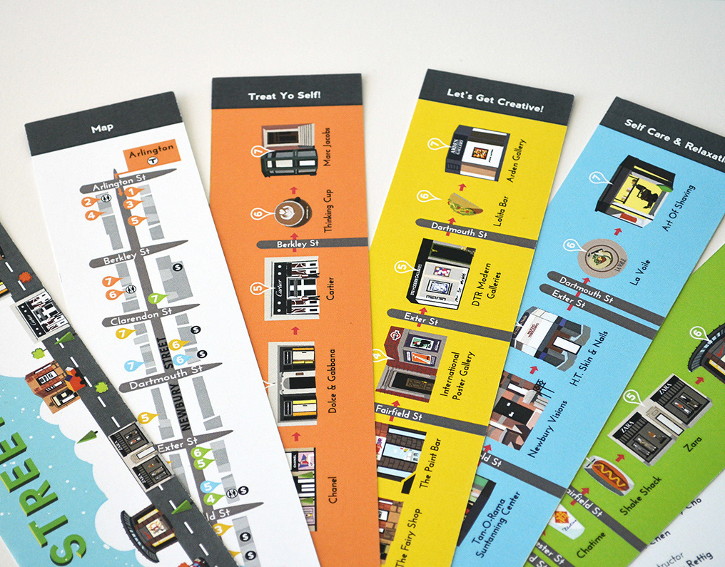
Newbury Street Map
A map of Newbury Street!
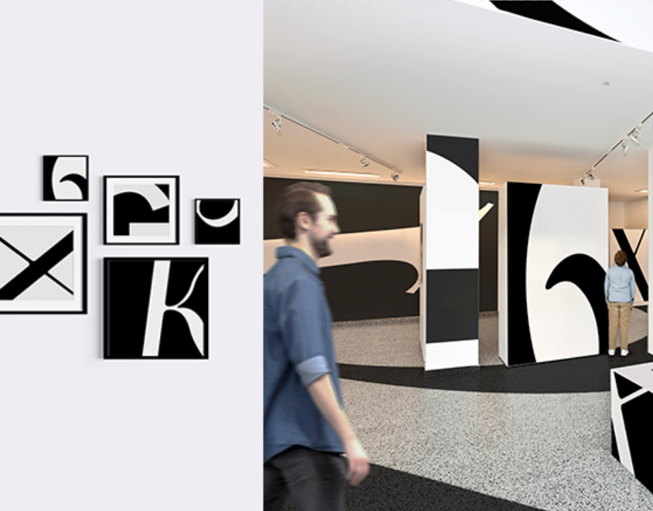
Immersive Letter Forms Gallery
Font explored: Adobe Garamond
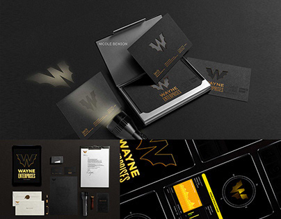
Wayne Enterprise Rebranding & Reactive Logo
"This branding is his philosophy personified."
Thank you for viewing my work.
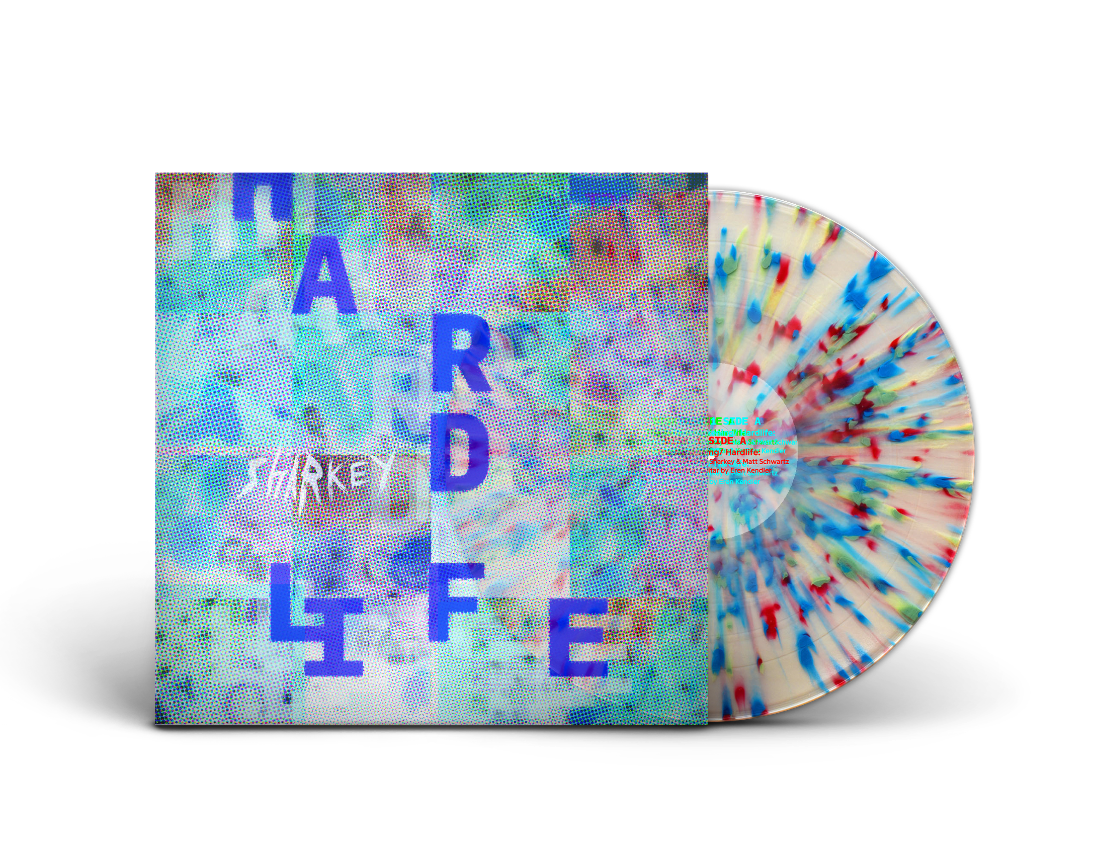
Hardlife Anniversary LP
A package design for a collector's edition record set with a one-scroll informational webpage
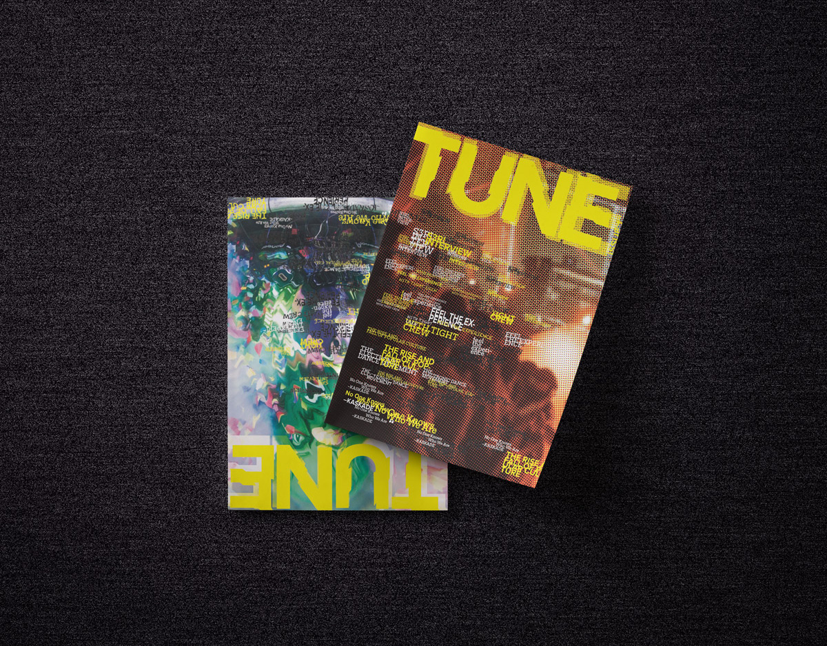
TUNE (A Zine On Underground Dance Music Culture)
Tune is a zine based out of the east coast of the United States that focuses on rave culture and music. For a Print copy upload PDF: https://www.peecho.com/checkout/issuu/284050/tune And if you wanna keep with the zine spirit, here is the HQ PDF to print yourself: https://drive.google.com/file/d/0B2_wrwceooDuLVNYQUVoUU93Unc/view?usp=sharing
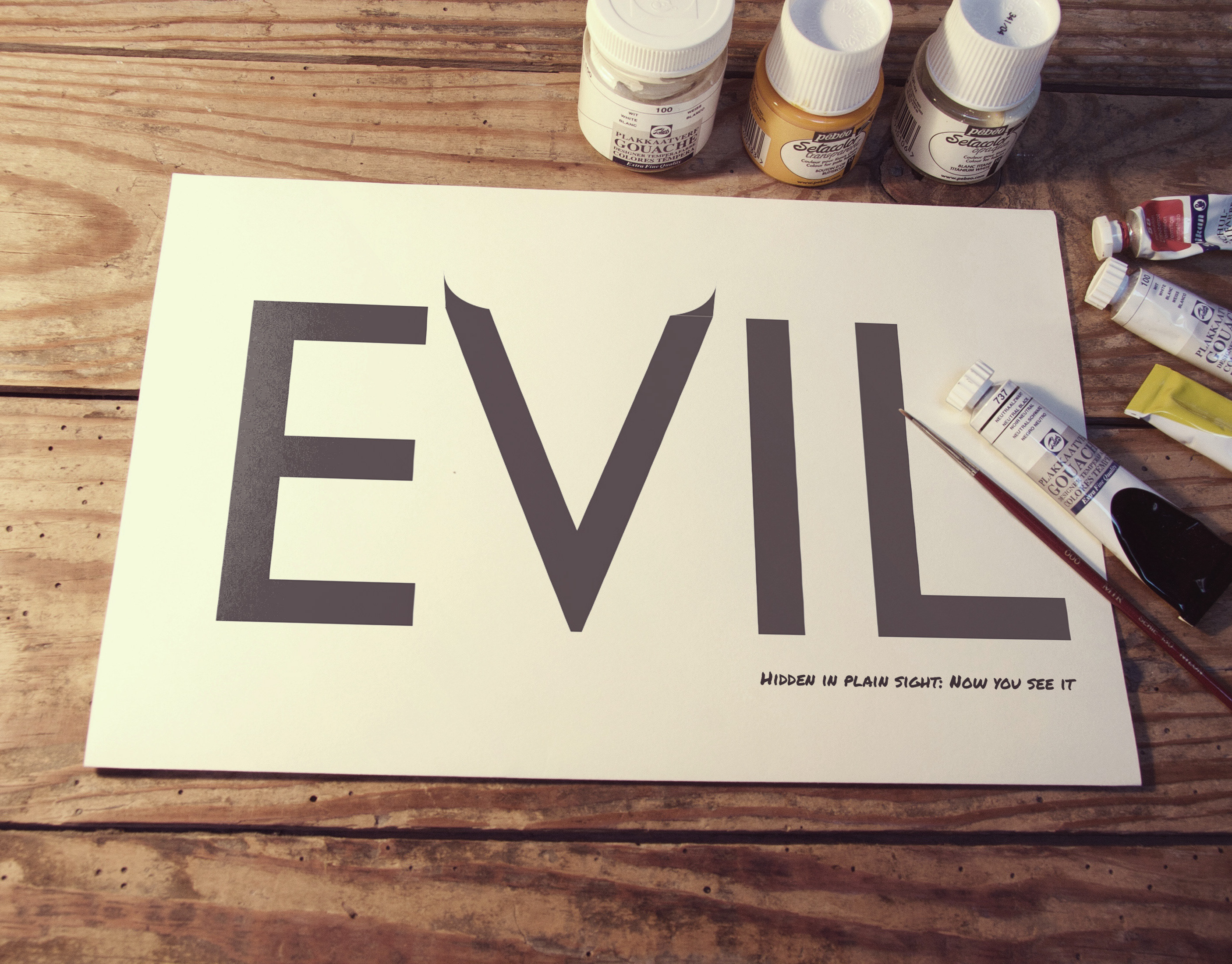
Word Play
Hand rendered typography for the word "Evil."
I chose the word Evil because, just like type, there are people or things in the universe who chose to blend into the environments we dwell in and they look like they are one of us – But in reality, they are …
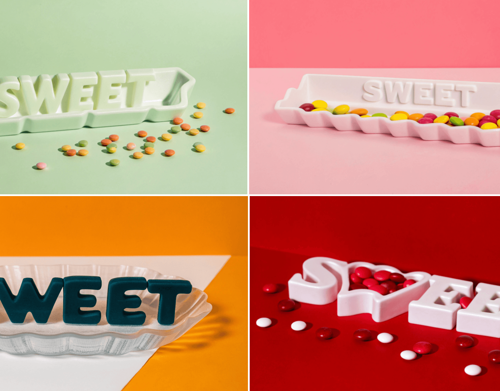
Concept Typographic Candy Dish
A concept design of a candy dish made to show what holds intentional contents that relate to the word in its design. In this, I chose the word Sweet. The reason it was never made into a real thing is because when I was trying to make it in the glass studio, the door were locked and they refused to honor my appointment. As a result, I created them using AI.
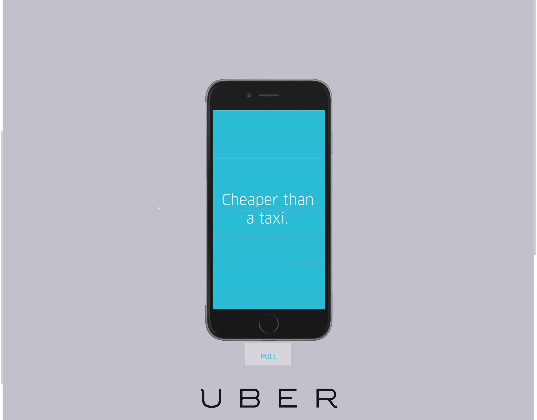
UBER Interactive Advertisement Series
UBER advertisement series. In use video coming soon!
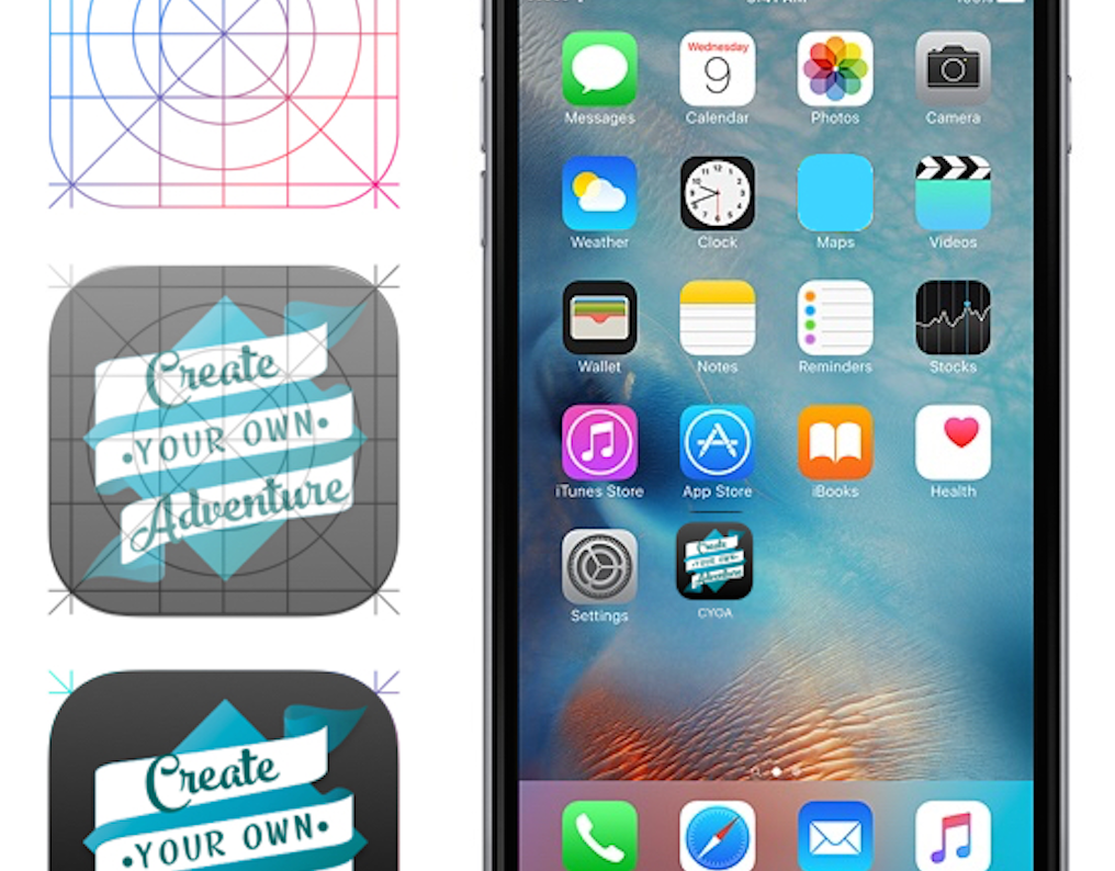
Create Your Own Adventure (Map App)
Create Your Own Adventure (Map App)
App Interface: https://invis.io/Y458M6IW5
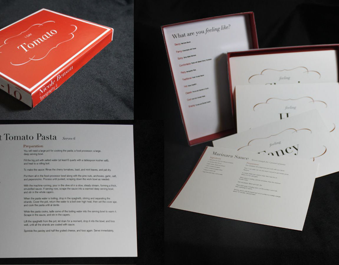
Feeling Italian
This is my set of ten recipe cards were made along with a box to store them in. Thank you for viewing!