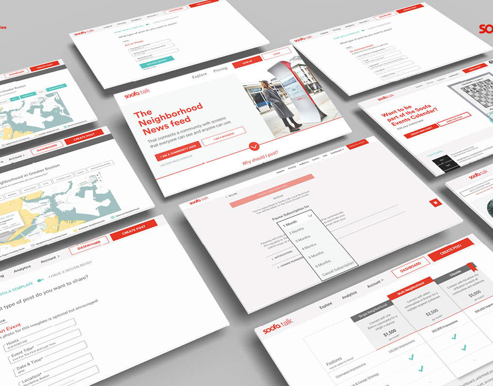

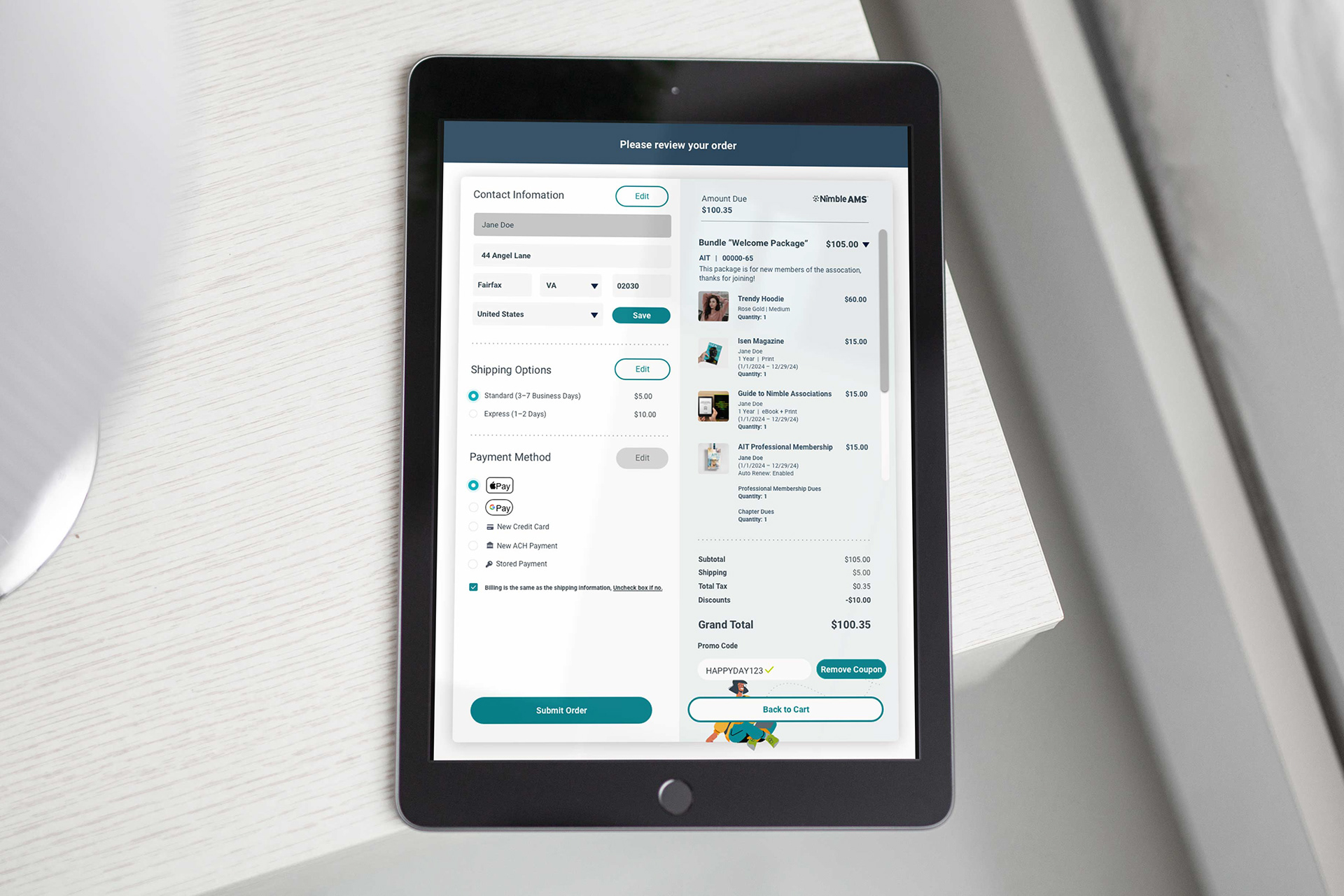
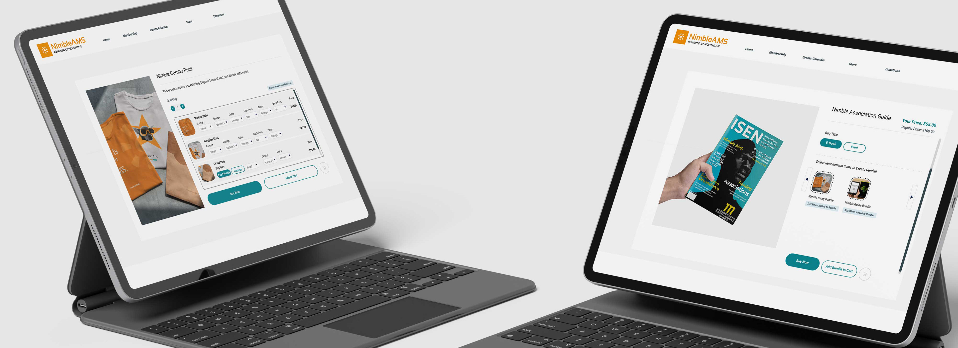
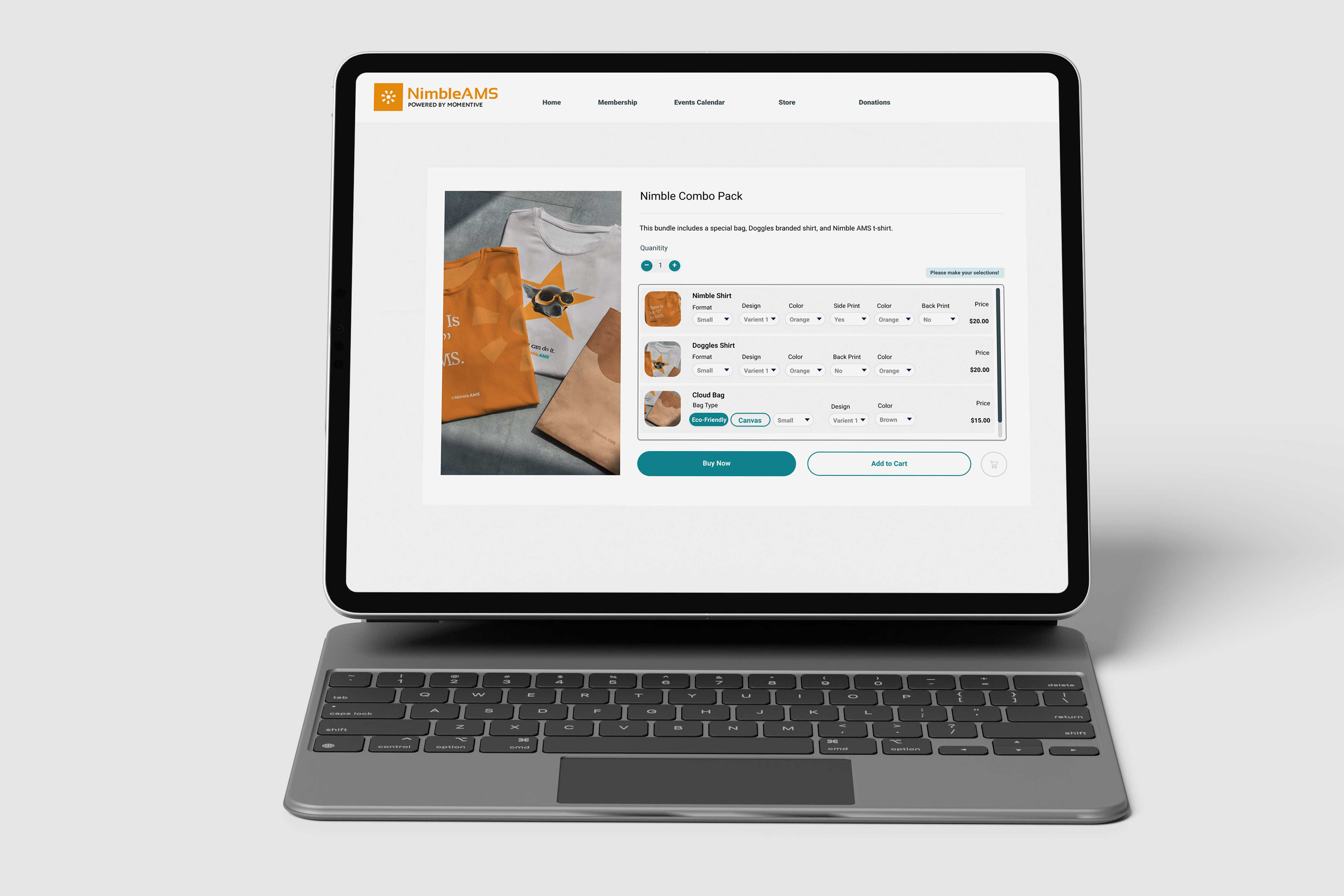
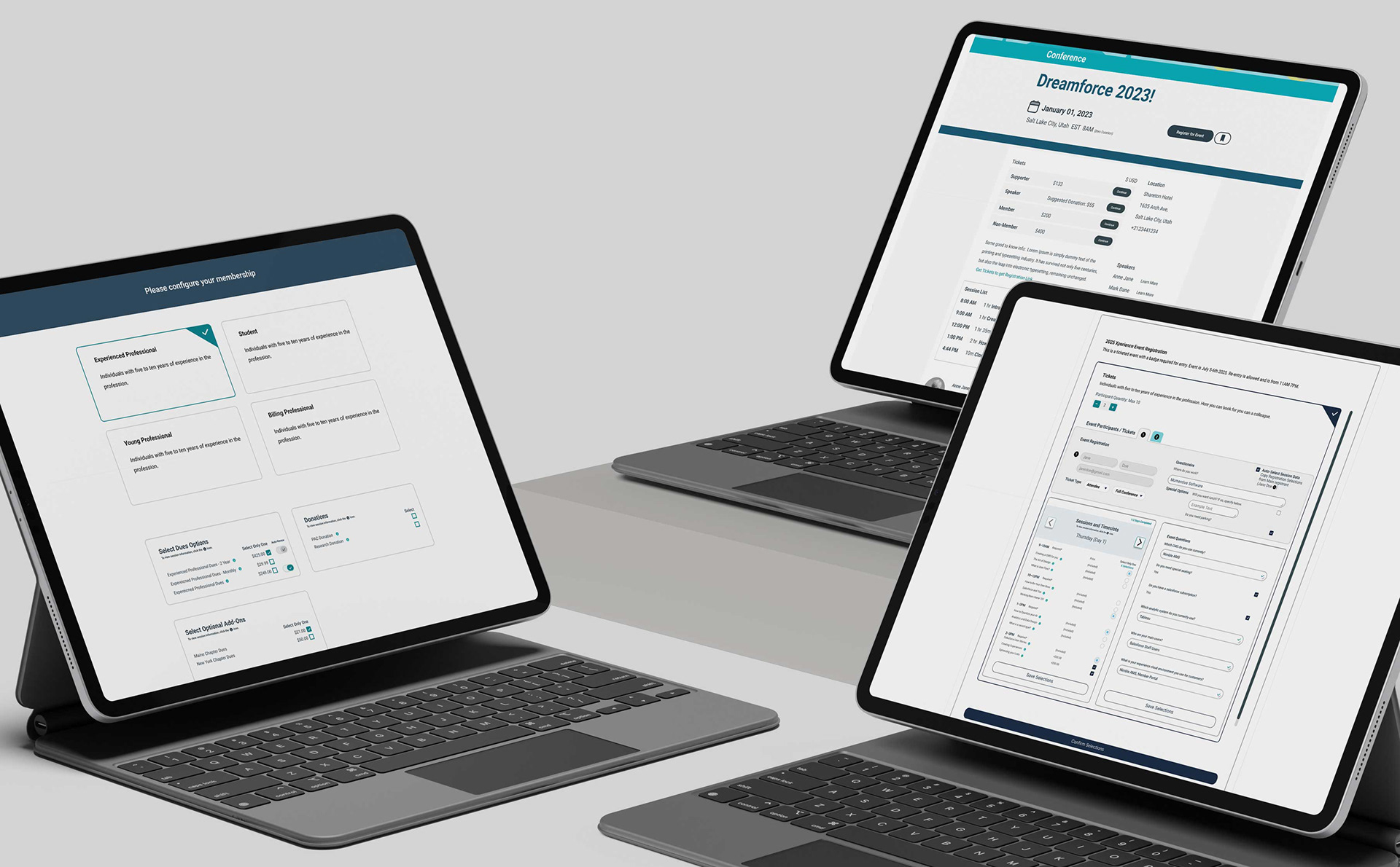
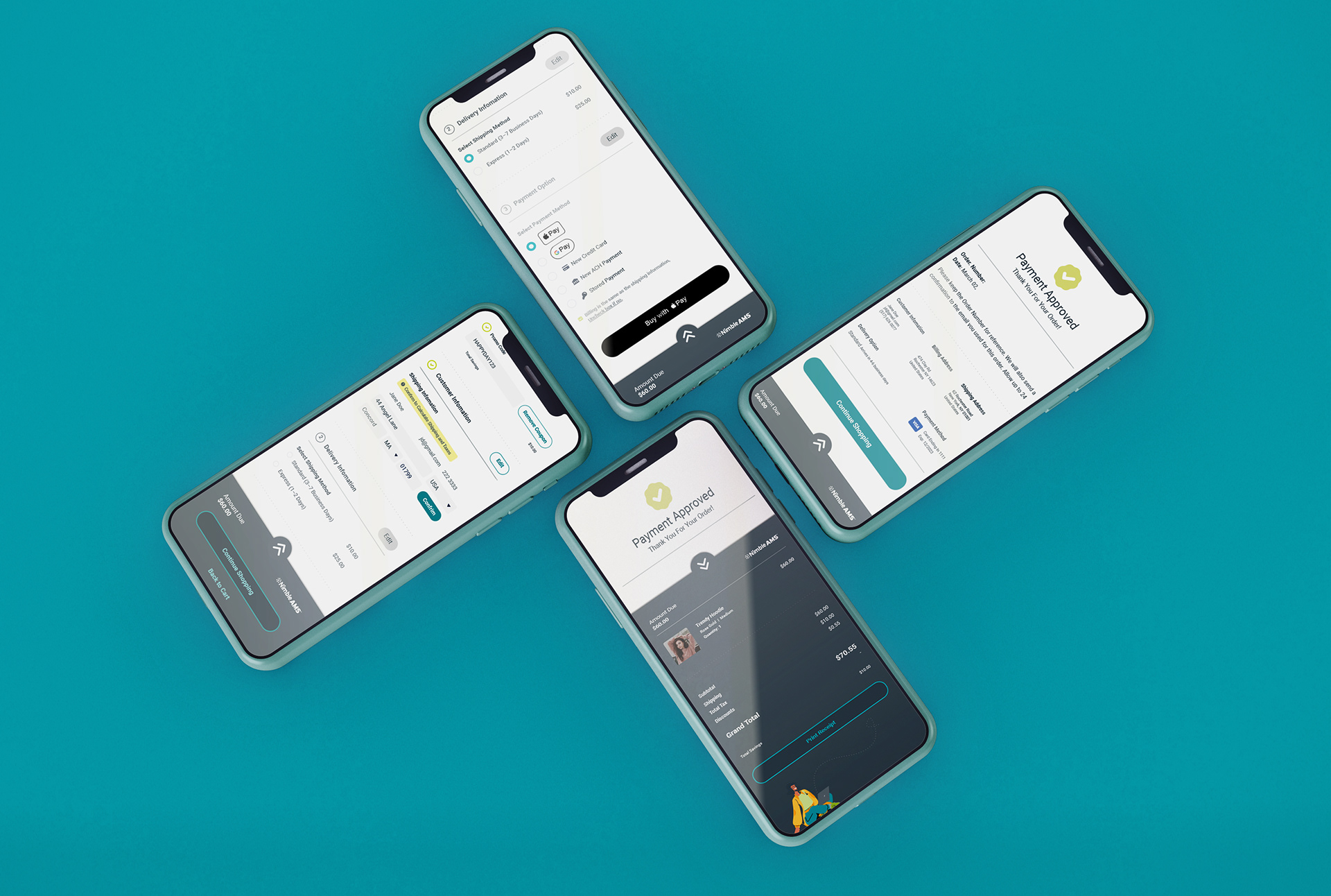
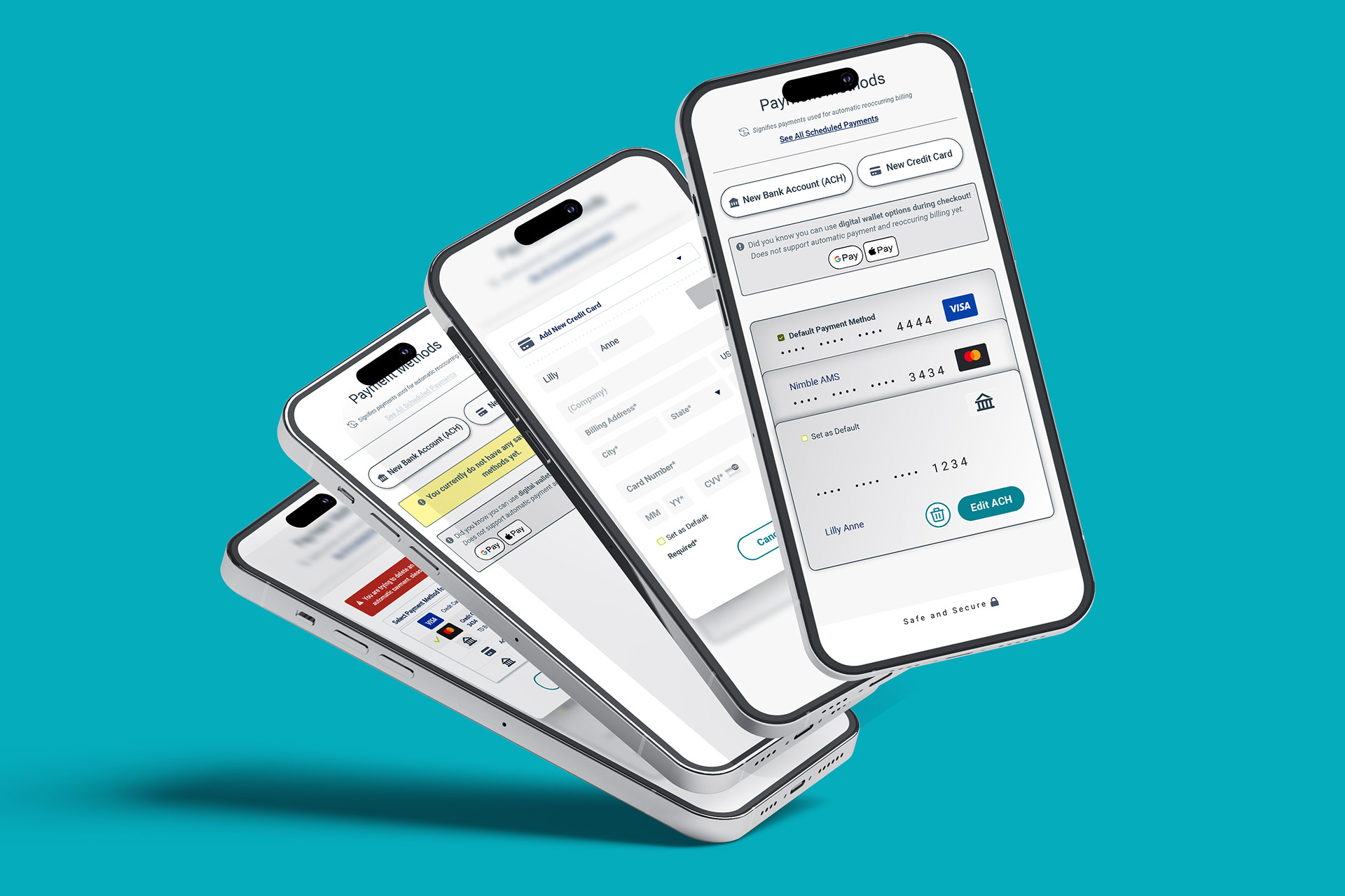
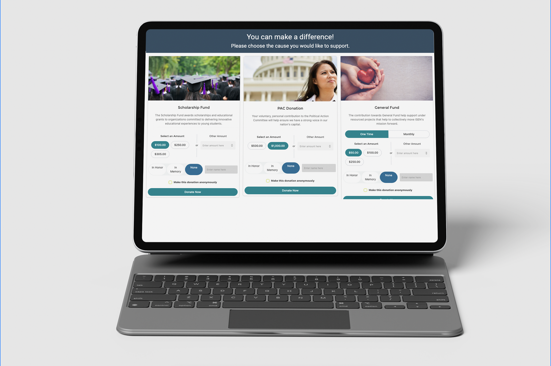
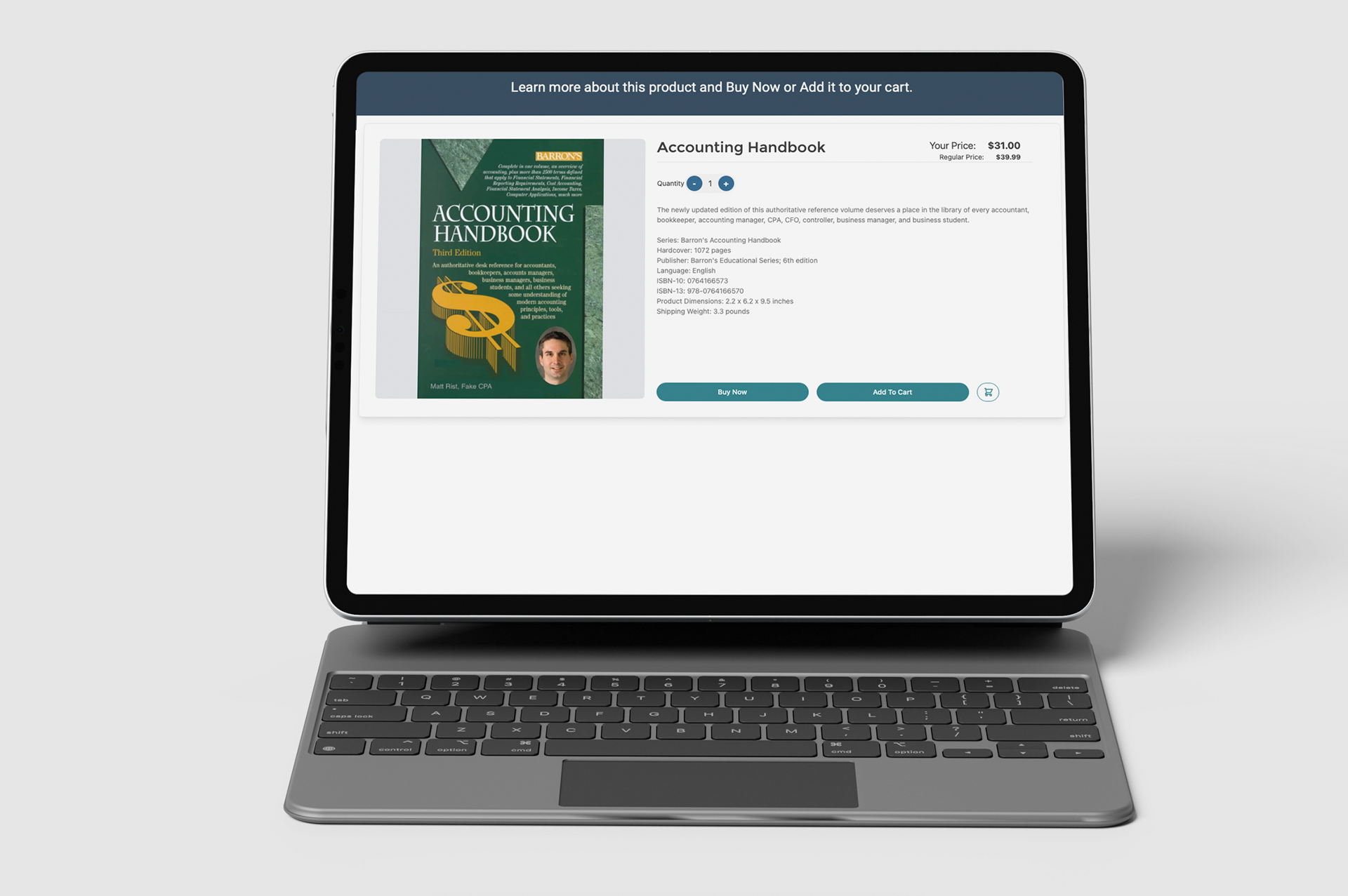
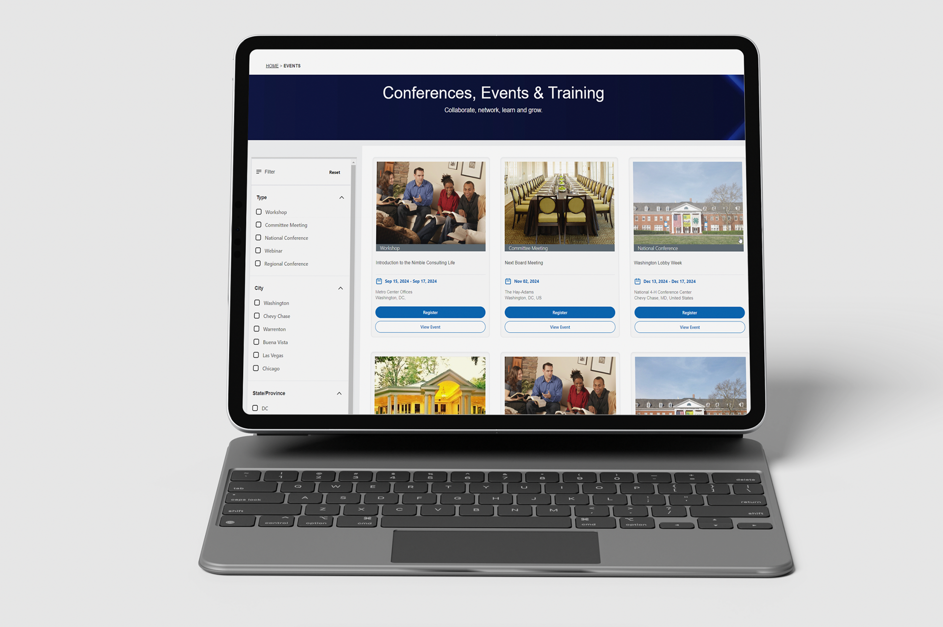
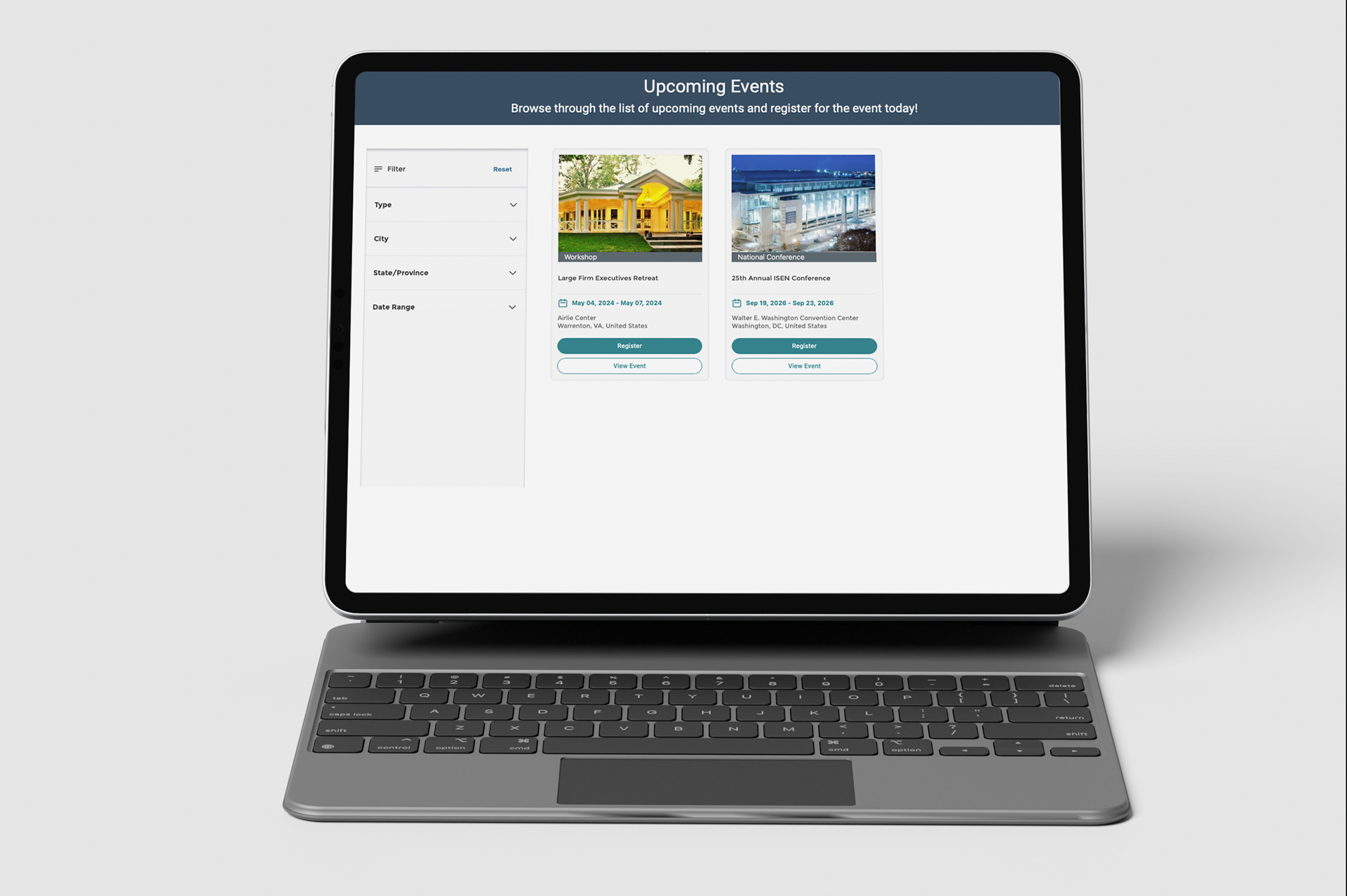
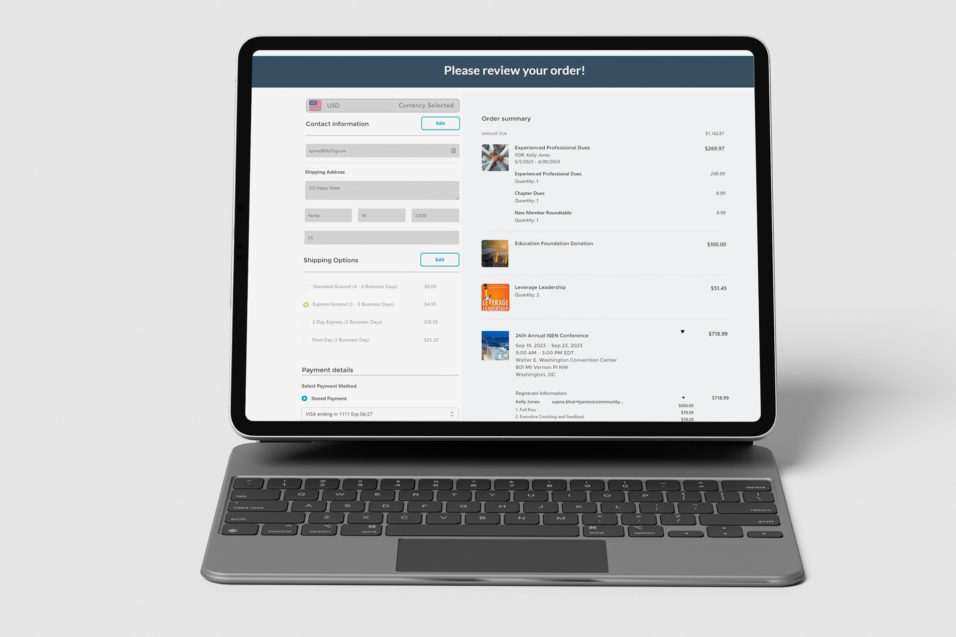
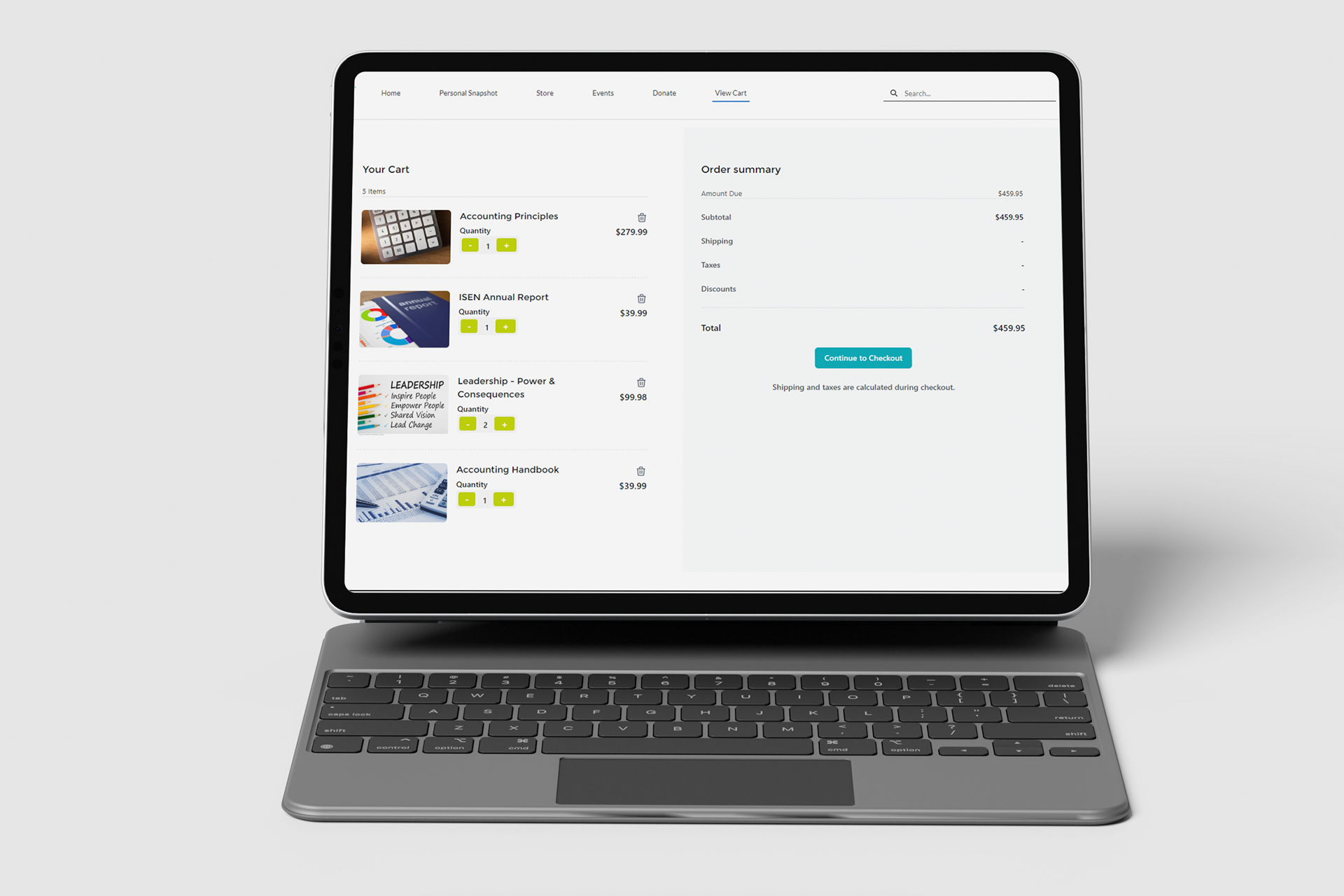
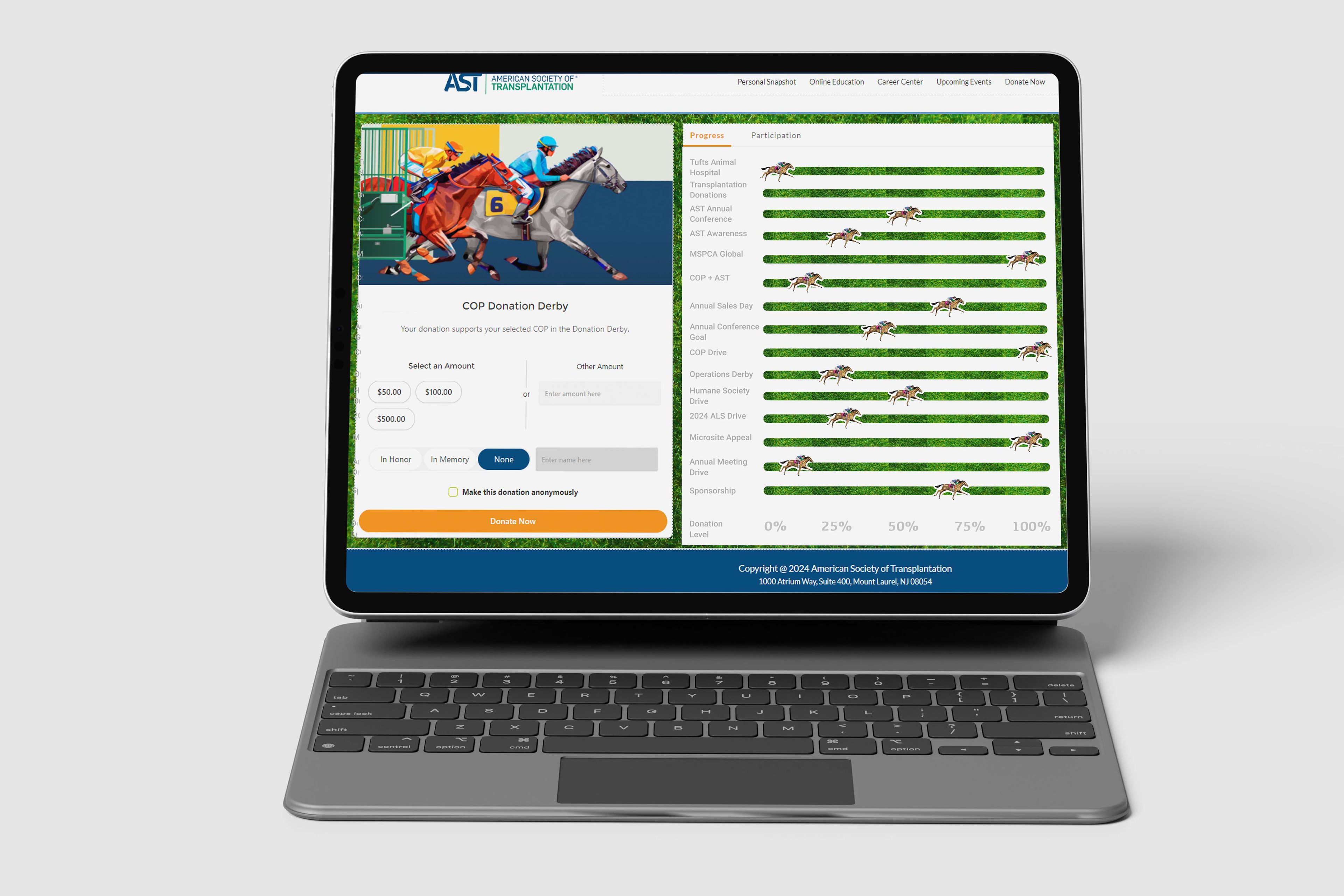
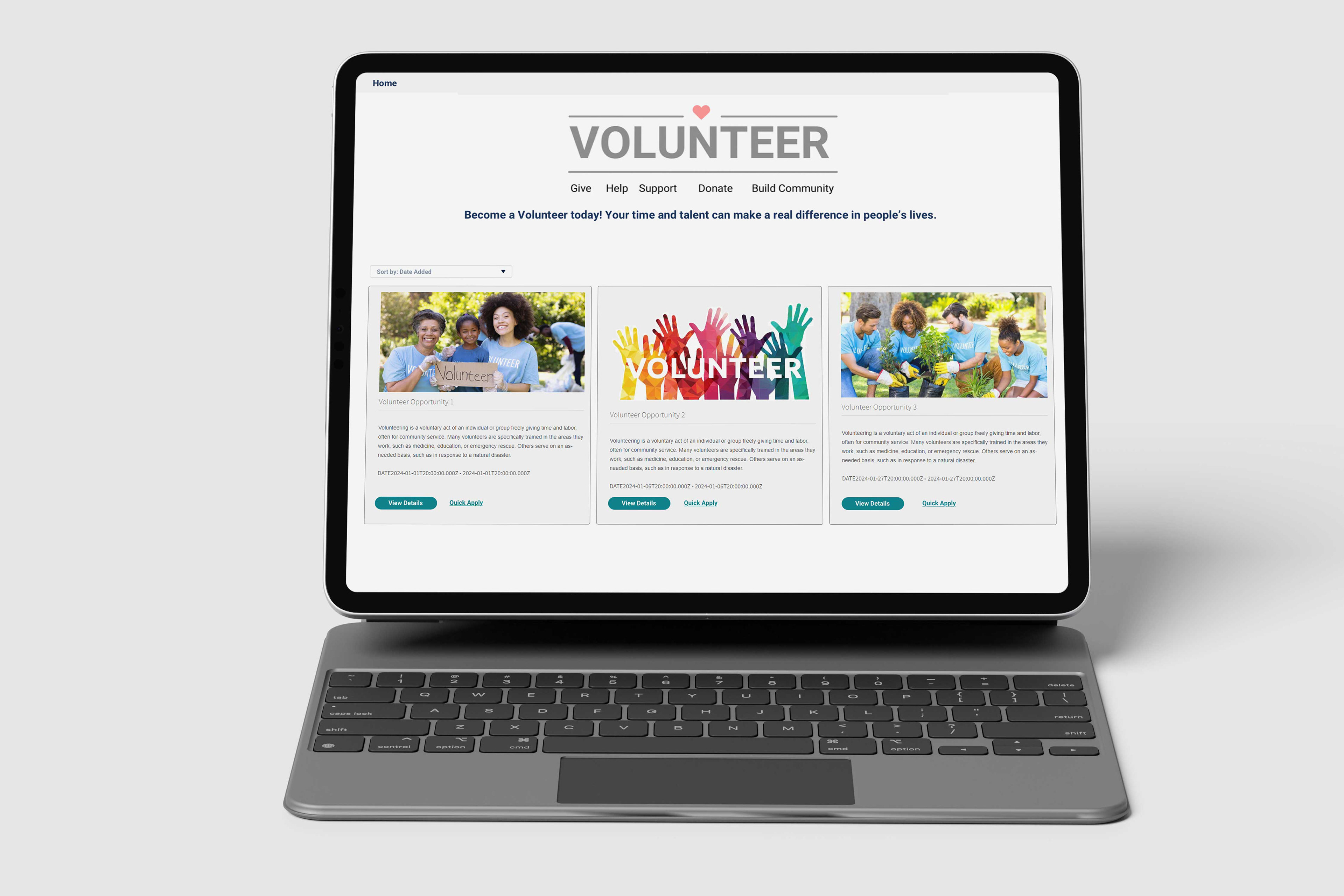
As part of my work on a leading AMS’s Member Portal, I led the design of a custom Lightning Web Component (LWC) system, aimed at improving the user interface and overall user experience. I focused on creating intuitive, user-friendly workflows that seamlessly integrate with Salesforce’s Experience Cloud. Through a research-driven approach—including pain point mapping, surveys, and feedback sessions. The result was a set of custom LWCs designed to improve efficiency and engagement for users, while maintaining a visually appealing and accessible design that aligned with branding fit for any template and company. This is their design system I created for them within their company.
Context & Background
Product: Nimble AMS — an association management software built on the Salesforce platform. (NimbleAMS.com)
Users: Internal staff (admins, membership/event management, reporting), external constituents / members of associations (through member portal / community hub / continuing education etc.) (NimbleAMS.com)
Business Aims:
1. Simplify / automate operational workflows (reduce manual tasks) (NimbleAMS.com)
2. Improve data visibility & reporting / analytics for better decision‐making (NimbleAMS.com)
3. Improve member experience via portals & community engagement tools (NimbleAMS.com)
4. Maintain upgradability, consistency, and reliability of the platform (e.g. fewer breakages during upgrades) (NimbleAMS.com)
Research / UX Inputs & Design Guidance
Some of the concrete policies, guidelines, or input mechanisms that drive the UX and UI design in Nimble AMS include:
AreaSource / GuidelineWhat It Dictates / Implies for UX / UI
Feedback from users (staff)Nimble AMS conducts periodic surveys on the standard homepage asking staff “On a scale from 0 to 10, how likely are you to recommend this product…?” with follow‐ups about what’s good, what’s missing. (Nimble AMS Help)Provides direct user sentiment, helps prioritizing improvements (features vs usability vs performance). Gives clues about friction points.
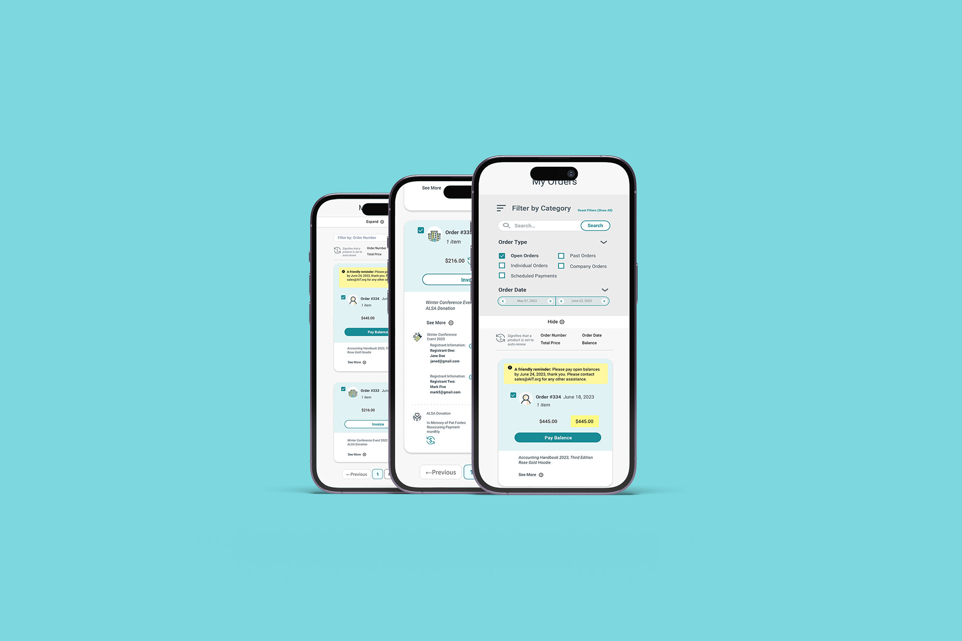
List View Design GuidelinesProvides standard for when to create list views, naming them, organizing fields. (Nimble AMS Help)
Ensures consistency of list views across modules (e.g. time‐based filters, categorical groupings). Helps staff find what they need efficiently. Reduces cognitive load when moving between objects.
Compact Layout Design GuidelinesAdmins are instructed to clone or create compact layouts instead of editing packaged ones (because packaged ones will be overwritten during upgrades). Also guidance on how many fields to include, field ordering etc. (Nimble AMS Help)Ensures that customization doesn’t break during updates; helps keep UI stable over time. Also forces thinking: only fields that matter should be visible in tight spaces; ordering should follow usage / importance.
Lightning Experience & Record Page / Home Page ChangesUsers can enable Lightning Experience; new Lightning record pages, compact layouts, home pages built for more modern UI/UX. (Nimble AMS Help)More modern visual design; better responsiveness; more flexibility in arranging components; faster / more fluid staff workflows. Also orientation toward more graphical, component-based UI.
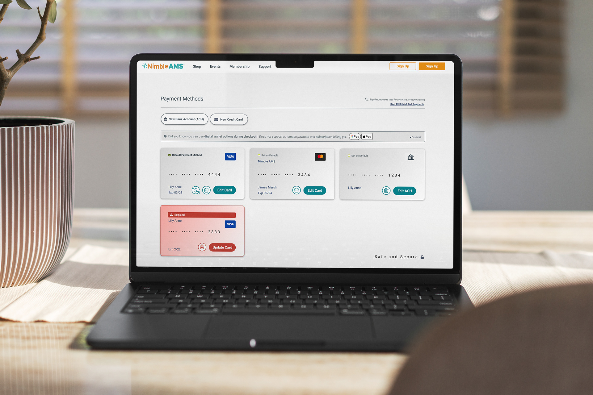
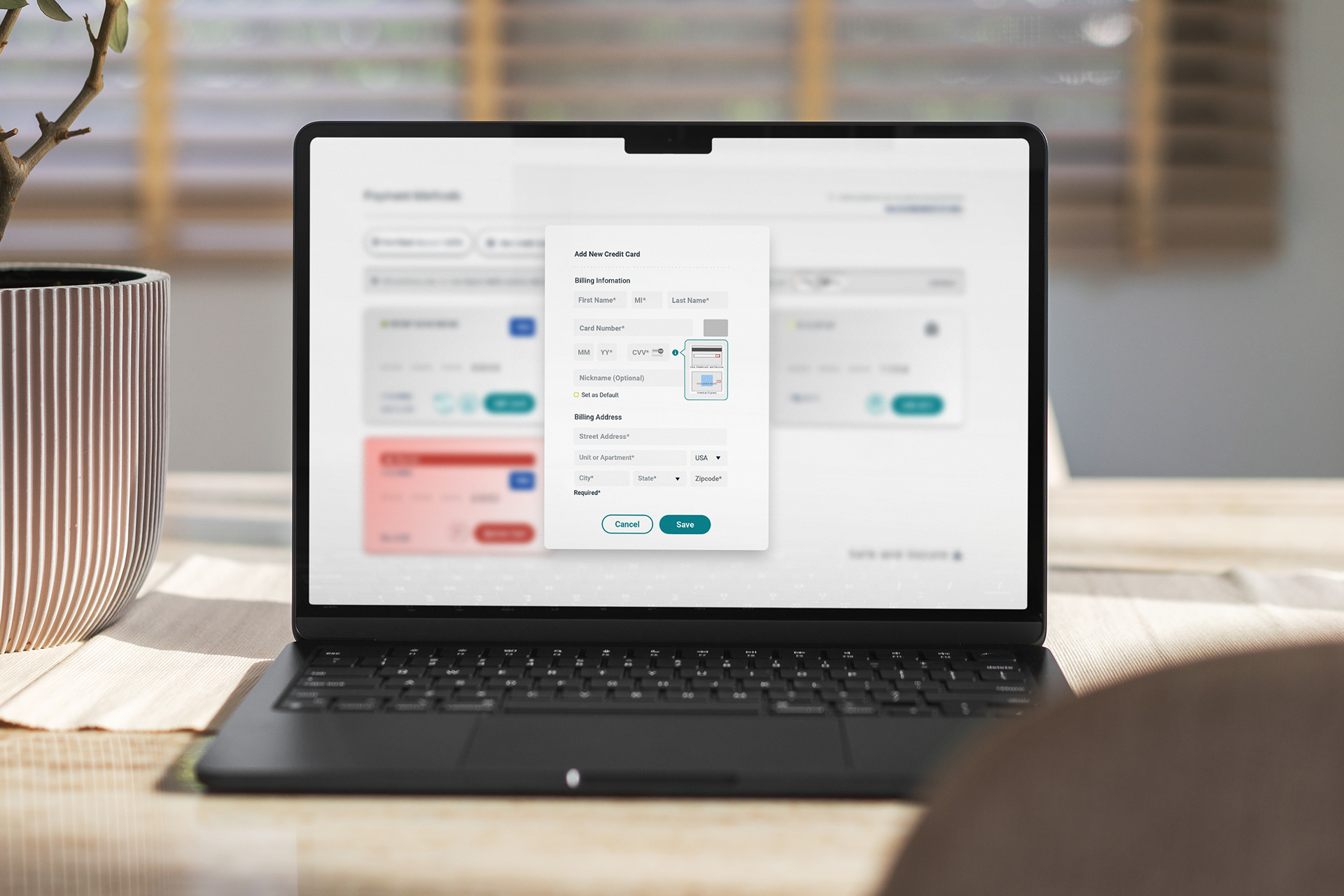
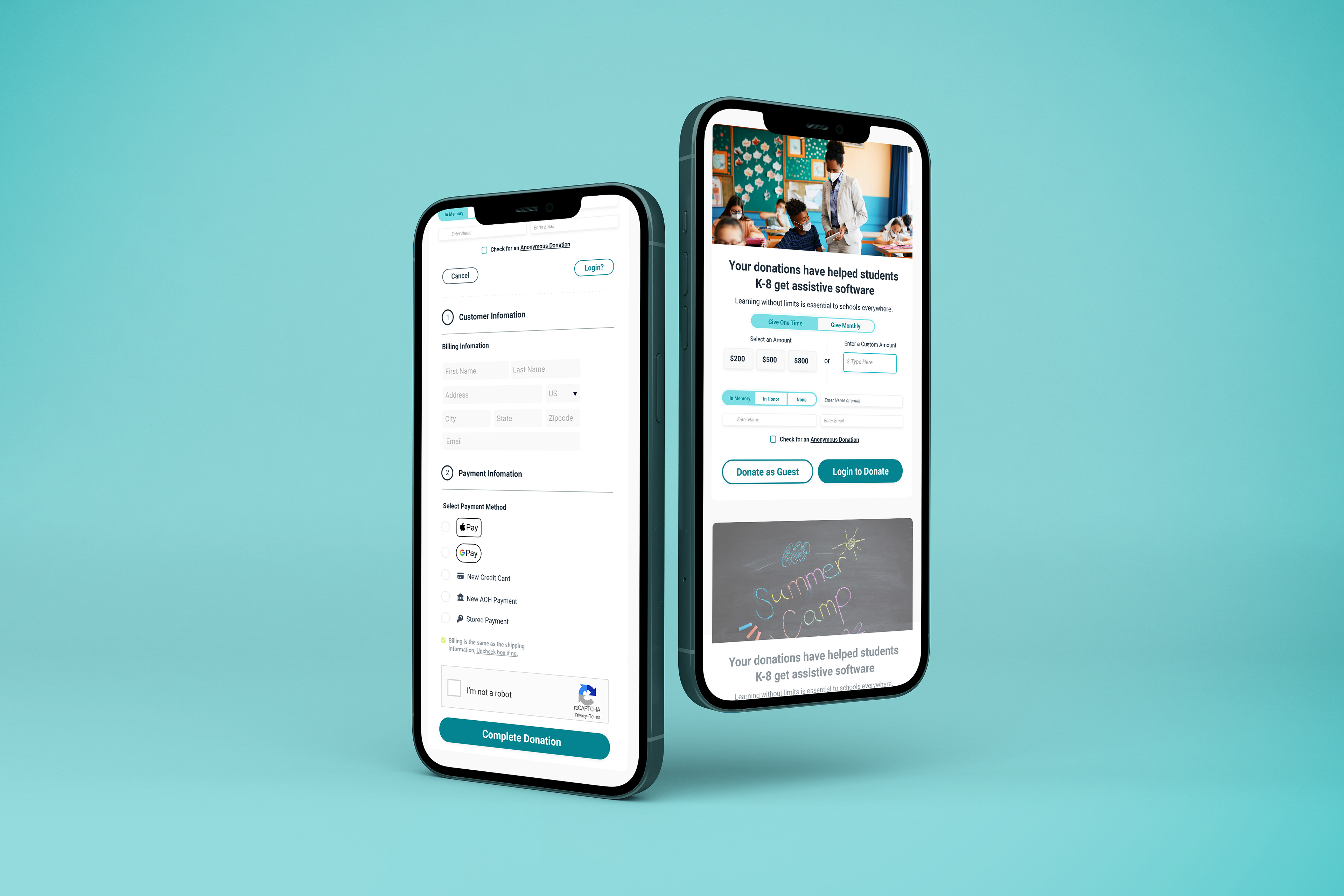
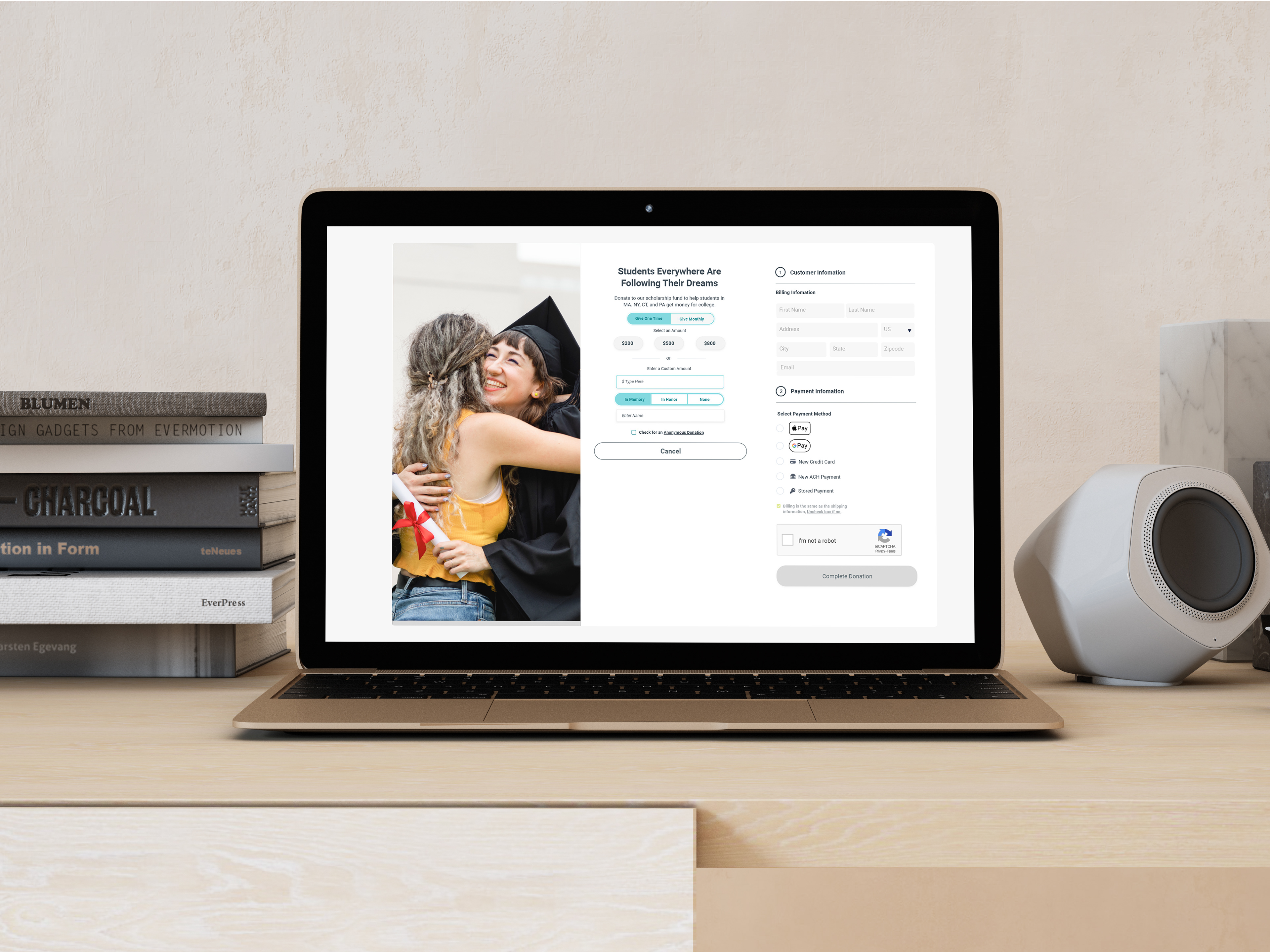
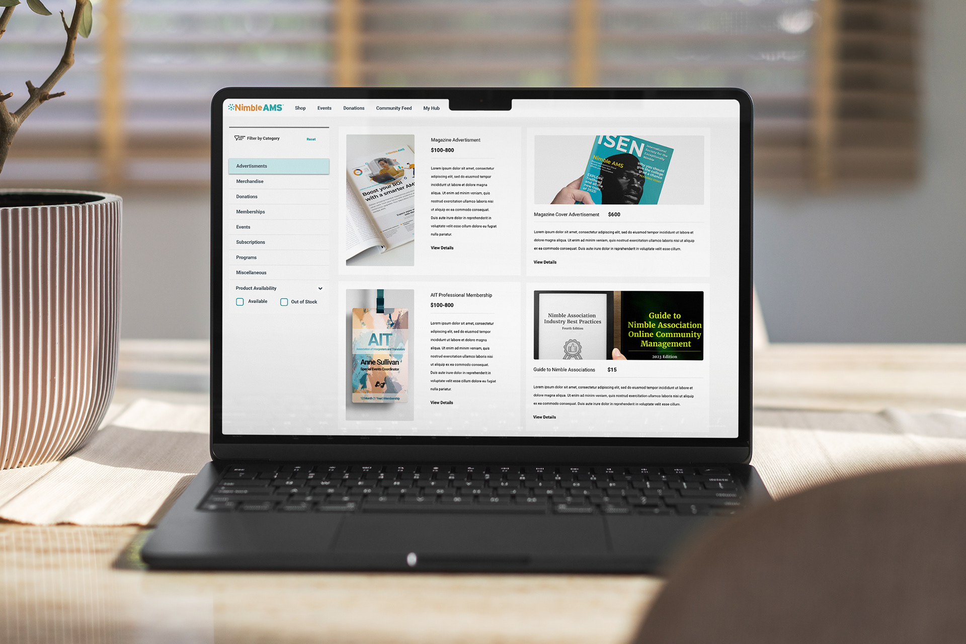
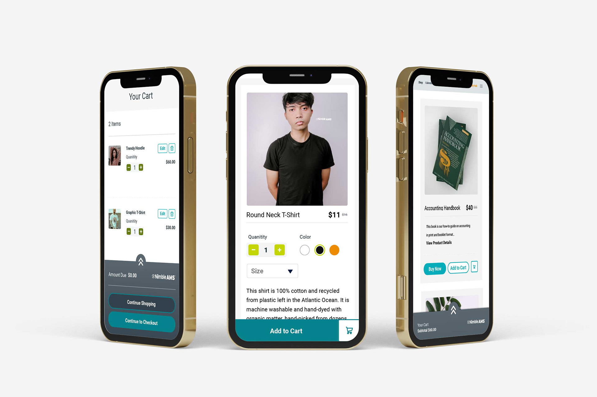
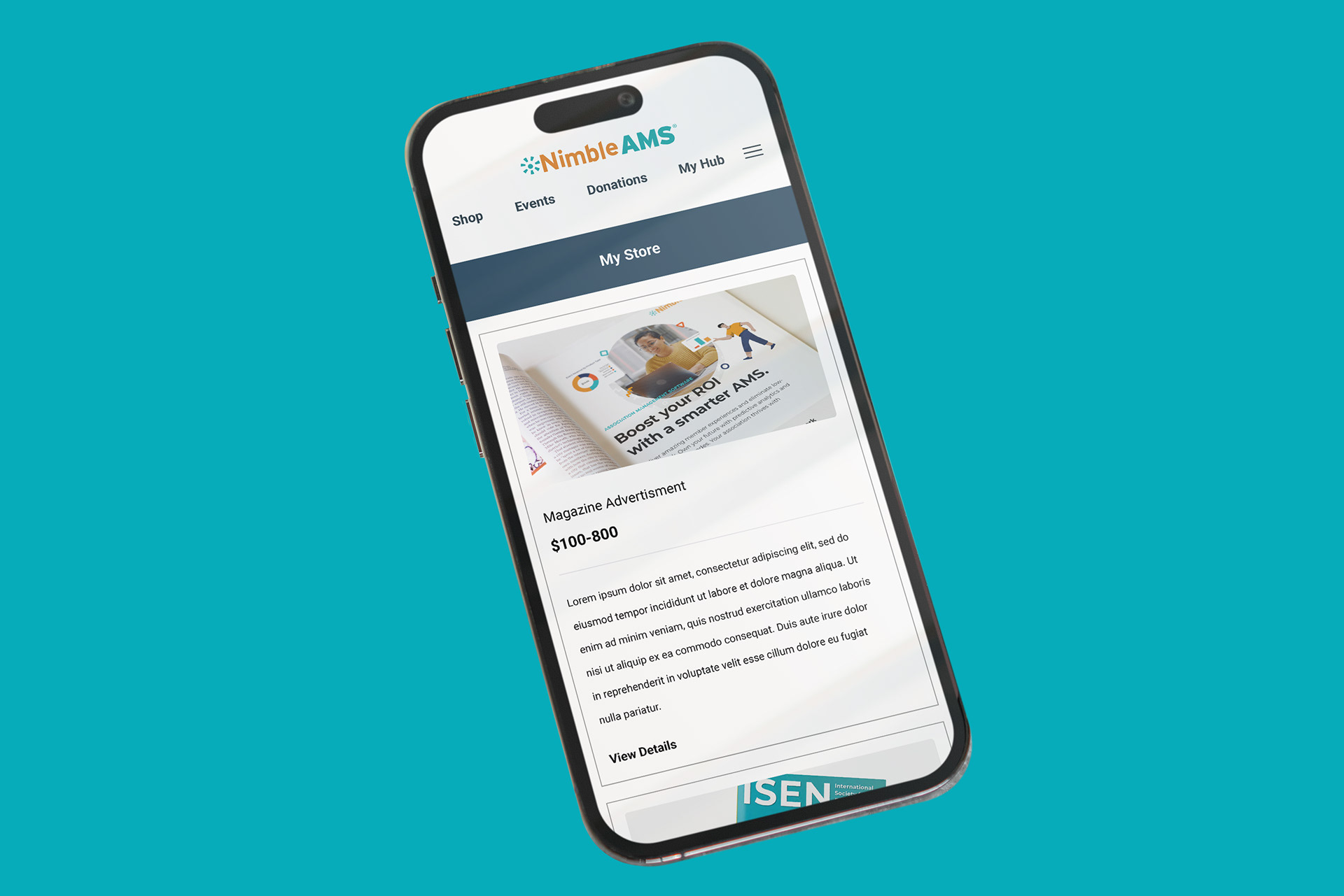
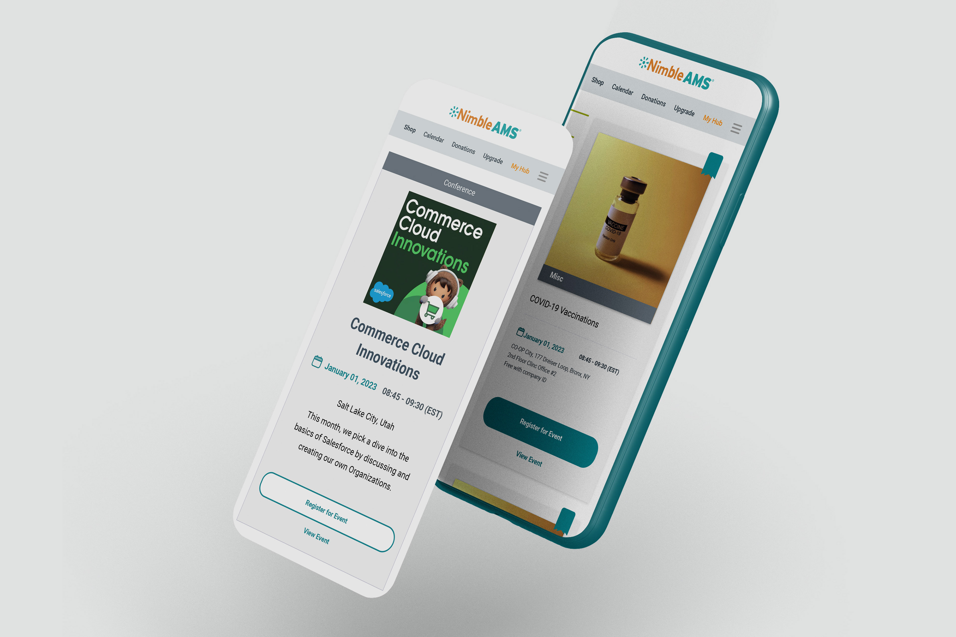
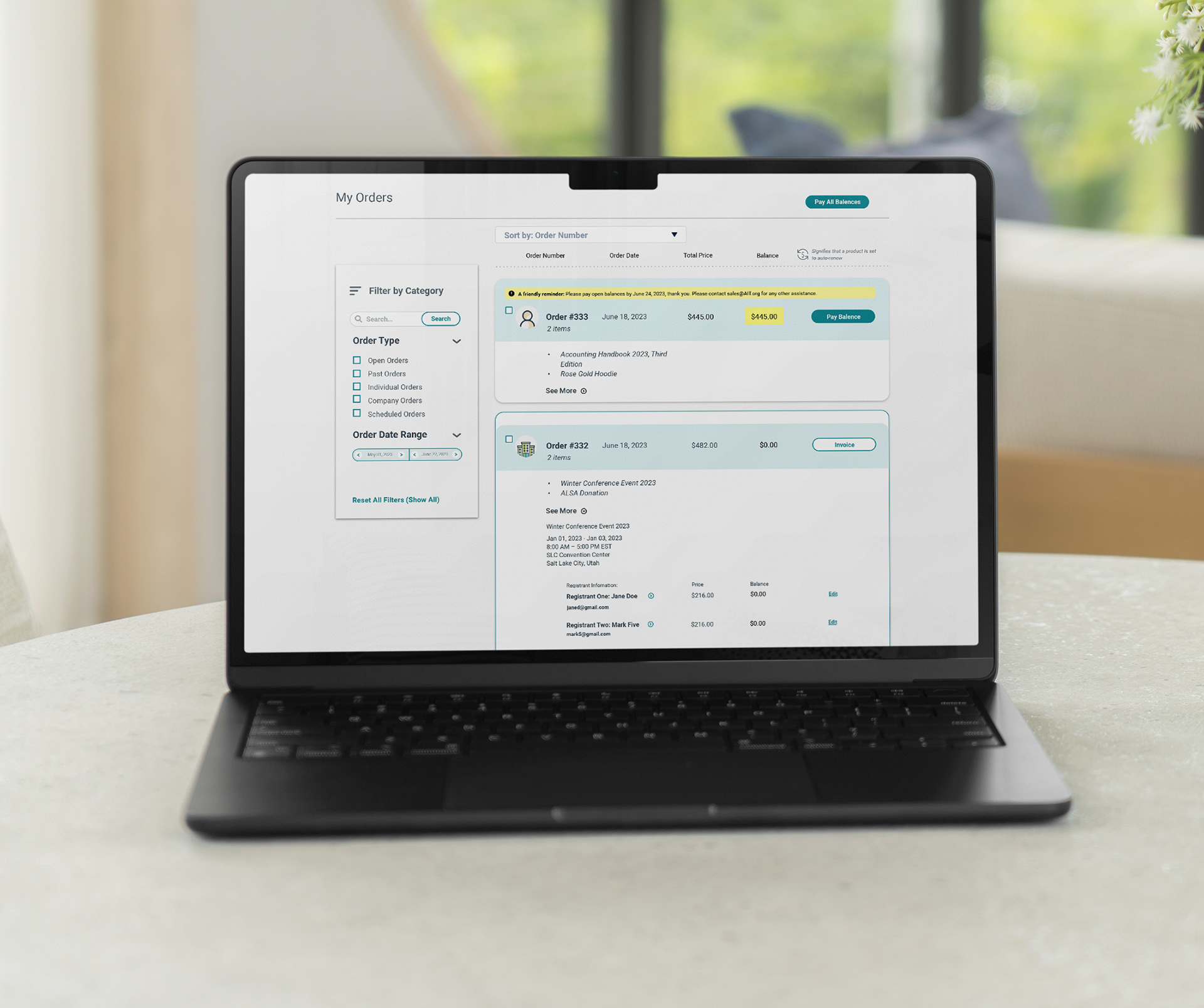
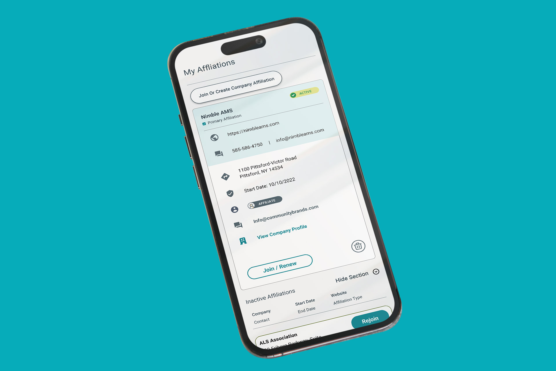
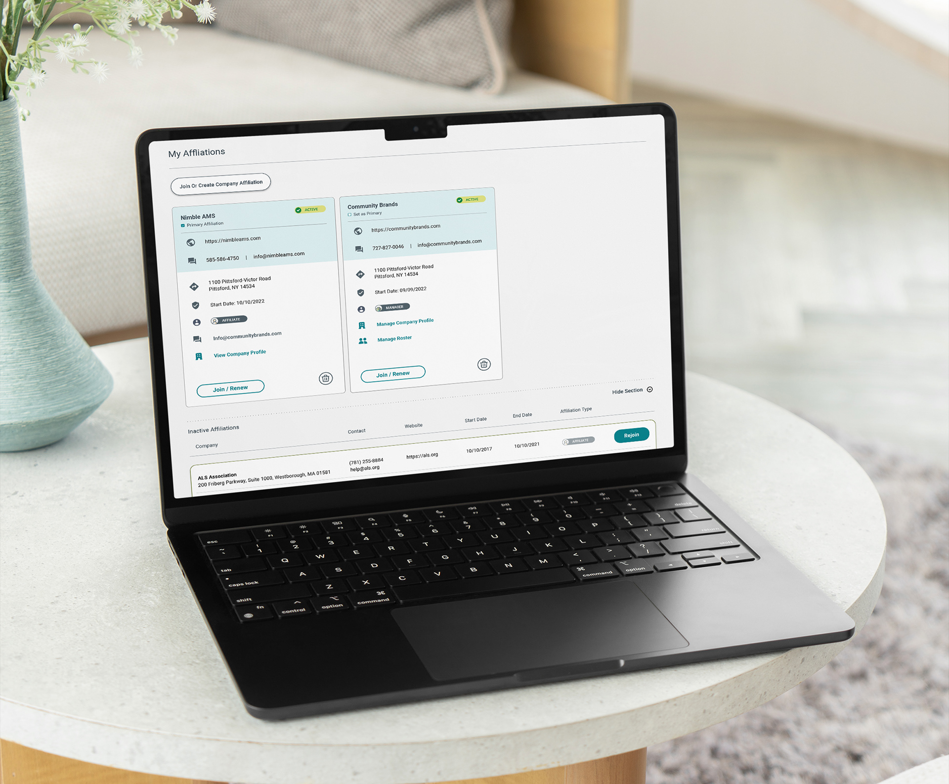
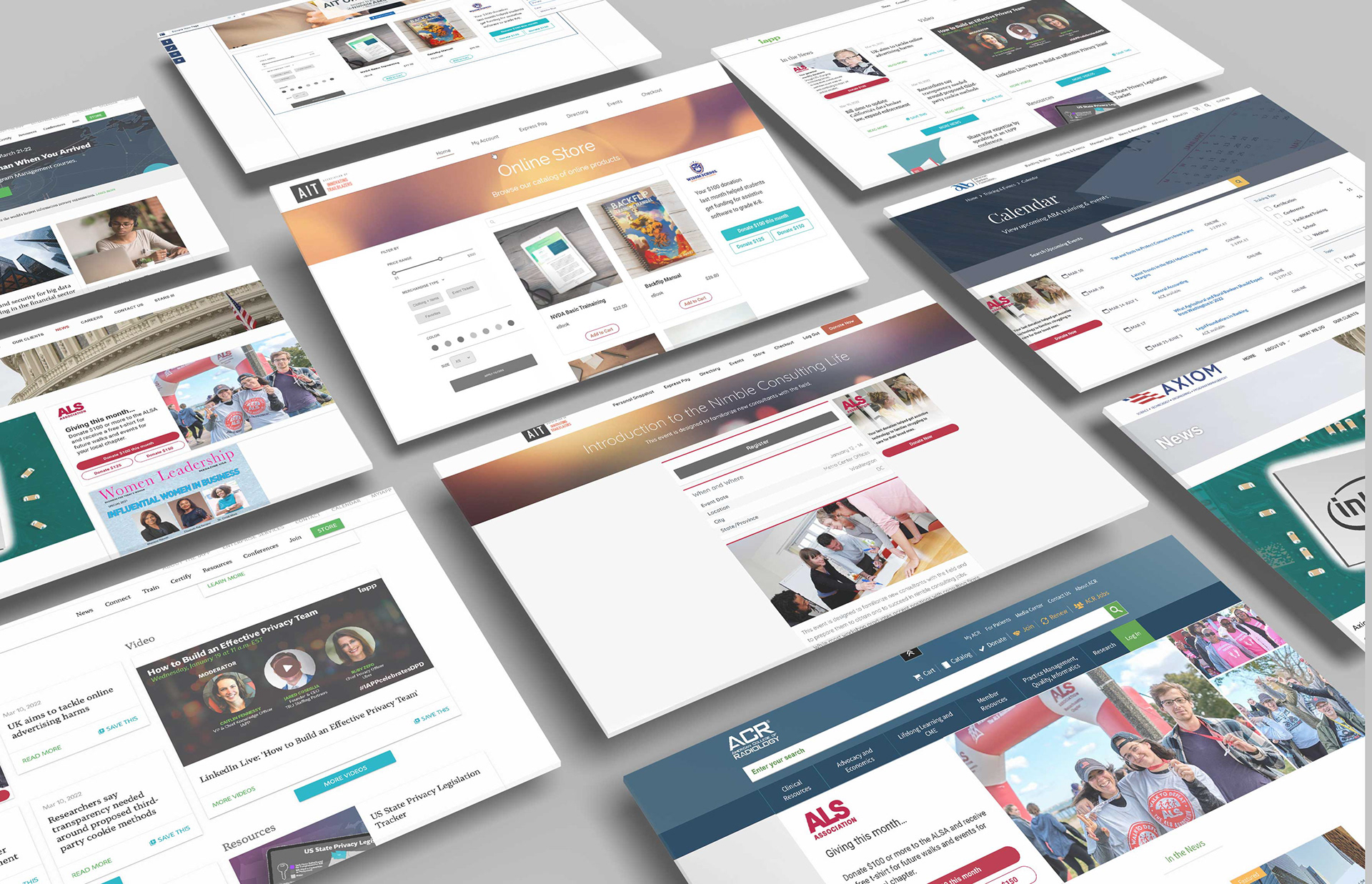
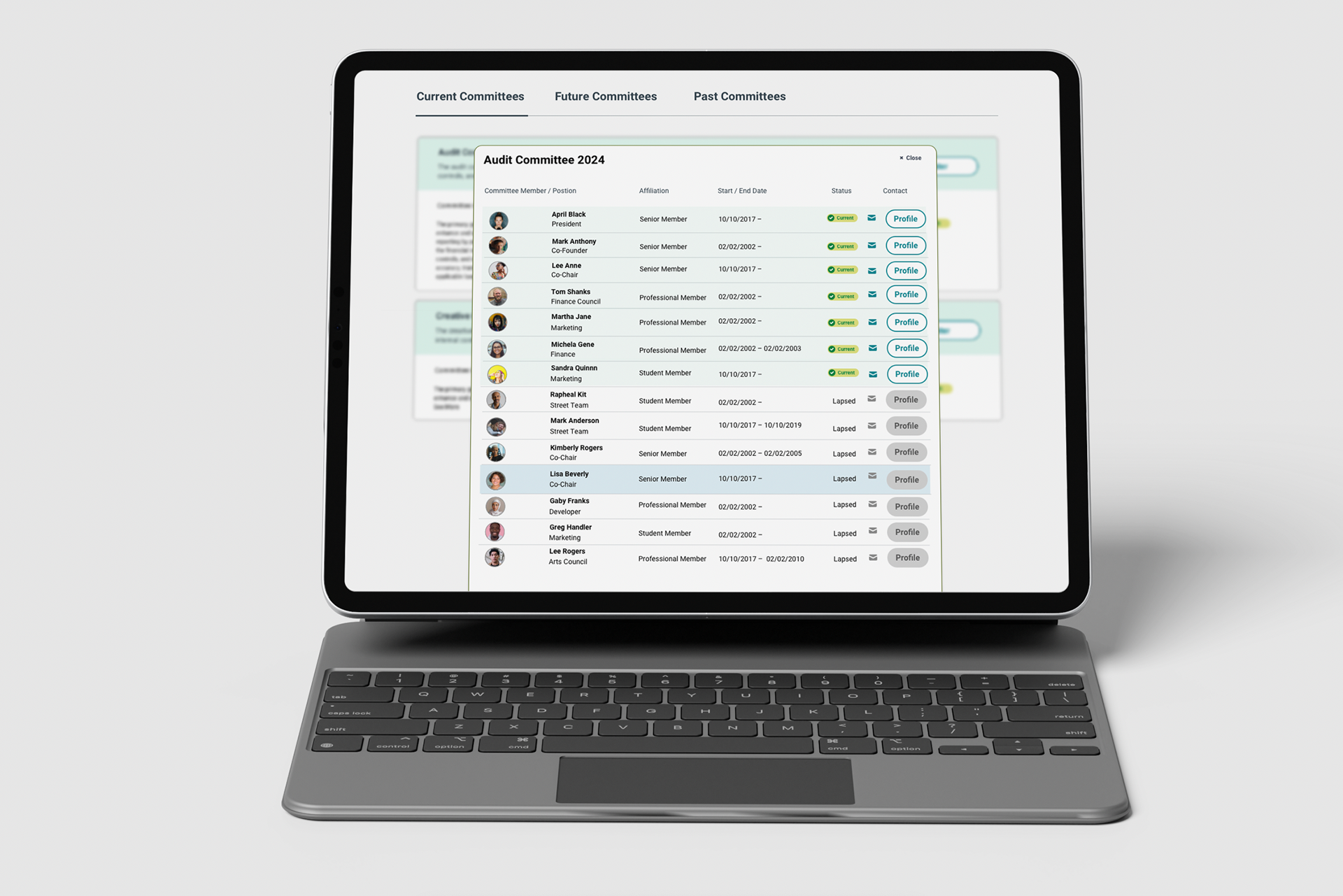
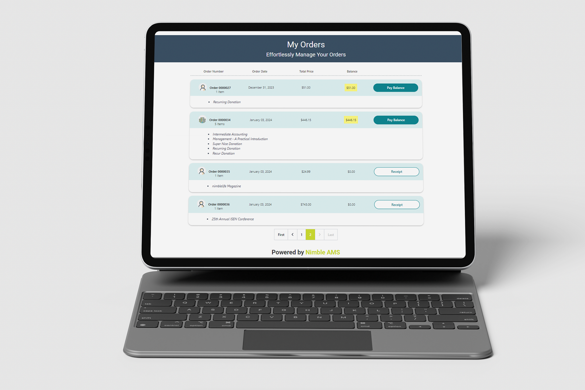
Community Hub ConfigurationThe Community Hub allows admins to customize themes, logos, pages, cards, filters, access controls etc. Also the components are designed to fit all screen sizes and orientations. (Nimble AMS Help)Good responsiveness / mobile support; branding; ability to tailor what members see; cards and filters imply card-based UI, possibly dashboard style. Ensures constituent facing UI is reasonably polished and usable.
Problems Identified (Pre-/Post Migration & UX Pain Points)
From case studies and testimonials, some of the issues prior to switching to or improving Nimble AMS:
Old AMS systems were hard to use, often broke during upgrades, and lacked flexibility. (NimbleAMS.com)
Manual, slow processes for membership renewals, reporting, event/course credit tracking. E.g. NASPA used to take 3 days for monthly membership reporting; after adopting Nimble AMS, cut that to 2 hours. (NimbleAMS.com)
Difficulty seeing real-time transactions / full member engagement picture; data fragmentation. (NimbleAMS.com)
Poor support for workflows / validation rules, complex data requirements (tracking demographics, addresses). (NimbleAMS.com)
Solutions & Design / Feature Interventions
Here are UX/UI / product features and design decisions that directly address those problems:
Feature / Design InterventionDescriptionUX/UI Impact (how it helps)
Configurability & AutomationAutomation of renewals, reporting; integration with LMS for auto syncing of learning credits (SIIM example) (NimbleAMS.com)Reduces manual work; less error; faster turnaround; improves staff satisfaction; makes the system more predictable.
Modern UI through Lightning ExperienceEnabling Lightning Apps, Lightning record pages, new home pages etc. (Nimble AMS Help)More visually coherent; better component reuse; faster navigation; possibly better performance; improved discoverability through updated menu/apps layout.
Consistent Layouts / Compact Layouts & List ViewsGuidelines for compact layouts; decision trees when to clone vs modify; consistent list view naming & structure. (Nimble AMS Help)Consistency helps reduce learning curve; faster scanning of information; predictability; reduce frustration from “why is this field here / missing elsewhere”.
Community Hub / Online CommunityACerS case: rolled out Nimble Communities (online member community) built on Salesforce Community Cloud; custom cards, pages etc. (NimbleAMS.com)Member engagement; gives constituents easier ways to connect; adds value beyond just transactional / administrative tasks; polish/member satisfaction.
Analytics & DashboardsNASPA case: better membership data insights; real time / dynamic dashboards. (NimbleAMS.com)Staff can make decisions faster; reduce reliance on data extraction and offline processing; spotting trends sooner.
Impact & Outcomes (UX / Business Metrics)
Here are measurable improvements and qualitative results, especially relevant from UX & product design perspectives:
Metric / OutcomeBeforeAfterUX Implication
Membership Reporting Time (Monthly)~3 days to produce report manually. (NimbleAMS.com)~2 hours with Nimble AMS. (NimbleAMS.com)Much faster turn-around, meaning staff have more time for value work; ability to access insights more frequently; improved responsiveness.
User Satisfaction & RetentionMany associations frustrated with old AMS: effort needed for even small configuration / reporting; multiple systems to shift between. (NimbleAMS.com)High customer retention (≈ 97%) and support satisfaction (≈ 98%) for Nimble AMS. (NimbleAMS.com)Users appreciate reliability, usability; less time lost to broken customizations or upgrade issues; stable UX over time.
Member Engagement / Community UseACerS had limited member networking / no home platform for virtual conversations. (NimbleAMS.com)After Nimble Communities rollout, ACerS exceeded goals for online community participation; members connected more broadly. (NimbleAMS.com)UX/design of community features (easy to use, discover, engage) matters; member felt more value; additive utility.
Learning / Continuing Education UX
It has manual processes for course credit and transcripts etc. Members had to wait or staff have to manually manage. (NimbleAMS.com)With Nimble AMS + LMS integration: automatic sync of course completions, certificates accessible, custom fields for credit types etc. (NimbleAMS.com)Improved member experience; fewer support tickets; more transparency; clean UI flows (from member view, staff view) for learning transcripts etc.
UX/UI Strengths
From the evidence, these are what Nimble AMS does well from a UX & product design standpoint:
Configurability with Guardrails
The system allows admins to customize layouts, list views, community hub, but many guidelines ensure that modifications are sustainable (e.g. compact layouts cloned instead of edited, so package upgrades don’t break them). (Nimble AMS Help)
The system allows admins to customize layouts, list views, community hub, but many guidelines ensure that modifications are sustainable (e.g. compact layouts cloned instead of edited, so package upgrades don’t break them). (Nimble AMS Help)
Integration & Automation
Features like LMS integration, automatic credit sync, automated reporting / workflows reduce friction. (NimbleAMS.com)
Features like LMS integration, automatic credit sync, automated reporting / workflows reduce friction. (NimbleAMS.com)
Modernization of UI / Visual Consistency
The use of Lightning Experience, compact layouts, updated apps / record pages, color/icon / brandable apps etc. help provide modern, more pleasant experience. (Nimble AMS Help)
The use of Lightning Experience, compact layouts, updated apps / record pages, color/icon / brandable apps etc. help provide modern, more pleasant experience. (Nimble AMS Help)
Responsive, Mobile-Friendly Member Portals
Through Community Hub configuration which adapts to screen sizes / orientations, admins can customize branding, menus, cards etc. which helps constituent UX. (Nimble AMS Help)
Through Community Hub configuration which adapts to screen sizes / orientations, admins can customize branding, menus, cards etc. which helps constituent UX. (Nimble AMS Help)
Strong Data Visibility & Analytics
Dashboards and reporting tools, real-time data, predictive analytics, continuous upgrades so new features added. Staff comment on being able to see engagement / transactions in real time. (NimbleAMS.com)
Dashboards and reporting tools, real-time data, predictive analytics, continuous upgrades so new features added. Staff comment on being able to see engagement / transactions in real time. (NimbleAMS.com)
UX/UI Weaknesses / Gaps or Risks (Derived from Cases / Public Feedback (on web and not internal)
Some of the areas for improvement or potential UX risks observed in the public documentation / testimonials:
Learning Curve for Admins / New Staff
Because there are many configuration options, setup of layouts, compact views, community hub themes etc., new staff may find this overwhelming. The guidelines help, but some associations noted previous systems had “too many clicks” to get what they needed. (NimbleAMS.com)
Because there are many configuration options, setup of layouts, compact views, community hub themes etc., new staff may find this overwhelming. The guidelines help, but some associations noted previous systems had “too many clicks” to get what they needed. (NimbleAMS.com)
Discoverability of Configuration Options
Some configuration options (e.g. which compact layout to clone vs modify; which list views exist; what filters/cards in Community Hub) may not be visible or obvious to new users. If not well documented or surfaced, users may duplicate work or set up sub-optimal layouts.
Some configuration options (e.g. which compact layout to clone vs modify; which list views exist; what filters/cards in Community Hub) may not be visible or obvious to new users. If not well documented or surfaced, users may duplicate work or set up sub-optimal layouts.
Upgrade-Related Constraints
While guidelines attempt to prevent breakages, there is always risk that customizations (especially UI / layout) get affected by seasonal upgrades; also, some UI behaviors or components may change. Users have indicated that old AMS systems often broke with upgrades, and Nimble AMS aims to reduce that, but ensuring that risk is minimized likely requires careful UX design & communications. (NimbleAMS.com)
While guidelines attempt to prevent breakages, there is always risk that customizations (especially UI / layout) get affected by seasonal upgrades; also, some UI behaviors or components may change. Users have indicated that old AMS systems often broke with upgrades, and Nimble AMS aims to reduce that, but ensuring that risk is minimized likely requires careful UX design & communications. (NimbleAMS.com)
Member-Facing Consistency vs Branding
Customization for the Community Hub (logos, themes, custom labels) is allowed, which is good, but heavy customization can introduce inconsistency or UX issues across associations (some might sacrifice usability for branding). Possible trade-offs between branding and clarity/usability.
Customization for the Community Hub (logos, themes, custom labels) is allowed, which is good, but heavy customization can introduce inconsistency or UX issues across associations (some might sacrifice usability for branding). Possible trade-offs between branding and clarity/usability.
Performance / Scale Considerations
For large associations with many members / many events / large data, UI response (list views, dashboards) might lag, especially when many filters/cards etc. are involved. Public case studies do not deeply address performance metrics, which could be a point to investigate.
For large associations with many members / many events / large data, UI response (list views, dashboards) might lag, especially when many filters/cards etc. are involved. Public case studies do not deeply address performance metrics, which could be a point to investigate.
Mobile UX Details
It’s asserted that Community Hub components are responsive, but public documentation does not always show detailed mobile / small screen workflows, error states, offline behavior etc. There may be latent issues in those edge-cases.
It’s asserted that Community Hub components are responsive, but public documentation does not always show detailed mobile / small screen workflows, error states, offline behavior etc. There may be latent issues in those edge-cases.
Design Principles Evident
From the research, several UX / UI principles Nimble AMS seems to follow:
User-Centered / Feedback-Driven: collecting staff feedback surveys; delivering features based on member & staff needs (e.g. SIIM, ACerS).
Consistency & Predictability: through design guidelines (list views, compact layouts, app naming, etc.) ensuring UI behaves similarly across modules.
Configurability & Flexibility: balancing out-of-box functionality with ability to customize (fields, layouts, portal content).
Maintainability / Upgradability: guidelines to avoid breaking customizations, delivery of regular product upgrades, packaged/prescribed layout rules.
Data & Visual Clarity: dashboards, reports, visual components (cards in Community Hub) to present data clearly; filters, layout ordering.
Responsive & Accessible Design: at least in the Community Hub, components fit on all screen sizes; also WCAG compliance mentioned in features listing. (NimbleAMS.com)
Suggestions / Recommendations (If You Were Doing a UX Audit / Next Iterations)
Based on the above, here are UX/UI improvements or experiments I'd recommend, which could be part of a future roadmap:
Onboarding / Guided Setup for New Admins
- Interactive walkthroughs for setting up compact layouts, list views, community hub pages/cards.
- Templates for common use-cases so associations don’t need to build from scratch.
- Interactive walkthroughs for setting up compact layouts, list views, community hub pages/cards.
- Templates for common use-cases so associations don’t need to build from scratch.
Dashboard / Reporting Customization Templates
- Pre-built dashboards for specific roles (membership director, events manager, finance).
- Ability to clone/share dashboards among users/orgs.
- Pre-built dashboards for specific roles (membership director, events manager, finance).
- Ability to clone/share dashboards among users/orgs.
Improve Discoverability of Features / Help Tools
- Contextual help overlays when in configuration pages.
- In-product suggestions (“Did you know you could clone a compact layout…”) to steer users toward best practices.
- Contextual help overlays when in configuration pages.
- In-product suggestions (“Did you know you could clone a compact layout…”) to steer users toward best practices.
Performance Monitoring UI
- For large lists/views, show loading states, progress indicators.
- Possibly lazy-loading of cards / components.
- For large lists/views, show loading states, progress indicators.
- Possibly lazy-loading of cards / components.
Accessible & Mobile UX Deep Dive
- Evaluate mobile flows for major user tasks (membership renewal, event registration, certificate printing).
- Audit for WCAG compliance beyond the basics; ensure keyboard nav, screen reader support, etc.
- Evaluate mobile flows for major user tasks (membership renewal, event registration, certificate printing).
- Audit for WCAG compliance beyond the basics; ensure keyboard nav, screen reader support, etc.
Member Persona-Based Customization
- Use design that adapts for different kinds of members (e.g. first-time, frequent, premium). Show relevant content / features more prominently.
- Use design that adapts for different kinds of members (e.g. first-time, frequent, premium). Show relevant content / features more prominently.